The OnePlus 6 Review: Among The Best Of 2018
by Andrei Frumusanu on July 27, 2018 8:30 AM EST- Posted in
- Mobile
- Smartphones
- OnePlus
- OnePlus 6
Software UI - OxygenOS 5.1
As noted in the introduction, I haven’t had the opportunity to spend much time with OnePlus devices in the past so OxygenOS is also naturally something I haven’t had much experience with. OnePlus is known to have excellent software support with quick and frequency updates. Indeed my review device was very quick in getting the latest July update to 5.1.9 and most interesting for users living on the bleeding edge, OnePlus takes part in the Android P beta program and it’s available for the OP6.
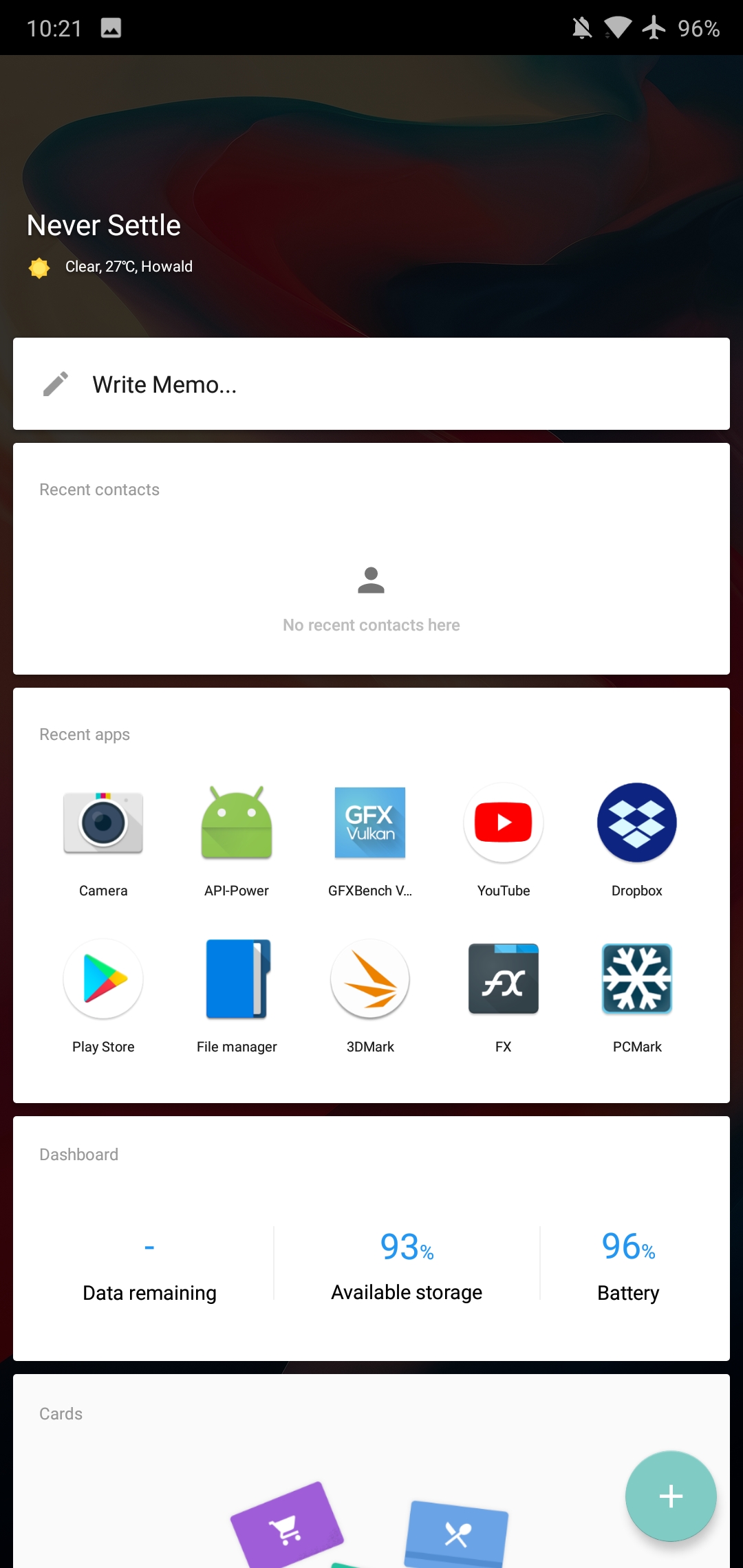
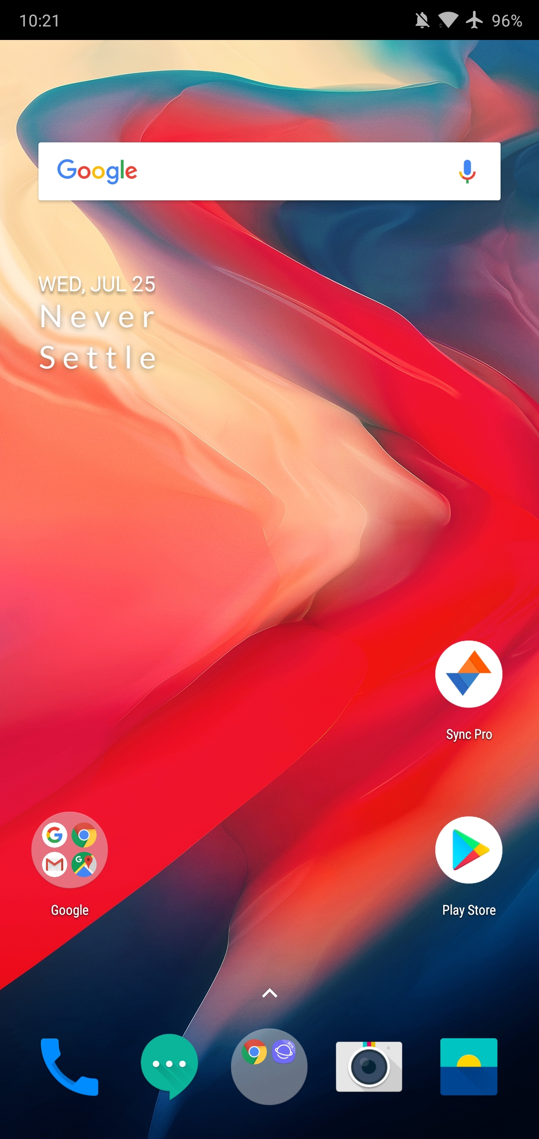
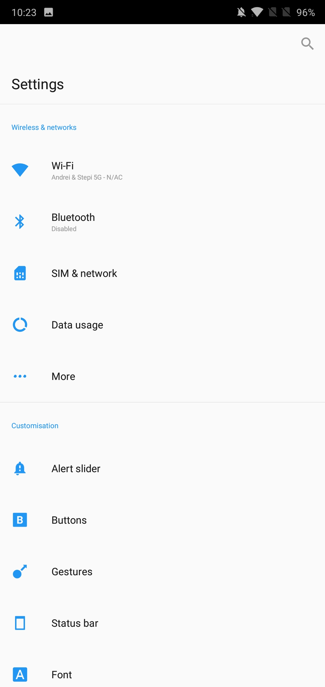
Design-wise, OxygenOS is as close to clean Android as it can be. Out of the box the phone comes with just the bare essentials with the only OnePlus “specific” application being the OP community app. The launcher includes both an app drawer as well as puts most recently installed applications on the second home-screen. The left screen from the homescreen acts as sort of a dashboard with various preconfigured widgets such as memo functionality, recent contacts, recent apps and other subjectively useful toolboxes. The important feature here is that you’re able to add in arbitrary widgets onto the scrollable list, which is an interesting way of organizing your widgets.
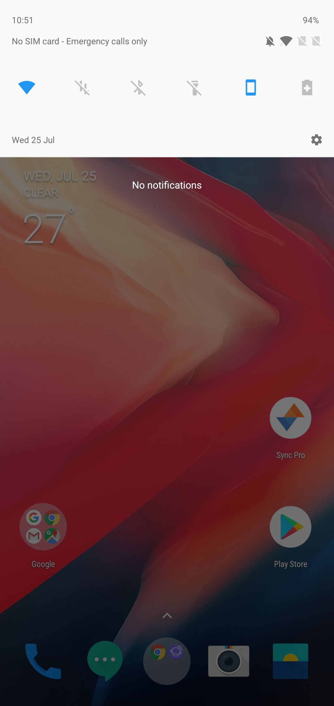
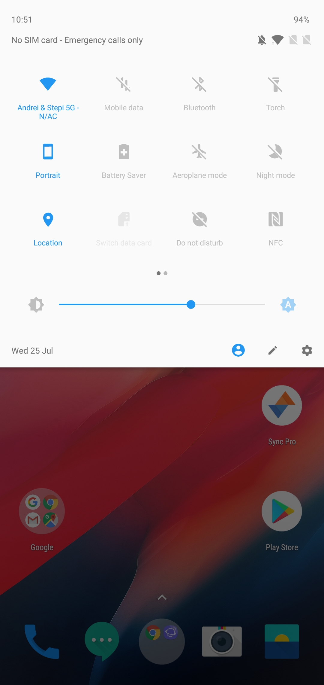
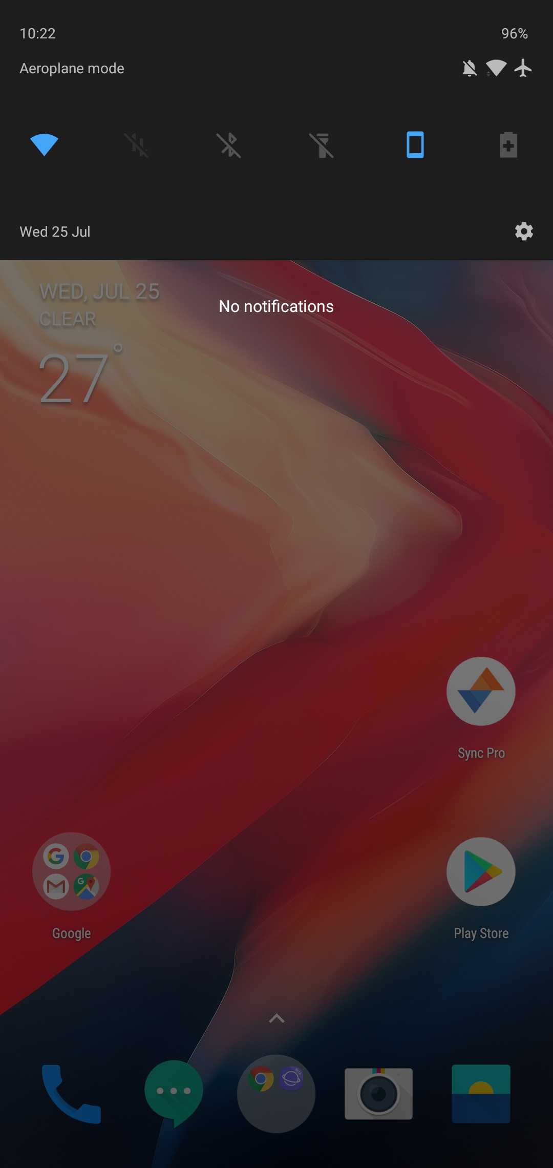
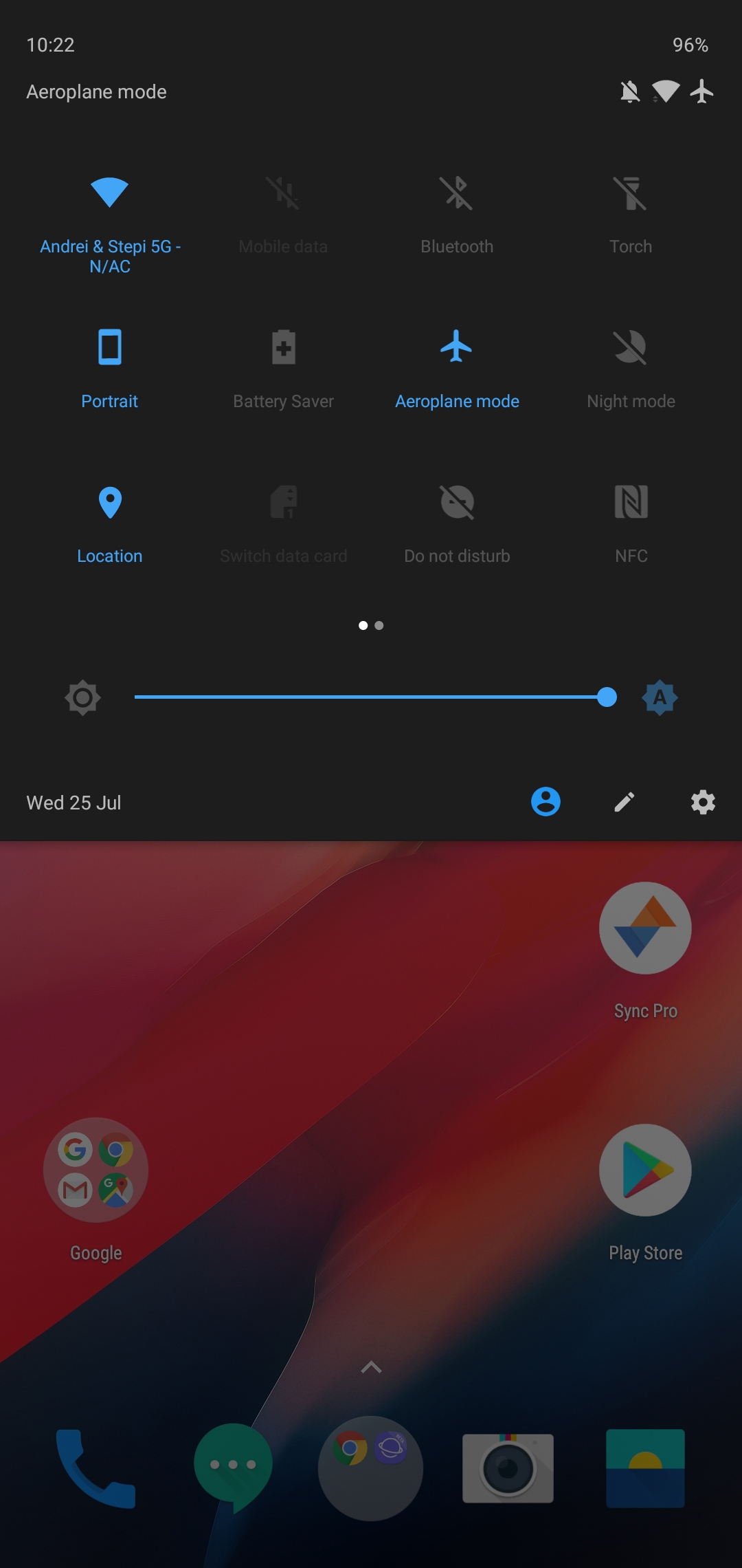
The notification tray is very clean and doesn’t veer far away from standard conventions.
A much appreciated default feature in the OS is the ability to switch the OS into a dark theme. This turns the then predominantly white UI into mostly black and dark coloured elements, not only throughout the SystemUI but also in the bundled system applications.
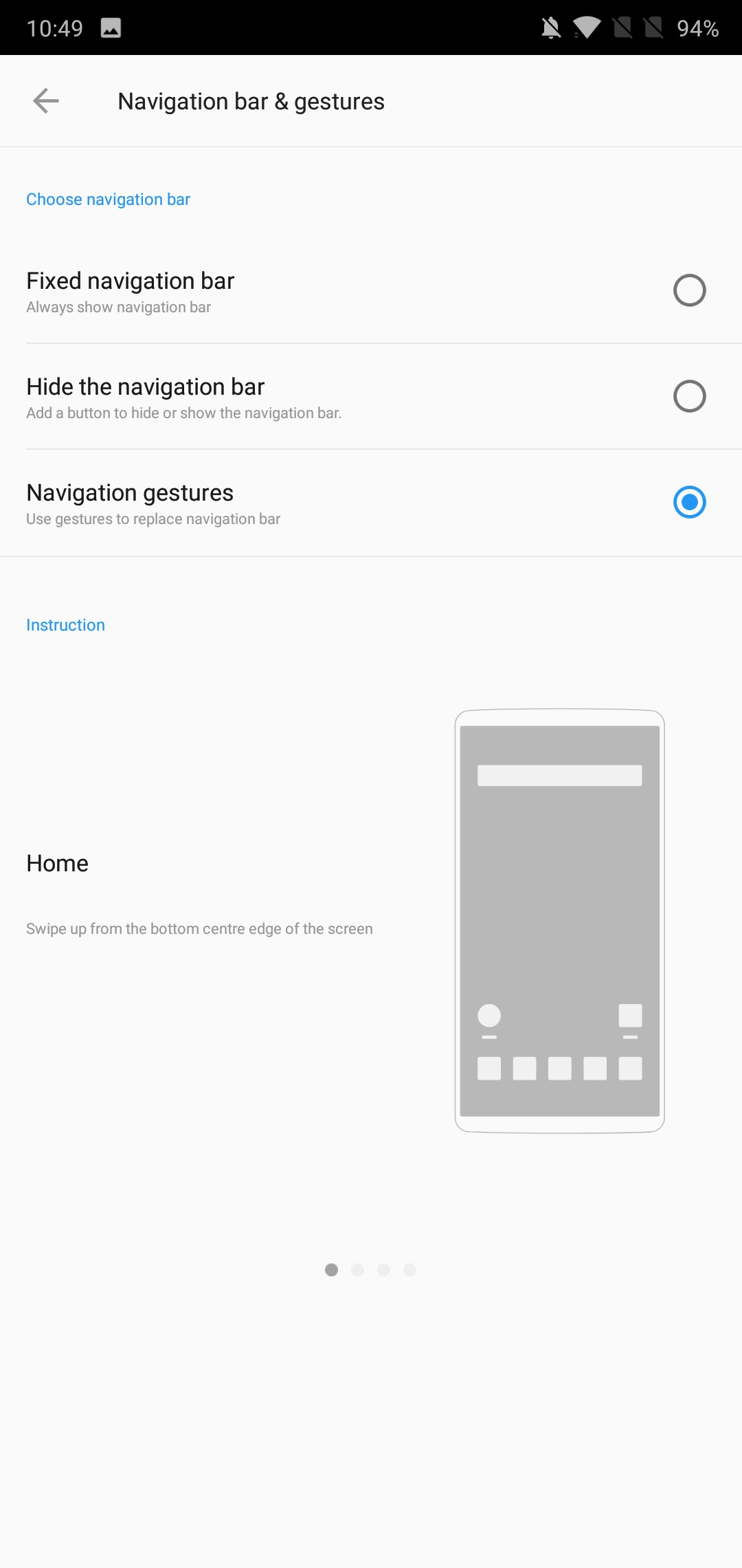
I’ve talked about how I really liked the gesture navigation on the Xiaomi MIX 2S and how it allowed for regaining more screen-estate by ditching the navigation bar. OnePlus’ implementation is similar in that swiping up from the bottom edge of the screen goes to the homescreen, but the back navigation functionality, instead of swiping up from the bottom lateral sides of the phone like on MIUI is implemented by swiping up from the sides of the bottom bezel which I find a lot more natural in terms of movement.
One aspect of OnePlus’ implementation that I did not like at all is the hold duration needed to bring up the multi-tasking screen. This is done by also swiping up from the bottom middle of the screen, but holding your finger instead of letting it go will open up the multi-tasking screen. The problem for me was that I found the hold duration required to be too long and kind of detracted from the fluidity of the navigation.
As an avid user of desktop browser gestures for a good 15 years, I’m extremely happy to see gesture navigation catching on in mobile – for many years we’ve had various innovative implementations from Chinese vendors but due to Google CTS limitations in the past we haven’t had the opportunity to see it wide-spread more often in western devices. Ironically it took Apple introducing them on the iPhone X to see Google finally have a change of heart. UI-less gesture navigations are in my opinion the single best solution to ergonomics. I think what Google did in Android P is a very poor and rushed attempt – hopefully vendors will have the liberty to implement their own variants.
For OnePlus what I’d like to see in the future is to have more customizability such as varying hold duration, and maybe more customizable gestures to just let the user decide how he’d like them to function. I’m really looking forward to how things will evolve over the next couple of years as I think in the transition towards immersive bezel-less displays the traditional navigation bar has outlived its purpose.

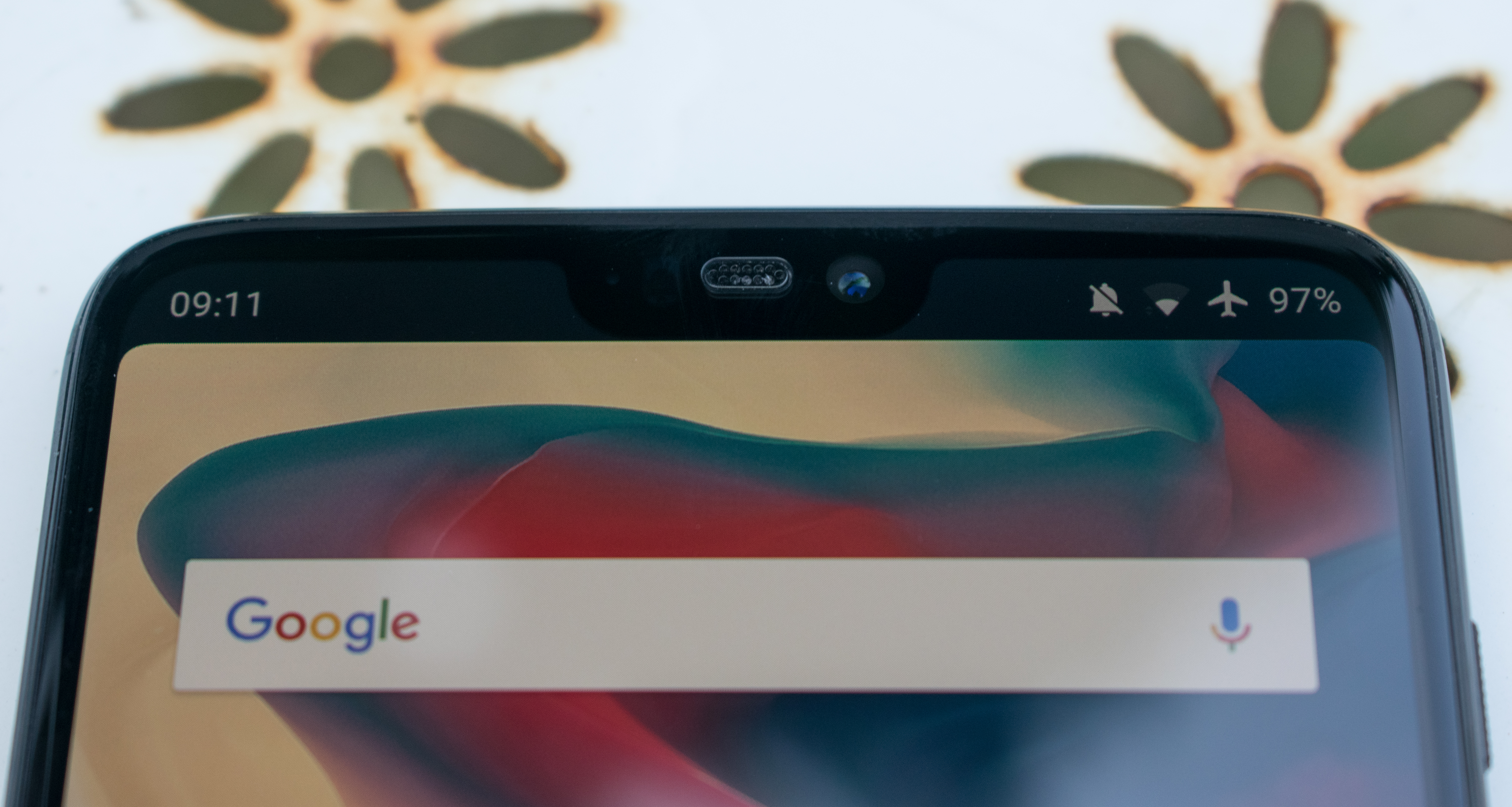
As mentioned in the intro, the notch attracts a lot of controversy. In reality there’s nothing controversial about it and it fulfils its purpose wonderfully: to extend screen real-estate. The OnePlus 6 in no way hinders any kind of experience and if you don’t like the visual cut-out, you can simply black it out.
Overall OxygenOS on the OnePlus 6 is very straightforward and there’s very little to criticise it on. Performance is also outstanding, and that’s what we’ll more closely analyse in the next section.


90 Comments
View All Comments
GREAT Expectations - Friday, July 27, 2018 - link
Just wanna know... Did you even read the article or did you skip right to the comments?I'm pretty sure the author has addressed your concerns already. And I've yet to see you providing a convincing counterargument. Reading the article isn't that hard is it?
Xex360 - Saturday, July 28, 2018 - link
I'm entitled to have a different opinion, and the the writer addressed the notch "problem" wasn't satisfying for me, I'm of the opinion that most phone manufacturers are just copying Apple nothing else, and copying the worst design choices from Apple and not the good/great ones.markiz - Monday, July 30, 2018 - link
Well, other than your subjective aesthetical opinion, reasonably, notch just makes sense. If status icons are moved there, that means you can get an extra line of text on the screen.Like, one extra email, or a message, or whatever.
I too also hate how it looks normally, but honestly, with OLED screen, it's barely noticeable, and I do appreciate extra space. I've come around :)
The fact that apple was first is could just be dependent on only 2 things:
- Samsung did not want to do it
- nobody else has scale and numbers to custom order OLED manufacturers to make special equipment to cut up their screens.
Teckk - Friday, July 27, 2018 - link
S9/S9+ might be better phones no doubt, but they're not "nearly the same price".markiz - Monday, July 30, 2018 - link
Where I live, in Europe, they certainly are. It's 20€ more for S9.PeachNCream - Friday, July 27, 2018 - link
I don't see how a notch could possibly make a phone useless. They aren't appealing to me, but it seems like the rejection of the notch is based more in a dislike of Apple than a concern about functionality in a lot of cases.mrochester - Friday, July 27, 2018 - link
The notch rejection comes purely from the hipsters.PeachNCream - Friday, July 27, 2018 - link
I'm not even sure exactly what traits make someone a hipster or not, but I think people that object to notches represent a fairly broad set of demographics.Flunk - Friday, July 27, 2018 - link
I don't think there are really that many people who care about notches. But if there are, all they need to do is refuse to buy phones that have them and suddenly alternatives will appear.ummduh - Friday, July 27, 2018 - link
"mrochester - Friday, July 27, 2018 - linkThe notch rejection comes purely from the hipsters."
I'm definitely as far from a hipster as you can get and I'm also definitely anti-notch. Unless being so anti hipster is the new hipster? Never mind, I don't want to know.
I'm also vehemently anti on-screen buttons and want my dedicated buttons back. I don't get this new screen form factor, it doesn't help anything and removes things I value.
I have a OP5 (not T). I like it. It's the last of the honest phones. I do miss IR blasters being in phones as well.
The Note4 was honestly the last great perfect phone. I went back and tried to use my old one and unfortunately it is just too slow. The new versions are over priced, and over Samsung'd. (That is to say, they're too locked down now.)