Apple's iPhone: The Future is Here
by Anand Lal Shimpi on July 2, 2007 6:13 PM EST- Posted in
- Smartphones
- Mobile
Using it as a Phone
Early on in what I'll call the camera-phone boom, someone clever came up with the complaint that there are no phones out there that just make phone calls well. They all have poor camera interfaces, are mediocre MP3 players and do a boatload of other things without having actually perfected making phone calls. As infuriating as it may sound, Apple's $500 iPhone actually fills the phone call niche quite well.
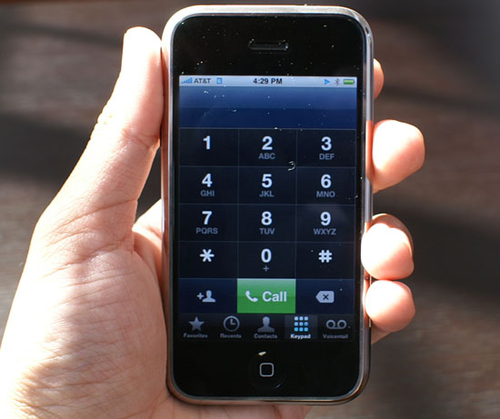
The only UI downside to using the iPhone as a phone is that you need to first click on the phone button at the bottom of the screen before you can access its ability to place phone calls. Obviously incoming calls can be received at any point, but if you actually want to dial out you have to hit that little green button first.
The iPhone is the perfect melding of your address book and a mobile phone. You have four options for dialing out on the iPhone, you can dial from a list of your favorite numbers, you can look at your call log, you can dial from your address book or do it the old fashioned way with the keypad.
If you're kickin' it old school, the keypad is absolutely enormous, something you don't find on the vast majority of mobile phones, and a true testament to Apple's idea of a morphing interface. In keypad mode, all you need on the screen is a gigantic keypad, having a virtual interface makes that possible.
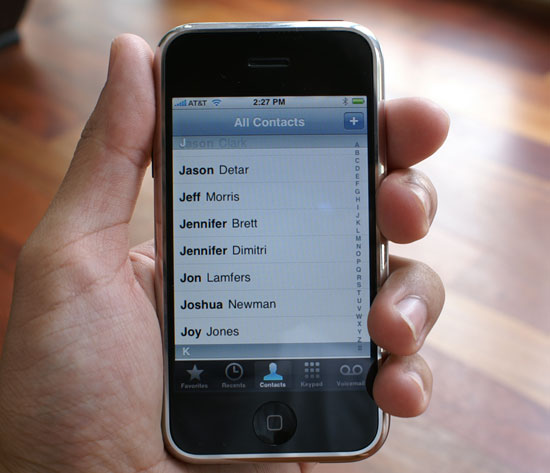
Dialing from your address book is just as simple as playing an MP3 on the iPhone, flick your finger up or down to find the contact, click on it and click on the number you'd like to call (e.g. work, home or mobile). Admittedly the contact list took some getting used to (I'm still not totally comfortable with it) being that the names on the screen are so large compared to what I'm used to on the Blackberry. In a way it seems like I'm lost trying to find the person I'm looking for since I'm so used to using a scroll wheel or trackball to navigate through a huge list of much smaller fonts.
The recents view is your call log; it logs incoming, outgoing and missed calls. Missed calls are colored red, and you can also view them separately by tapping missed at the top of the screen. The interface doesn't distinguish between incoming and outgoing calls until you click the little blue arrow to the right of the call.
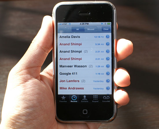
A call log done right
Multiple calls to/from the same person within close proximity in time are grouped together, with the number of calls placed in parentheses. Selecting additional details about any group of calls will tell you exactly when the calls took place. None of this data is unique to the iPhone, the Blackberry and Blackjack both offer it, but neither competitor presents it in such a clean and easily accessible way.
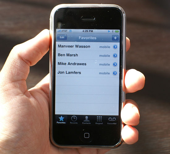
Your favorites are basically your speed dial numbers, for those contacts that you call/harass oh so frequently, it's just one touch to call from this list.
Steve Jobs' visual voicemail demo at Macworld was one of the things that really got me excited about the iPhone, it was voicemail done right. In practice, it works just like you'd expect it to.
When you get a voicemail your iPhone will vibrate and the phone icon at the home screen will get a little 1 next to it, indicating that you have one unchecked message of some sort (either a missed call, or in this case a voicemail).
The voicemail interface is super simple, you're presented with a list of people who have left you messages and you can listen to them in any order. No calling a weird number and dealing with an automated voicemail system; your voicemail is handled the way it is done on any VoIP platform, except this is on your cellphone.
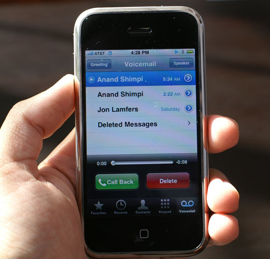
Let's see what Anand left us!
You can even record your voicemail greeting from this interface.
Features like forwarding voicemail simply aren't available from the iPhone and I have no idea how visual voicemail works (or doesn't) if you're roaming on other networks. The iPhone doesn't let you select what GSM/Edge network you're on, so I couldn't force it to join a non AT&T network to see the impact on visual voicemail.
The device isn't ergonomically suited to being held up to your head for prolonged periods of time, if you're going to be having long conversations you'll want to invest in a bluetooth headset. The weight of the device contributes to it being uncomfortable while held up to your ear.
The earpiece gets really warm if you use the WiFi a lot, and putting it up to your ear while on the phone will result in profuse ear-sweats. It's not as hot as the bottom of the MacBook Pro for example; it's warm enough to notice, not to burn.
The speakerphone works well and voice quality is respectable, at least compared to the Blackjack and Blackberry Curve.


85 Comments
View All Comments
michael2k - Sunday, July 8, 2007 - link
Except of course for the keyboard.If he unveiled the thing, it would have to be as a small laptop.
edwinder - Wednesday, July 4, 2007 - link
Anand, I never got through your iPhone review...because everything I read is basically Blackberry this, Blackberry that. Just so that you know, not all your readers like/own/used Blackberries, and have found other replacements that suit us more besides a Blackberry (i.e E61). Yes, I know you love your BB's, but hope you can rename your article to reflect the review that you wrote. Nothing wrong with it... but reading your article gave me no basis of which to refer to, hence stopped reading it after a few pages.aGoGo - Wednesday, July 4, 2007 - link
Exactly,I used BB 8700, 8100, 8300 and 8800.. all of them suck, i have to admit that the RIM makes the best "stupid-proof" devices, that can enable you connect to your work email through BES, other than that, every single feature sucks.
I'm using the Imate Jasjar (HTC Universal) and it can do every single thing the iPhone can do, without the cute looking UI, people wanna use things, not look at them, how many of you are still using Aero glass and DreamScene? Every single person disabled them after one week.
r33tr33t - Wednesday, July 4, 2007 - link
You can catch bits of Anand's gigantic house as well as his face reflected back in the metallic part of some of the iPhone photos.plinden - Tuesday, July 3, 2007 - link
Actually, http://www.apple.com/iphone/specs.html">here, Apple does claim "up to 6 hours" internet time, so what you're seeing is in line with Apple's claims.
Yes, I do like my Apple products (3 Macs and two iPods) but I've always taken the battery life claims with a large pinch of salt.
Anand Lal Shimpi - Tuesday, July 3, 2007 - link
I know exactly what you're saying; battery life on the MacBook Pro is no where near Apple's 6-hour claims; I'd be lucky to get 2.5 hours of real work on mine.Thanks for the correction, I too was shocked to see it actually lasted 6 hours on WiFi. I'm doing some more tests now looking closer at its battery life, so you may see a follow-up article in the near future.
Take care,
Anand
strikeback03 - Tuesday, July 3, 2007 - link
Looks nice, but too big for me. If they can build one around something more like a 2.25" screen that would be sweet.Also on the next to last page there is a picture missing of the screen you get to unlock the phone.
Anand Lal Shimpi - Tuesday, July 3, 2007 - link
Agreed. An iPhone mini could be very interesting but I'm not sure how the keyboard would work out. And I've added the missing image, thanks for the heads up :)Take care,
Anand
Drumsticks - Wednesday, January 7, 2015 - link
I had to go through this review for a paper I was writing for school, and I came across this comment. In 2015... how times have changed :)aGoGo - Tuesday, July 3, 2007 - link
Blackberry Curve and Blackjack?there are better phones to use, how about the HTC Universal? Nokia N95? SE P990i? HTC Athena?
I really don't know how much this damn thing is gonna cost if it's unlocked? $1000?