Apple's iPhone: The Future is Here
by Anand Lal Shimpi on July 2, 2007 6:13 PM EST- Posted in
- Smartphones
- Mobile
Oh Hashmir, Multi-Touch Me Down There
We've already established that finger prints and smudges on the screen are a non issue when the device is on, now the question is: how well does the interface work?
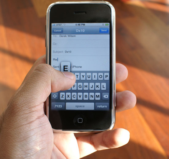
Apple's idea behind the iPhone's multi-touch interface is that mobile phones can't work with a fixed input device. Mobile phones have to be incredibly compact, yet these days they have to run a variety of applications: everything from writing emails to planning routes in Google Maps to organizing your photos. To make things worse, the ideal interface for inputting an address is wildly different from the ideal interface for viewing pictures.
A fixed keyboard is great for writing emails (e.g. Blackberry), but you need the equivalent of a mouse for scrolling around webpages on a small screen. The stylus is a nice attempt at a mobile mouse but it's redundant, your fingers are just as capable of pointing as a plastic pen.
The multi-touch screen on the iPhone fundamentally works like most other touch screens, with the exception that it allows multiple simultaneous inputs on the screen. Much like Apple's approach in OS X, the iPhone's multi-touch interface works the way you'd expect it to.

If you want to hit a button, simply tap on it. If you want to zoom in on a picture or web page, double tap on it (double tap once more to zoom out). To scroll around tap and hold your finger in one place then drag it around.
Scrolling through long lists is done by flicking your finger up or down; place your finger on the screen then drag it up to scroll down and vice versa. The motion takes seconds to master and it's quite intuitive.
Flipping through multiple "tabs" in Safari or pictures in the iPhone's photo albums is just as easy as scrolling. Instead of flicking your finger from top to bottom, simply move it from left to right as if you were flipping through pages of a book.
By far my favorite gesture is used when quickly deleting items in a list. If you want to delete an email for example, just strike through the email with your finger from left to right, a delete icon appears and selecting it will delete the email. It's the smoothest way I've ever deleted anything.
The more advanced features involve two fingers, I found myself using my index finger and thumb but technically you could use any two of your digits. Aside from the double tap (which may not work depending on the situation), you can zoom in on an image by taking your index finger and thumb and making a stretching motion with them on the screen. Hold your thumb and index finger together, place them on the screen, then pull them apart while maintaining contact with the screen. You'll zoom in on the area you just stretched. To achieve the opposite effect, just reverse the motion by pinching your fingers together.
You do have to be firm with your touches, and you can't use your fingernails (or gloves). At the same time, the multi-touch screen works best if your hands are clean and dry; if you've got oily skin, plan on washing your hands a lot to get the best experience with the iPhone. If your hands aren't clean/dry you'll find that the gestures don't always react exactly how you'd like them to, the device is still usable but there's a measurable difference between using it with clean/dry hands vs. oily hands.
When the iPhone's CPU isn't busy downloading mail or rendering a web page, the pinch/stretch works flawlessly, as do all of the gestures mentioned above. The only time you'll encounter choppy response is if a "heavy" task is still being executed in the background.
The iPhone is usable in one of two orientations: portrait or landscape. There's an integrated silicon mass sensor that detects, based on the gravitational pull on the device, whether it is being held in portrait or landscape mode.
Switching between portrait and landscape mode is, for the most part, as seamless as it is in the TV commercials. Not all applications support landscape mode (e.g. iPhone Mail only works in portrait mode) while the playing videos in the YouTube app works exclusively in landscape. In order for the iPhone's internal sensor to best gauge its orientation, you'll want to hold the device as close to perpendicular to the ground as possible when rotating.
I have seen some quirks where the iPhone's scheduler is unable to immediately interrupt a task as I rotate the phone, causing a multi-second pause between when I rotate the phone and when the screen switches orientation.
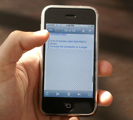
Mobile phone interfaces are often unreasonably sluggish, and it's clear that Apple set out to fix that with the iPhone. The OS will do whatever it takes to preserve the responsiveness of the UI; for example, if you have a long email that you scroll through quickly, the iPhone may not have all of the email present in its frame buffer given the limited amount of memory on the device (possibly 128MB). If you scroll too far down in the email too quickly, you'll be greeted with a checkerboard pattern while the email gets moved into the display buffer. However, while this is happening, the UI never behaves any differently - it's still as responsive as when scrolling through data that's present in the display buffer.

Scroll too far ahead and you'll get this before the display buffer gets the data it needs; the iPhone is fast, but you're still faster.
I suspect that future versions of the iPhone with more memory and a faster processor won't have this issue, but Apple made do with what was available at the time.
For navigating through the basic iPhone interface, selecting applications, toggling settings, scrolling, zooming, etc..., the multi-touch screen works flawlessly. Being able to re-orient the display from portrait to landscape mode on the fly with virtually no interruption in the user experience is beyond impressive. It truly feels like something out of a sci-fi movie and it's one of the most understated but impressive features of the iPhone. The interface just works.


85 Comments
View All Comments
EODetroit - Tuesday, July 3, 2007 - link
Holy Comprehensive Review Batman! That took most of my morning at work, good thing its practically a holiday here already.Now my question is:
How many poop pictures has Anand received from the A-Tech staff?
Haha
Shimmishim - Tuesday, July 3, 2007 - link
Yes. It was a good read. One of the best reviews of any piece of hardware (computer or consumer related) I've read in a long time.Anand Lal Shimpi - Tuesday, July 3, 2007 - link
Thanks guys :)And no, zero poop-pictures from AT staff.
Take care,
Anand
LoneWolf15 - Tuesday, July 3, 2007 - link
While not perfect as a product either, Anandtech completely skipped any Palm Treo devices for this comparison. The Treo has done SMS by contact for some time now, just as you have mentioned the iPhone does (I've had it on both the 650p and 750p; I'm sure the new 755p does as well). While I have some issues with Palm support as far as their product goes, I still haven't seen a smartphone that can do better --I blame this at least in part due to carrier wars and desire for control (i.e., crippled Bluetooth, not adding WiFi, so carriers can make you pay for everything through them), rather than blaming cell phone manufacturers.Anand Lal Shimpi - Tuesday, July 3, 2007 - link
There were a number of products I would've liked to have included, but I was very limited by time so I tried to shoot for two of the most popular: the Curve and the Blackjack. I've already dropped Nokia an email but I'll do the same for Palm and see what comes of it :)Take care,
Anand
retrospooty - Tuesday, July 3, 2007 - link
Ya, quite alot of things like that the Treo has done, and done well for a long time now, all that and an open platform. The issue is the latest Treo is, 4 years later, still the same repackaged Treo, with a few minor upgrades. The iPhone is by far the best UI, and that alone will be its saving grace, and its legacy on the industry. A few years from now, REAL smartphone manufacturers will copy the UI and improve everything, and do it cheaply, and on all carriers. That is the best thing about the iPhone.LoneWolf15 - Tuesday, July 3, 2007 - link
Actually, in 4 years, the Treo added Bluetooth (the first 600p didn't have it), EVDO (the iPhone has only EDGE, which has been rated far slower, and slowest when provided by AT&T/Cingular, the single carrier of the iPhone), an SD card slot (600p didn't have one), and several other features.As I said, the Treo isn't perfect. And I think the UI of the iPhone is pretty spiffy, plus I'll bet it has the best web browser of any phone on the market. But I don't think I could do without a real (by real I mean tactile) QWERTY keyboard (I rely on text messages for work, since cell reception can be spotty in a reinforced concrete building), I like having EVDO support, and I like the fact that I can choose from Sprint, T-Mobile, Alltel, Verizon, or AT&T Cingular for a Treo (AT&T/Cingular has little or no reception in my work area, so it nixes any thought of an iPhone, and by my understanding, they have a five-year exclusive agreement with Apple). And I can get a Treo for a few hundred less as well.
I want to like the iPhone. Unfortunately, Apple set conditions of pricing and carrier that mean I'll never find out how good a phone it might really be.
sviola - Tuesday, July 3, 2007 - link
Not only the Palm Treo, but the Nokia N95, which is just awesome:In-built GPS and Navigation Program (over 100+ countries maps)
5 MP Camera with Zeiss Lens and Optical Zoom, and Video Recording
Symbian OS
Plays MP3, video, etc
Bluetooth, Wi-Fi, USB, TV out
Quadriband GSM/WCDMA (3G)
MicroSD Card Reader
Among many other features.
rowcroft - Tuesday, July 3, 2007 - link
The iPhone looks great, but the big gotcha for me is that I routinely use my 8525 to access the internet on my laptop. Can't do that with the iPhone from what I understand.As for all the comparisons to Verizon & such, if you look at the total cost of ownership (Verizon's data plan is significantly more expensive), the iPhone is just a few dollars cheaper than the Blackjack w/Verizon.
Locutus465 - Tuesday, July 3, 2007 - link
I've got a Samsung i720 with verizon... For a "last gen" PDA phone priced at just $100 brand new from verizon when I got it, it's pretty sweet. Admitingly the display isn't quite as good as apples, but as far as functionality it does everything the iPhone does and more. I also appriciate the sliding screen with which reveals a keyboard. There's also the other advanatages I mentioned earlier, i.e. Windows Mobile being open to 3rd party development etc.