Apple's iPhone: The Future is Here
by Anand Lal Shimpi on July 2, 2007 6:13 PM EST- Posted in
- Smartphones
- Mobile
As predictable as what happened next may be, its truth is undeniable: I actually got better with the iPhone's keyboard. I wasn't as fast as I was on my Blackberry or even the Blackjack, but I was getting there and typing on the phone no longer made me want to kill myself with a SIM card.
There are really two tricks to getting reasonably fast with the keyboard, and Apple is very forthcoming with both:
1) Start with your index finger alone (give your thumbs the week off), and
2) Trust the auto correction
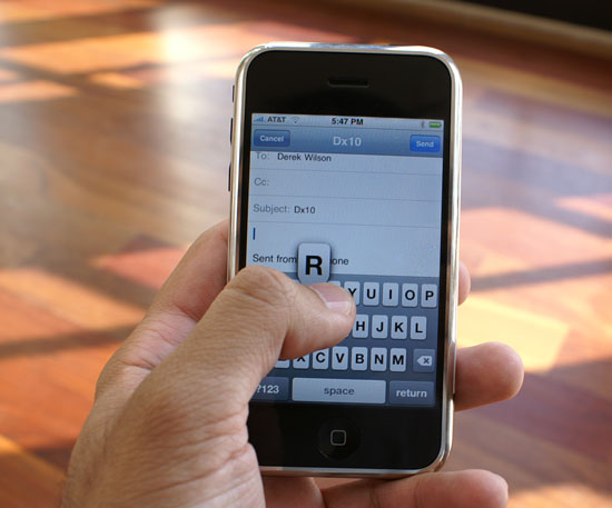
Using the index finger is important for one main reason: it's smaller than your thumb. Just as the cramped keyboard is an issue on the Blackjack and Curve, it's an issue on the iPhone. Since there are no distinct divisions between keys, it's very easy to cross boundaries and select a letter you didn't intend to. Whenever you tap a key, the key itself will get bigger to show you what you've just selected, hopefully exposing itself from beneath your finger. If you happen to select the wrong key, your initial instinct will be to delete and try again but that's not necessarily the best reaction with the iPhone as you'll soon see.

The iPhone will make you feel like you've got the fattest thumbs ever
With my index finger, I'm accurate and fast in typing on the iPhone. On my best days you'd swear a room full of monkeys were churning out a copy of Macbeth, that being said, I'm in desperate need of mastering two thumbed typing. Not only does typing long emails with a single index finger grow tiring, two thumbs are necessary to even remain competitive with typing speeds on regular qwerty keyboard devices.
I'm guessing the trick to mastering thumb typing is deliberate placement of your thumbs over the keys you wish to strike. Although your thumb is bigger than your index finger, the part of your thumb that actually triggers the keystroke isn't that much larger. The main issues seem to be that the thumb's contact patch is located in a different area, and the thumb covers up more of the keyboard, making it more difficult to 1) orient and 2) trust yourself, when typing. As you can probably guess, I'm still struggling with thumbs, but it looks like there's still room to grow in typing efficiency on the iPhone.
The iPhone does its best to replace tactile feedback with aural response; you get a rewarding typewriter keystroke sound every time you hit a key on the keyboard (you can disable this if you hate it). The sound is rewarding in the sense that once you actually get fast at typing, it sounds like your pounding out your fifth novel on your iPhone, and if you thrive on feelings of accomplishment like yours truly, it'll help you get better. It's like a personal trainer cheering you on as you work out, the sounds keep coming as long as you keep hitting keys, they don't care if you hit the wrong ones or not, and that's where the second trick comes in.
The early previews and reviews of the iPhone praised its autocorrecting capabilities, which I truly didn't understand because predictive text input has been around for ages. From a distance, that's all the iPhone appeared to have, a slightly cleaner interface to T9. On the second day of using the iPhone, I finally understood what all the fuss was about.

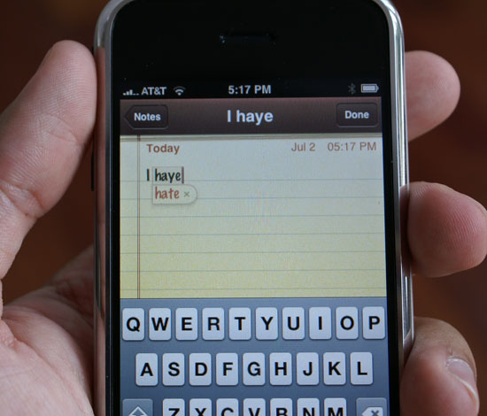
When you're entering text, the iPhone compares what you're typing to its built in dictionary and suggest words that it thinks you are trying to type. For example, if you are typing the word incredible the iPhone will figure it out once you've typed incredibl and suggest the full word. Hitting space at this point will accept the dictionary's suggestion, saving you a keystroke.

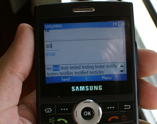
T9 in action
The first difference between the iPhone and some T9 based systems (e.g. the Blackjack) is that the iPhone provides a single suggestion while you're typing. If you enable T9 on the Blackjack, you lose some of your screen to a two-line suggestion of possible words you could be trying to type, which changes dynamically as you type away. The end result is a distracting element on the screen that adds marginal functionality on a device with a full qwerty keyboard vs. the iPhone method that remains nonintrusive.

If you don't like the iPhone's suggestion, simply tap the suggested word and it'll disappear. Note that just like T9 based systems, the iPhone's dictionary will grow based on your typing habits; proper nouns and other words will eventually start appearing as suggestions as you type them more frequently.
Both the T9 and iPhone approaches take some getting used to if you are a qwerty Blackberry user who isn't used to such aids, but the iPhone system has a gentler learning curve thanks to its simplicity.
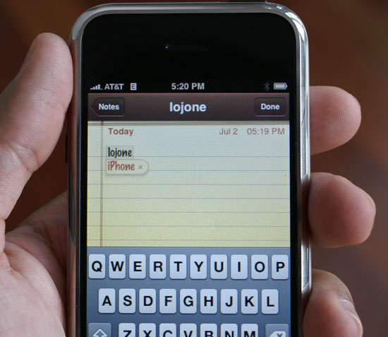
In addition to looking at the word you're typing, iPhone also looks at the keys you're hitting and the proximity of those keys to other keys that you may have actually wanted to hit instead. For example, the word iPhone comes preloaded into the dictionary, the device doesn't have to learn it. But if, while typing furiously with your index finger, you lose your bearings and type iogonr instead (the o key is right next to the p key, the g key is right next to h, and and r is right next to e), the iPhone will mathematically determine that although iogonr could be a word, it's also possible that you just fouled up your finger placement and meant to type iPhone. The software will suggest iPhone as a correction and all you have to do is hit space to accept it.
When Apple recommends that you trust the intelligence of the device, it's this analysis of finger placement that you need to trust. When typing, you know what keys you meant to hit, Apple's iPhone tries its best to figure that out as well (it doesn't like to be yelled at, so it tries really hard).


85 Comments
View All Comments
EODetroit - Tuesday, July 3, 2007 - link
Holy Comprehensive Review Batman! That took most of my morning at work, good thing its practically a holiday here already.Now my question is:
How many poop pictures has Anand received from the A-Tech staff?
Haha
Shimmishim - Tuesday, July 3, 2007 - link
Yes. It was a good read. One of the best reviews of any piece of hardware (computer or consumer related) I've read in a long time.Anand Lal Shimpi - Tuesday, July 3, 2007 - link
Thanks guys :)And no, zero poop-pictures from AT staff.
Take care,
Anand
LoneWolf15 - Tuesday, July 3, 2007 - link
While not perfect as a product either, Anandtech completely skipped any Palm Treo devices for this comparison. The Treo has done SMS by contact for some time now, just as you have mentioned the iPhone does (I've had it on both the 650p and 750p; I'm sure the new 755p does as well). While I have some issues with Palm support as far as their product goes, I still haven't seen a smartphone that can do better --I blame this at least in part due to carrier wars and desire for control (i.e., crippled Bluetooth, not adding WiFi, so carriers can make you pay for everything through them), rather than blaming cell phone manufacturers.Anand Lal Shimpi - Tuesday, July 3, 2007 - link
There were a number of products I would've liked to have included, but I was very limited by time so I tried to shoot for two of the most popular: the Curve and the Blackjack. I've already dropped Nokia an email but I'll do the same for Palm and see what comes of it :)Take care,
Anand
retrospooty - Tuesday, July 3, 2007 - link
Ya, quite alot of things like that the Treo has done, and done well for a long time now, all that and an open platform. The issue is the latest Treo is, 4 years later, still the same repackaged Treo, with a few minor upgrades. The iPhone is by far the best UI, and that alone will be its saving grace, and its legacy on the industry. A few years from now, REAL smartphone manufacturers will copy the UI and improve everything, and do it cheaply, and on all carriers. That is the best thing about the iPhone.LoneWolf15 - Tuesday, July 3, 2007 - link
Actually, in 4 years, the Treo added Bluetooth (the first 600p didn't have it), EVDO (the iPhone has only EDGE, which has been rated far slower, and slowest when provided by AT&T/Cingular, the single carrier of the iPhone), an SD card slot (600p didn't have one), and several other features.As I said, the Treo isn't perfect. And I think the UI of the iPhone is pretty spiffy, plus I'll bet it has the best web browser of any phone on the market. But I don't think I could do without a real (by real I mean tactile) QWERTY keyboard (I rely on text messages for work, since cell reception can be spotty in a reinforced concrete building), I like having EVDO support, and I like the fact that I can choose from Sprint, T-Mobile, Alltel, Verizon, or AT&T Cingular for a Treo (AT&T/Cingular has little or no reception in my work area, so it nixes any thought of an iPhone, and by my understanding, they have a five-year exclusive agreement with Apple). And I can get a Treo for a few hundred less as well.
I want to like the iPhone. Unfortunately, Apple set conditions of pricing and carrier that mean I'll never find out how good a phone it might really be.
sviola - Tuesday, July 3, 2007 - link
Not only the Palm Treo, but the Nokia N95, which is just awesome:In-built GPS and Navigation Program (over 100+ countries maps)
5 MP Camera with Zeiss Lens and Optical Zoom, and Video Recording
Symbian OS
Plays MP3, video, etc
Bluetooth, Wi-Fi, USB, TV out
Quadriband GSM/WCDMA (3G)
MicroSD Card Reader
Among many other features.
rowcroft - Tuesday, July 3, 2007 - link
The iPhone looks great, but the big gotcha for me is that I routinely use my 8525 to access the internet on my laptop. Can't do that with the iPhone from what I understand.As for all the comparisons to Verizon & such, if you look at the total cost of ownership (Verizon's data plan is significantly more expensive), the iPhone is just a few dollars cheaper than the Blackjack w/Verizon.
Locutus465 - Tuesday, July 3, 2007 - link
I've got a Samsung i720 with verizon... For a "last gen" PDA phone priced at just $100 brand new from verizon when I got it, it's pretty sweet. Admitingly the display isn't quite as good as apples, but as far as functionality it does everything the iPhone does and more. I also appriciate the sliding screen with which reveals a keyboard. There's also the other advanatages I mentioned earlier, i.e. Windows Mobile being open to 3rd party development etc.