Apple's iPhone: The Future is Here
by Anand Lal Shimpi on July 2, 2007 6:13 PM EST- Posted in
- Smartphones
- Mobile
Safari
The iPhone has four major functions, all of which are lined up along the bottom of the home screen. You've heard the keynote by now, it's a phone, it's an email client, it's an iPod and its a web browser. The iPhone ships with a port of Safari 3, and does actually make web surfing bearable on a mobile phone.
The problem with web surfing on most mobile phones is that the screens are so small that there's no reasonable way to display an entire web page. The manufacturers make a tradeoff and attempt to display the page at full resolution, forcing you to scroll around to find what you want. Site owners, in turn, create mobile-friendly versions of their websites that are basically long pages of text so you can at least read the content on a crippled browser.
By doing away with any sort of fixed input device, Apple freed up a lot of real estate on the iPhone for a huge screen. So why not try to display an entire website, just scaled down on this gorgeous screen? That's exactly what the iPhone does.
You get a zoomed out version of the same website you'd see on your computer, and using the same double tap/stretch/pinch gestures you can zoom in and navigate around the website. Double tapping can sometimes get annoying in Safari, if you accidentally double tap on a link, which is where the stretch gesture is useful. When you zoom in on a page the actual zooming process is quick, but there's about a one second delay before the website is usable again as the page is re-rendered in the new resolution. During this delay, nothing works, gestures, scrolling, clicking, etc... It's frustrating because the rest of the UI is so fast and responsive that whenever it stops it's even more pronounced.
Page rendering is also an issue; while a web page is loading you basically can't do anything else on the screen. For example, trying to scroll while a page is loading will either result in you not being able to scroll, or a choppy half scroll that stops abruptly. You're far better off waiting for the page to load before trying to proceed. Even trying to hit the X button to stop loading a page can take some time to process.
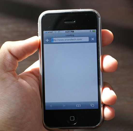
Expect to see this screen a lot
The problem is that even over WiFi (and especially over Edge), web pages can take a long time to fully render, and when the rest of the OS runs so smoothly it's frustrating to be in any situation where it doesn't. Just because you're on WiFi you shouldn't expect to get notebook-speed performance when loading web pages. My guess is that we're fairly CPU bound here, possibly compounded by a lack of system memory.
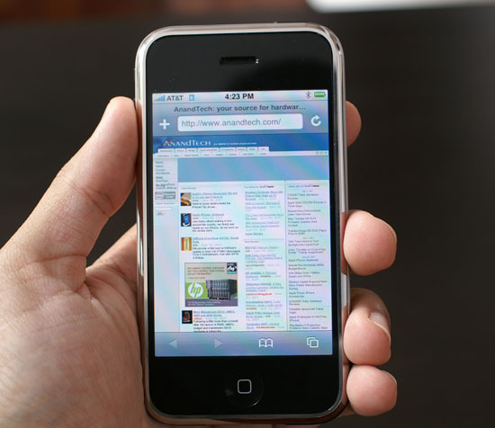
The vast majority of sites I visited had no problems with mini Safari 3 on the iPhone, although occasionally I'd run into a site that had issues with a background repeating itself too many times. There is no Flash or Java support, so expect to see many missing elements on websites (but on the bright side, it's like free ad-block right?).
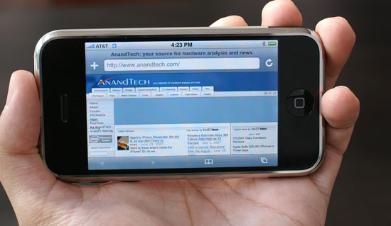
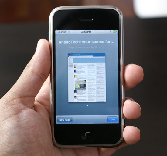
AnandTech in my palm
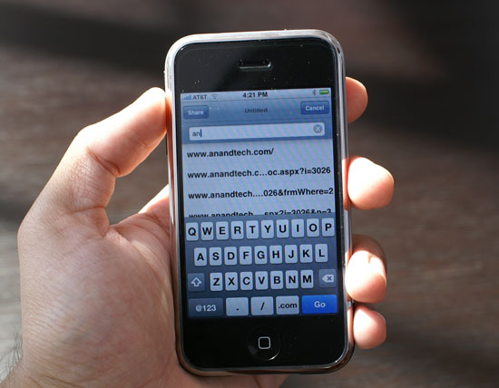
Entering in URLs is very easy, you get a slightly different virtual keyboard in Safari than you do in other apps on the iPhone. There's no spacebar, but you have dedicated / and .com keys. There's no www. key but for most URLs you can just leave that part off and you'll be ok. Typing .net, .org or any other non-com TLDs can be frustrating since you don't have a one touch way of getting to those, but luckily Safari keeps a great history of previously visited URLs. Just typing "ana" in the address bar brings up AnandTech and a couple articles I visited while testing the iPhone.
One annoyance is that there's no quick way to bring up the address bar while on a web page; you have to scroll up to the top of the page to find the address bar, which can be a problem once again if the page isn't done rendering, making scrolling a little tough. Update: Thanks to a number of AnandTech readers, I now know a work-around for my Safari quirk. If you're at the bottom of a page in Safari, where the address bar isn't visible, simply tapping the top of the screen (where the time is) will take you to the top revealing, you guessed it, the address bar. Thanks to all who commented/wrote in, you've made my iPhone experience a little better :)
Multi-window browsing is supported on the iPhone, simply tap the icon in the lower right hand corner and select New Window to open a new browser window. You can also flip through open browser windows in this view, but once you open a couple windows the contents of the inactive ones are dumped from memory and simply reloaded when you switch back. Apple clearly made the iPhone as conservative as possible with its memory management.
Given that there is no copy/paste support, the only way to share something interesting with your friends/family/co-workers is to email them the URL. If you click on the address bar there's an option to "Share" the URL, which opens up an email window with the active URL pasted into the message body.
Safari on the iPhone is good, easily the best mobile browsing experience on any device this size and light years better than its closest competitors, but it needs work. I suspect that many of the problems will simply take software optimization and faster hardware to correct, but they are solvable and this is a step in the right direction.


85 Comments
View All Comments
jay401 - Tuesday, July 3, 2007 - link
Now that's practically an unpardonable sin, given that it's such a basic request and something absent from most phones because most providers think people are dumb enough to pay money to download a ringtone (like hell would I ever do that nonsense).
So why not just let people use their mp3s? I already do that on my cellphone but since I can't do it directly I do it in a round-about way by sending myself the mp3 clips as attachments to messages sent to my phone, which I can then download and assign as a ringtone.
Why not just make it straightforward and easy? You'd think this is one thing Apple could do right. :(
jay401 - Tuesday, July 3, 2007 - link
from page 11:If I could read any of the incredibly tiny text in that picture, maybe I would be able to. ;P
Anand Lal Shimpi - Tuesday, July 3, 2007 - link
Seriously, the PDF looked shockingly good. Once you stretch to zoom in so you can actually read the slides, it's amazing. Yes, I realized being excited about how good a PDF looks on a phone is silly, but I figure after waiting in line for five hours for said phone, I've got nothing more to lose :)Take care,
Anand
Griswold - Tuesday, July 3, 2007 - link
You can't make videos on the phone, you can't copy/paste, there's no IM client, you can't replace the battery on your own, you can't add applications to it, there's no Flash/Java support, it's heavy and the list goes on. But here's the catch: there isn't a phone out today (smart or not) that doesn't have at least as long of a list of issues.But for a price tag like this, I expect a shorter list. And unfortunately, many of the things on this list are important to me.
Still, after being so skeptic about the iphone, I'd still like to have one (yea, it does have this star trek datapad feeling!!) but due to the flaws and shortcomings, i'll just wait for the next incarnation that will most likely hit the street within a year.
I dont believe in early adopting gear from a company with zero experience on this particular field, and while apple did most of their homework, my motto (rightfully) stands.
The next iphone will most likely be much better suited for me.
mongo lloyd - Tuesday, July 3, 2007 - link
Comic Sans? Really?plinden - Tuesday, July 3, 2007 - link
No - http://www.searchfreefonts.com/fonts/m9.htm">Marker Felt Thinmongo lloyd - Wednesday, July 4, 2007 - link
Oh ok. Equally terrible font, I'd say. Is that a standard-use font for Apple? Yikes to that.Sunrise089 - Tuesday, July 3, 2007 - link
Lots of personality, info that wasn't just a run down of specs, and best of all telepathy.I was actually thinking while I read this "I wonder if I'd be able to watch TopGear clips on this, since often they get pulled from Youtube. I scroll down the page, and see Clarkson staring back at me. Amazing.
One more thing, about the homeless guy's choice between the Enzo and the Veyron - between ugly and boring, I don't know which I'd pick either. After all these years, McLaren F1 FTW!
Yongsta - Tuesday, July 3, 2007 - link
Nice Review, the iphone sounds great but $600 is out of my budget. Hopefully Apple in the future releases new types of iphone's at affordable prices. Maybe Samsung/Nokia/Motorola will try to make a copycat phone but they probably cant match Apple's UI.Locutus465 - Tuesday, July 3, 2007 - link
I do love the looks of the iPhone... However if everything I hear about it is true then it would not interest me. Complete lack of 3rd party software support? If this is true then yikes! I've got my Windows Mobile phone running with quite a bit of 3rd party software and for me that's a huge must... Like my Trillian like all in one chat client, Pocket Putty, CISCO VPN client and of course, pocket mahjoong (spelling?).Also, I've heard for a closed system they missed the boat on what would be some truely killer features (which could be solved via allowing 3rd party software). For instance it has (google?) maps, yet from what I hear no GPS integration? Why not? At least in windows mobile you have options (though yes, it's not built into that platform either).
It would however, be nice to see more cell companies consentrate on end user experience... It's appriciated that is for sure.