Apple's iPhone: The Future is Here
by Anand Lal Shimpi on July 2, 2007 6:13 PM EST- Posted in
- Smartphones
- Mobile
Simplicity Perfected
The iPhone has four physical buttons on it, and honestly you don't need any more. On the front of the phone is the home button, which takes you to the home screen regardless of what you're doing. The home button isn't an iPhone exclusive, many phones have it, including Samsung's Blackjack. The button is key for switching between tasks; say you're writing an email but decide you want to check a fact on wikipedia or you just remembered something that you want to SMS to a friend, hit the home button and fire up Safari or the SMS client, do what you need to do and then switch back to your email to pick up where you left off.
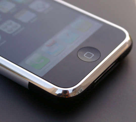
Take me home tonight
Hitting the home button doesn't close any applications, it merely switches back to your iPhone desktop. The home button is your iPhone's Alt (or Cmd) Tab, it's your ticket to quickly switching between applications; one press of it and a touch later and you're in another application. The functionality is perfected by the fact that the iPhone's user interface is incredibly responsive, switching between applications works like a computer, not a mobile phone.
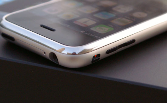
The ringer toggle switch is set to silent, hence the visible red dot
Along the left hand side of the iPhone are two switches: a volume rocker and a ringer toggle switch. The volume rocker works as you'd expect it to, during a call or audio playback it will adjust the volume of the earpiece or speaker, otherwise it will adjust ringer volume. Mac users should find the on screen display comfortingly familiar:
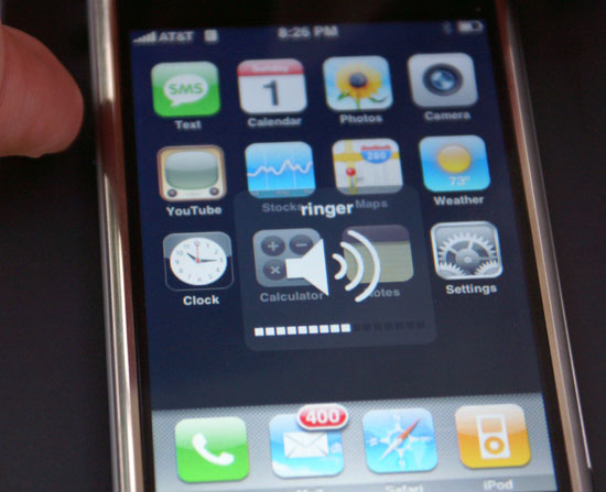
Home sweet home...for OS X users
The ringer toggle switches between normal and silent ringer modes; these are the only two profiles you can configure on the iPhone and even then, they aren't very configurable:
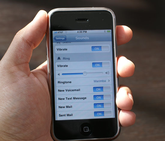
In silent mode, all audible notifications are disabled and the iPhone will only vibrate to alert you of an incoming call/message/email. You can disable the vibrator so that the iPhone is completely silent and motionless in this mode, but that's all.
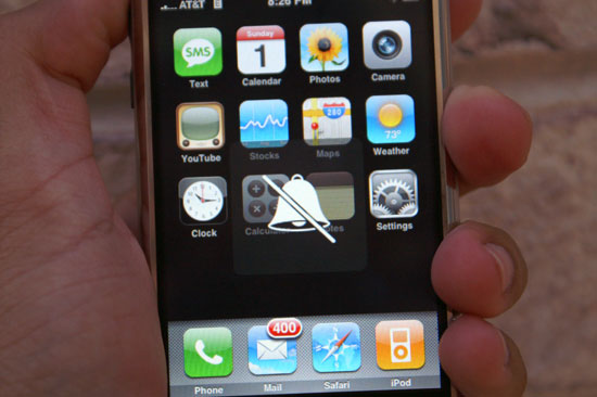
Silence!
In normal mode, the iPhone will ring, bark, beep or boing at you as loudly as you have the volume set. In addition, it will also vibrate to give you the complete aural and tactile experience. You can control what events will trigger sounds, but that's as far as the customization goes.
For me personally, this is all the configurability I need when it comes to custom profiles. I usually keep my phone on vibrate, and if I want an audible notification as well a flick of a switch is all I need on the iPhone. I've never really used profiles on my Blackberries and Windows Mobile Phones of years past, mostly because there are way too many keystrokes associated with switching between them all.
On the Blackberry Curve, you have to scroll to profiles and select the one you want. It seems silly to complain about using a trackball and having to make two clicks to change a profile, but compared to flicking a single switch that you can do without staring at the screen, it is a big deal.
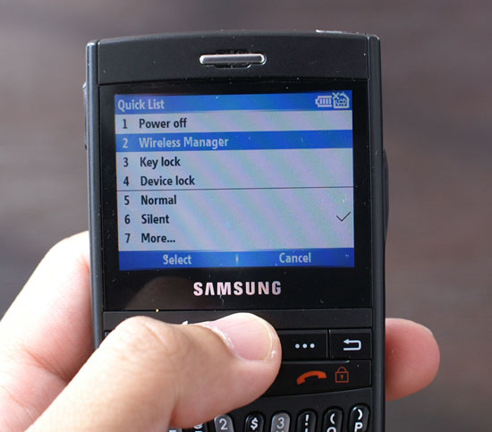
Profiles on the Blackjack
To switch profiles on the Blackjack you have to hit the power button and select from a list. Thankfully Samsung included a silent mode button on the keyboard itself, just hold it down and your phone is silenced. The only issue with Samsung's implementation is that the button is sandwiched between the spacebar and comma keys, not the easiest to blindly select.
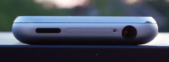
From left to right: sleep/wake button, SIM tray, 1/8" headphone jack (recessed and very particular about what headphones it'll work with)
The only remaining button on the iPhone is along the top of the device, and it is Apple's Sleep/Wake button. The button is stiff enough where it won't accidentally get hit in your pocket, and just like the ringer toggle you can easily activate it without looking at the phone. Hitting the sleep/wake button while your iPhone is on and active will shut down the screen, pause whatever you're doing (e.g. web pages will not continue to load while the phone is asleep) and lock the interface. Tapping on the screen won't wake it back up, you either have to hit the home button or the sleep/wake button again. Doing so will bring up this screen:
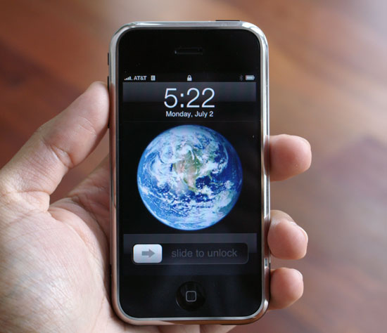
And simply slide your finger where indicated to unlock the phone (which is very cool by the way); if you've got a password set, you'll be asked to enter it next. Just like the ringer toggle, the sleep/wake button is ridiculously useful yet overlooked on many cellphones. The Blackjack lets you lock the phone by holding down the end call key for a few seconds, while the Blackberry requires you manually select the lock button from the phone's interface (or if you have dial from home disabled, just hit the 'k' key). Both competitors at least offer an alternative, but neither is as easy as the iPhone's dedicated button.
The rest of the iPhone's interface is completely virtual, driven by the 3.5" mult-touch LCD. Know what you're getting into with the iPhone; on first glance it seems overly simplified, but if your needs and its abilities mesh, it truly is a phone interface done right.


85 Comments
View All Comments
jay401 - Tuesday, July 3, 2007 - link
Now that's practically an unpardonable sin, given that it's such a basic request and something absent from most phones because most providers think people are dumb enough to pay money to download a ringtone (like hell would I ever do that nonsense).
So why not just let people use their mp3s? I already do that on my cellphone but since I can't do it directly I do it in a round-about way by sending myself the mp3 clips as attachments to messages sent to my phone, which I can then download and assign as a ringtone.
Why not just make it straightforward and easy? You'd think this is one thing Apple could do right. :(
jay401 - Tuesday, July 3, 2007 - link
from page 11:If I could read any of the incredibly tiny text in that picture, maybe I would be able to. ;P
Anand Lal Shimpi - Tuesday, July 3, 2007 - link
Seriously, the PDF looked shockingly good. Once you stretch to zoom in so you can actually read the slides, it's amazing. Yes, I realized being excited about how good a PDF looks on a phone is silly, but I figure after waiting in line for five hours for said phone, I've got nothing more to lose :)Take care,
Anand
Griswold - Tuesday, July 3, 2007 - link
You can't make videos on the phone, you can't copy/paste, there's no IM client, you can't replace the battery on your own, you can't add applications to it, there's no Flash/Java support, it's heavy and the list goes on. But here's the catch: there isn't a phone out today (smart or not) that doesn't have at least as long of a list of issues.But for a price tag like this, I expect a shorter list. And unfortunately, many of the things on this list are important to me.
Still, after being so skeptic about the iphone, I'd still like to have one (yea, it does have this star trek datapad feeling!!) but due to the flaws and shortcomings, i'll just wait for the next incarnation that will most likely hit the street within a year.
I dont believe in early adopting gear from a company with zero experience on this particular field, and while apple did most of their homework, my motto (rightfully) stands.
The next iphone will most likely be much better suited for me.
mongo lloyd - Tuesday, July 3, 2007 - link
Comic Sans? Really?plinden - Tuesday, July 3, 2007 - link
No - http://www.searchfreefonts.com/fonts/m9.htm">Marker Felt Thinmongo lloyd - Wednesday, July 4, 2007 - link
Oh ok. Equally terrible font, I'd say. Is that a standard-use font for Apple? Yikes to that.Sunrise089 - Tuesday, July 3, 2007 - link
Lots of personality, info that wasn't just a run down of specs, and best of all telepathy.I was actually thinking while I read this "I wonder if I'd be able to watch TopGear clips on this, since often they get pulled from Youtube. I scroll down the page, and see Clarkson staring back at me. Amazing.
One more thing, about the homeless guy's choice between the Enzo and the Veyron - between ugly and boring, I don't know which I'd pick either. After all these years, McLaren F1 FTW!
Yongsta - Tuesday, July 3, 2007 - link
Nice Review, the iphone sounds great but $600 is out of my budget. Hopefully Apple in the future releases new types of iphone's at affordable prices. Maybe Samsung/Nokia/Motorola will try to make a copycat phone but they probably cant match Apple's UI.Locutus465 - Tuesday, July 3, 2007 - link
I do love the looks of the iPhone... However if everything I hear about it is true then it would not interest me. Complete lack of 3rd party software support? If this is true then yikes! I've got my Windows Mobile phone running with quite a bit of 3rd party software and for me that's a huge must... Like my Trillian like all in one chat client, Pocket Putty, CISCO VPN client and of course, pocket mahjoong (spelling?).Also, I've heard for a closed system they missed the boat on what would be some truely killer features (which could be solved via allowing 3rd party software). For instance it has (google?) maps, yet from what I hear no GPS integration? Why not? At least in windows mobile you have options (though yes, it's not built into that platform either).
It would however, be nice to see more cell companies consentrate on end user experience... It's appriciated that is for sure.