Apple's iPhone: The Future is Here
by Anand Lal Shimpi on July 2, 2007 6:13 PM EST- Posted in
- Smartphones
- Mobile
Oh Hashmir, Multi-Touch Me Down There
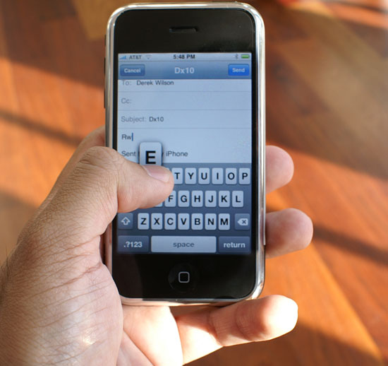
We've already established that finger prints and smudges on the screen are a non issue when the device is on, now the question is: how well does the interface work?
Apple's idea behind the iPhone's multi-touch interface is that mobile phones can't work with a fixed input device. Mobile phones have to be incredibly compact, yet these days they have to run a variety of applications: everything from writing emails to planning routes in Google Maps to organizing your photos. To make things worse, the ideal interface for inputting an address is wildly different from the ideal interface for viewing pictures.
A fixed keyboard is great for writing emails (e.g. Blackberry), but you need the equivalent of a mouse for scrolling around webpages on a small screen. The stylus is a nice attempt at a mobile mouse but it's redundant, your fingers are just as capable of pointing as a plastic pen.
The multi-touch screen on the iPhone fundamentally works like most other touch screens, with the exception that it allows multiple simultaneous inputs on the screen. Much like Apple's approach in OS X, the iPhone's multi-touch interface works the way you'd expect it to.

If you want to hit a button, simply tap on it. If you want to zoom in on a picture or web page, double tap on it (double tap once more to zoom out). To scroll around tap and hold your finger in one place then drag it around.
Scrolling through long lists is done by flicking your finger up or down; place your finger on the screen then drag it up to scroll down and vice versa. The motion takes seconds to master and it's quite intuitive.
Flipping through multiple "tabs" in Safari or pictures in the iPhone's photo albums is just as easy as scrolling. Instead of flicking your finger from top to bottom, simply move it from left to right as if you were flipping through pages of a book.
By far my favorite gesture is used when quickly deleting items in a list. If you want to delete an email for example, just strike through the email with your finger from left to right, a delete icon appears and selecting it will delete the email. It's the smoothest way I've ever deleted anything.
The more advanced features involve two fingers, I found myself using my index finger and thumb but technically you could use any two of your digits. Aside from the double tap (which may not work depending on the situation), you can zoom in on an image by taking your index finger and thumb and making a stretching motion with them on the screen. Hold your thumb and index finger together, place them on the screen, then pull them apart while maintaining contact with the screen. You'll zoom in on the area you just stretched. To achieve the opposite effect, just reverse the motion by pinching your fingers together.
You do have to be firm with your touches, and you can't use your fingernails (or gloves). At the same time, the multi-touch screen works best if your hands are clean and dry; if you've got oily skin, plan on washing your hands a lot to get the best experience with the iPhone. If your hands aren't clean/dry you'll find that the gestures don't always react exactly how you'd like them to, the device is still usable but there's a measurable difference between using it with clean/dry hands vs. oily hands.
When the iPhone's CPU isn't busy downloading mail or rendering a web page, the pinch/stretch works flawlessly, as do all of the gestures mentioned above. The only time you'll encounter choppy response is if a "heavy" task is still being executed in the background.
The iPhone is usable in one of two orientations: portrait or landscape. There's an integrated silicon mass sensor that detects, based on the gravitational pull on the device, whether it is being held in portrait or landscape mode.
Switching between portrait and landscape mode is, for the most part, as seamless as it is in the TV commercials. Not all applications support landscape mode (e.g. iPhone Mail only works in portrait mode) while the playing videos in the YouTube app works exclusively in landscape. In order for the iPhone's internal sensor to best gauge its orientation, you'll want to hold the device as close to perpendicular to the ground as possible when rotating.
I have seen some quirks where the iPhone's scheduler is unable to immediately interrupt a task as I rotate the phone, causing a multi-second pause between when I rotate the phone and when the screen switches orientation.
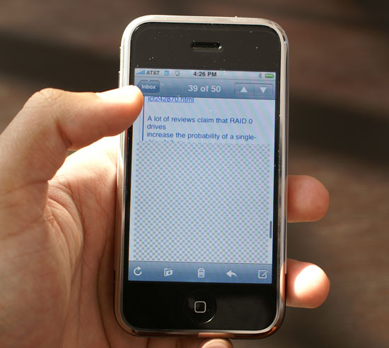
Mobile phone interfaces are often unreasonably sluggish, and it's clear that Apple set out to fix that with the iPhone. The OS will do whatever it takes to preserve the responsiveness of the UI; for example, if you have a long email that you scroll through quickly, the iPhone may not have all of the email present in its frame buffer given the limited amount of memory on the device (possibly 128MB). If you scroll too far down in the email too quickly, you'll be greeted with a checkerboard pattern while the email gets moved into the display buffer. However, while this is happening, the UI never behaves any differently - it's still as responsive as when scrolling through data that's present in the display buffer.

Scroll too far ahead and you'll get this before the display buffer gets the data it needs; the iPhone is fast, but you're still faster.
I suspect that future versions of the iPhone with more memory and a faster processor won't have this issue, but Apple made do with what was available at the time.
For navigating through the basic iPhone interface, selecting applications, toggling settings, scrolling, zooming, etc..., the multi-touch screen works flawlessly. Being able to re-orient the display from portrait to landscape mode on the fly with virtually no interruption in the user experience is beyond impressive. It truly feels like something out of a sci-fi movie and it's one of the most understated but impressive features of the iPhone. The interface just works.


85 Comments
View All Comments
jay401 - Tuesday, July 3, 2007 - link
Now that's practically an unpardonable sin, given that it's such a basic request and something absent from most phones because most providers think people are dumb enough to pay money to download a ringtone (like hell would I ever do that nonsense).
So why not just let people use their mp3s? I already do that on my cellphone but since I can't do it directly I do it in a round-about way by sending myself the mp3 clips as attachments to messages sent to my phone, which I can then download and assign as a ringtone.
Why not just make it straightforward and easy? You'd think this is one thing Apple could do right. :(
jay401 - Tuesday, July 3, 2007 - link
from page 11:If I could read any of the incredibly tiny text in that picture, maybe I would be able to. ;P
Anand Lal Shimpi - Tuesday, July 3, 2007 - link
Seriously, the PDF looked shockingly good. Once you stretch to zoom in so you can actually read the slides, it's amazing. Yes, I realized being excited about how good a PDF looks on a phone is silly, but I figure after waiting in line for five hours for said phone, I've got nothing more to lose :)Take care,
Anand
Griswold - Tuesday, July 3, 2007 - link
You can't make videos on the phone, you can't copy/paste, there's no IM client, you can't replace the battery on your own, you can't add applications to it, there's no Flash/Java support, it's heavy and the list goes on. But here's the catch: there isn't a phone out today (smart or not) that doesn't have at least as long of a list of issues.But for a price tag like this, I expect a shorter list. And unfortunately, many of the things on this list are important to me.
Still, after being so skeptic about the iphone, I'd still like to have one (yea, it does have this star trek datapad feeling!!) but due to the flaws and shortcomings, i'll just wait for the next incarnation that will most likely hit the street within a year.
I dont believe in early adopting gear from a company with zero experience on this particular field, and while apple did most of their homework, my motto (rightfully) stands.
The next iphone will most likely be much better suited for me.
mongo lloyd - Tuesday, July 3, 2007 - link
Comic Sans? Really?plinden - Tuesday, July 3, 2007 - link
No - http://www.searchfreefonts.com/fonts/m9.htm">Marker Felt Thinmongo lloyd - Wednesday, July 4, 2007 - link
Oh ok. Equally terrible font, I'd say. Is that a standard-use font for Apple? Yikes to that.Sunrise089 - Tuesday, July 3, 2007 - link
Lots of personality, info that wasn't just a run down of specs, and best of all telepathy.I was actually thinking while I read this "I wonder if I'd be able to watch TopGear clips on this, since often they get pulled from Youtube. I scroll down the page, and see Clarkson staring back at me. Amazing.
One more thing, about the homeless guy's choice between the Enzo and the Veyron - between ugly and boring, I don't know which I'd pick either. After all these years, McLaren F1 FTW!
Yongsta - Tuesday, July 3, 2007 - link
Nice Review, the iphone sounds great but $600 is out of my budget. Hopefully Apple in the future releases new types of iphone's at affordable prices. Maybe Samsung/Nokia/Motorola will try to make a copycat phone but they probably cant match Apple's UI.Locutus465 - Tuesday, July 3, 2007 - link
I do love the looks of the iPhone... However if everything I hear about it is true then it would not interest me. Complete lack of 3rd party software support? If this is true then yikes! I've got my Windows Mobile phone running with quite a bit of 3rd party software and for me that's a huge must... Like my Trillian like all in one chat client, Pocket Putty, CISCO VPN client and of course, pocket mahjoong (spelling?).Also, I've heard for a closed system they missed the boat on what would be some truely killer features (which could be solved via allowing 3rd party software). For instance it has (google?) maps, yet from what I hear no GPS integration? Why not? At least in windows mobile you have options (though yes, it's not built into that platform either).
It would however, be nice to see more cell companies consentrate on end user experience... It's appriciated that is for sure.