Apple's iPhone: The Future is Here
by Anand Lal Shimpi on July 2, 2007 6:13 PM EST- Posted in
- Smartphones
- Mobile
Pulling its Weight
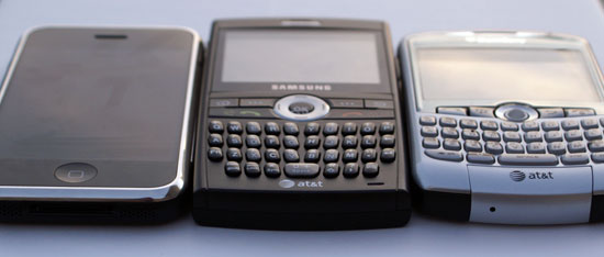
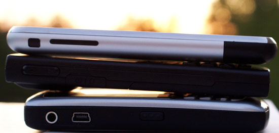
In preparing for this review I spent quite a bit of time with Samsung's Blackjack, and honestly it still takes the cake as far as form factor and weight are concerned. Apple's iPhone is slightly thinner (-0.4mm) and 1mm longer/wider than the Blackjack, making it pretty darn close to what felt to me like the perfect smartphone form factor. Where the iPhone falls short is in its weight; while the Blackjack weighs in at 3.5 oz (99g), the iPhone is a hefty 4.8 oz (135g). While we're talking fairly small numbers here, the difference is noticeable. The added weight is by no means a deal breaker, but keep in mind that the iPhone is heavier than the Blackberry Curve in a device that's about the same size as the Blackjack; in other words, it's dense.

From left to right: Apple iPhone, Samsung Blackjack, Blackberry Curve
The heft of the device makes one handed operation difficult, something that is made even tougher by the touch-screen interface. In comparison, the Blackjack feels far more natural with only a single hand, just like a plain old cell phone.

From front to back: Apple iPhone, Samsung Blackjack, Blackberry Curve
Thankfully Apple went with a brushed aluminum exterior for the back of the iPhone, meaning we don't get the fingerprint ridden mess that has plagued some of the flashier iPods. The shiny metal rim around the glass screen does collect its fair share of grease, nicks and scratches, but there's not much you can do about that.

From Top to Bottom: Apple iPhone, Samsung Blackjack, Blackberry Curve
The device itself looks quite stylish, making even recently released smartphones and Blackberries seem archaic by comparison. A perfect marriage of a gorgeous screen and great industrial design, the iPhone is the first mobile phone I've used that feels like it was truly designed for 2007.


85 Comments
View All Comments
zsdersw - Tuesday, July 3, 2007 - link
As a long-time Star Trek fan and someone who regards The Next Generation as the best of the series, I have to say I'm not at all interested in the iPhone.Two primary reasons:
- Price. For $500 and a 2yr contract, what it brings to the table above and beyond its competitors is less than compelling, IMO.
- AT&T only. Screw that. I'm never buying a phone with which only one carrier is available.
tuteja1986 - Tuesday, July 3, 2007 - link
alot of features are missing :!Bluetooth is crippled
Virtual keyboard onlys works good with Web browser since its horizontal. keyboard sucks
Does not have 3G
battery life is 4hrs talk time.. unable to change battery. black berry 8800 can do 10hrs+
Digital camera is very basic compared to high quality camera used in phone like Nokia N95.
No support for 3rd party application
Its has edge connection which sucks
no support for HDSPA
No GPS
No IM program
No widget support
Not able to abstract the image anywhere.. sending image through email reduces it low res which sucks :(
The only awesome thing about iphone i think its interface , the screen and the ipod video/music feature which works. The phone is certinaly not worth $600 and can be sold for $350 and apple can still make a decent profit.
plinden - Tuesday, July 3, 2007 - link
Where is 4 hour talk time mentioned. Anand didn't mention talk time, did he? He did get 6-7 hours with wifi.
Just about every other reviewer got 7 hours or more talk time, close to what Apple claims.
tuteja1986 - Wednesday, July 4, 2007 - link
Comfired by latest TWIT episode :! TWIT networks has the biggest apple fanboys ever :)http://www.twit.tv/TWiT">http://www.twit.tv/TWiT
but I sorry to burst you bubble but read the review by mobile phone professionals.
http://www.wirelessinfo.com/content/Apple-iPhone-C...">http://www.wirelessinfo.com/content/App...one-Cell...
Also ain't a anti apple but people buying it for so many reason as its calling the revolutionary phone which is not in tech wise , features but is revolution in only in UI design.
sviola - Tuesday, July 3, 2007 - link
YEah, the Nokia N95 is an excelent phone, here are some of it's features.In-built GPS and Navigation Program (over 100+ countries maps)
5 MP Camera with Zeiss Lens and Optical Zoom, and Video Recording
Symbian OS
Plays MP3, video, etc
Bluetooth, Wi-Fi, USB, TV out
Quadriband GSM/WCDMA (3G)
MicroSD Card Reader
I would like to see an anand review on it and a comparative against the iPhone.
vectersmith - Monday, July 2, 2007 - link
I have enjoyed the iPhone thoroughly and agree that while it is not perfect, for what it does do it does better far and above anything else.Edge speed is slow, but bearable (barely). Wi-Fi is must better, although I still have sites that just hang and I have to hit the X button and reload.
The UI is breathtaking, earth shattering, and will revolutionize the smartphone industry. It has too, once you use the iPhone everything else seems like fruitcake for Christmas (no offense intended to those that enjoy fruitcake on Christmas). I find myself just taking it out of my pocket to slide the unlock and see if anything is new :)
Also I will agree with Anand about the SMS, you really have to watch out what you are doing as having a conversation is just painless which causes those SMS message count the fly up :)
kilkennycat - Monday, July 2, 2007 - link
....how long did you take to compose the review and how much sleep did you get in the process? Did you work from a pre-written plan?Anand Lal Shimpi - Tuesday, July 3, 2007 - link
Thanks :)I wrote the whole thing in about 24 hours, but the testing took a lot longer obviously. As with all my articles I have a very high level outline, but what ended up being written was significantly larger than even I expected it to be. My initial outline had something around 10 - 15 pages long, then by 3AM Monday morning I estimated it would be around 20 pages and by the time it published I realized it was going to be just shy of 30.
I had to cut out a lot of additional material from the review just in the interest of time, and I took another 6 or 7 hours working on it to try and make sure I was keeping the attention of the reader throughout the piece (hopefully it worked :)...). There's enough extra content that I didn't use for at least two more articles, but I'm not sure what the demand will be for that so who knows if it'll ever get used.
As far as sleep goes, I don't sleep much in general when I'm working but the iPhone weekend was ridiculous. I went to bed Saturday night, woke up Sunday and didn't get to bed again until 4AM Tuesday morning. Needless to say, sleeping last night was the most amazing thing ever.
Take care,
Anand
oopyseohs - Thursday, July 5, 2007 - link
This is definitely the best article I have ever read on AnandTech or on anything technology related in general. Also, it is nice to see that someone else exhibits the same behavior I do when writing major articles!DerekWilson - Monday, July 2, 2007 - link
I'm sure Anand is finally getting some sleep after a grueling weekend with the iPhone, taking only the occasional nap so as not to die.And a pre-written plan? naah, Anand's just that good :-)