Apple's iPhone: The Future is Here
by Anand Lal Shimpi on July 2, 2007 6:13 PM EST- Posted in
- Smartphones
- Mobile
Oh Hashmir, Multi-Touch Me Down There
We've already established that finger prints and smudges on the screen are a non issue when the device is on, now the question is: how well does the interface work?
Apple's idea behind the iPhone's multi-touch interface is that mobile phones can't work with a fixed input device. Mobile phones have to be incredibly compact, yet these days they have to run a variety of applications: everything from writing emails to planning routes in Google Maps to organizing your photos. To make things worse, the ideal interface for inputting an address is wildly different from the ideal interface for viewing pictures.
A fixed keyboard is great for writing emails (e.g. Blackberry), but you need the equivalent of a mouse for scrolling around webpages on a small screen. The stylus is a nice attempt at a mobile mouse but it's redundant, your fingers are just as capable of pointing as a plastic pen.
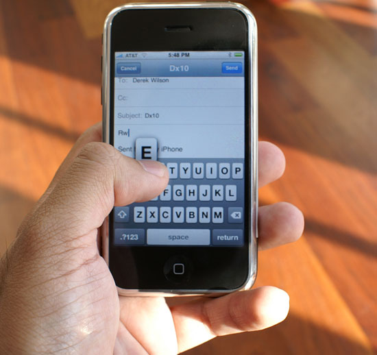
The multi-touch screen on the iPhone fundamentally works like most other touch screens, with the exception that it allows multiple simultaneous inputs on the screen. Much like Apple's approach in OS X, the iPhone's multi-touch interface works the way you'd expect it to.

If you want to hit a button, simply tap on it. If you want to zoom in on a picture or web page, double tap on it (double tap once more to zoom out). To scroll around tap and hold your finger in one place then drag it around.
Scrolling through long lists is done by flicking your finger up or down; place your finger on the screen then drag it up to scroll down and vice versa. The motion takes seconds to master and it's quite intuitive.
Flipping through multiple "tabs" in Safari or pictures in the iPhone's photo albums is just as easy as scrolling. Instead of flicking your finger from top to bottom, simply move it from left to right as if you were flipping through pages of a book.
By far my favorite gesture is used when quickly deleting items in a list. If you want to delete an email for example, just strike through the email with your finger from left to right, a delete icon appears and selecting it will delete the email. It's the smoothest way I've ever deleted anything.
The more advanced features involve two fingers, I found myself using my index finger and thumb but technically you could use any two of your digits. Aside from the double tap (which may not work depending on the situation), you can zoom in on an image by taking your index finger and thumb and making a stretching motion with them on the screen. Hold your thumb and index finger together, place them on the screen, then pull them apart while maintaining contact with the screen. You'll zoom in on the area you just stretched. To achieve the opposite effect, just reverse the motion by pinching your fingers together.
You do have to be firm with your touches, and you can't use your fingernails (or gloves). At the same time, the multi-touch screen works best if your hands are clean and dry; if you've got oily skin, plan on washing your hands a lot to get the best experience with the iPhone. If your hands aren't clean/dry you'll find that the gestures don't always react exactly how you'd like them to, the device is still usable but there's a measurable difference between using it with clean/dry hands vs. oily hands.
When the iPhone's CPU isn't busy downloading mail or rendering a web page, the pinch/stretch works flawlessly, as do all of the gestures mentioned above. The only time you'll encounter choppy response is if a "heavy" task is still being executed in the background.
The iPhone is usable in one of two orientations: portrait or landscape. There's an integrated silicon mass sensor that detects, based on the gravitational pull on the device, whether it is being held in portrait or landscape mode.
Switching between portrait and landscape mode is, for the most part, as seamless as it is in the TV commercials. Not all applications support landscape mode (e.g. iPhone Mail only works in portrait mode) while the playing videos in the YouTube app works exclusively in landscape. In order for the iPhone's internal sensor to best gauge its orientation, you'll want to hold the device as close to perpendicular to the ground as possible when rotating.
I have seen some quirks where the iPhone's scheduler is unable to immediately interrupt a task as I rotate the phone, causing a multi-second pause between when I rotate the phone and when the screen switches orientation.
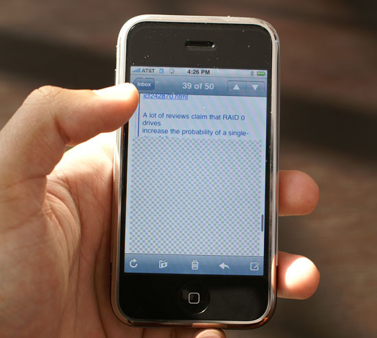
Mobile phone interfaces are often unreasonably sluggish, and it's clear that Apple set out to fix that with the iPhone. The OS will do whatever it takes to preserve the responsiveness of the UI; for example, if you have a long email that you scroll through quickly, the iPhone may not have all of the email present in its frame buffer given the limited amount of memory on the device (possibly 128MB). If you scroll too far down in the email too quickly, you'll be greeted with a checkerboard pattern while the email gets moved into the display buffer. However, while this is happening, the UI never behaves any differently - it's still as responsive as when scrolling through data that's present in the display buffer.

Scroll too far ahead and you'll get this before the display buffer gets the data it needs; the iPhone is fast, but you're still faster.
I suspect that future versions of the iPhone with more memory and a faster processor won't have this issue, but Apple made do with what was available at the time.
For navigating through the basic iPhone interface, selecting applications, toggling settings, scrolling, zooming, etc..., the multi-touch screen works flawlessly. Being able to re-orient the display from portrait to landscape mode on the fly with virtually no interruption in the user experience is beyond impressive. It truly feels like something out of a sci-fi movie and it's one of the most understated but impressive features of the iPhone. The interface just works.


85 Comments
View All Comments
zsdersw - Tuesday, July 3, 2007 - link
As a long-time Star Trek fan and someone who regards The Next Generation as the best of the series, I have to say I'm not at all interested in the iPhone.Two primary reasons:
- Price. For $500 and a 2yr contract, what it brings to the table above and beyond its competitors is less than compelling, IMO.
- AT&T only. Screw that. I'm never buying a phone with which only one carrier is available.
tuteja1986 - Tuesday, July 3, 2007 - link
alot of features are missing :!Bluetooth is crippled
Virtual keyboard onlys works good with Web browser since its horizontal. keyboard sucks
Does not have 3G
battery life is 4hrs talk time.. unable to change battery. black berry 8800 can do 10hrs+
Digital camera is very basic compared to high quality camera used in phone like Nokia N95.
No support for 3rd party application
Its has edge connection which sucks
no support for HDSPA
No GPS
No IM program
No widget support
Not able to abstract the image anywhere.. sending image through email reduces it low res which sucks :(
The only awesome thing about iphone i think its interface , the screen and the ipod video/music feature which works. The phone is certinaly not worth $600 and can be sold for $350 and apple can still make a decent profit.
plinden - Tuesday, July 3, 2007 - link
Where is 4 hour talk time mentioned. Anand didn't mention talk time, did he? He did get 6-7 hours with wifi.
Just about every other reviewer got 7 hours or more talk time, close to what Apple claims.
tuteja1986 - Wednesday, July 4, 2007 - link
Comfired by latest TWIT episode :! TWIT networks has the biggest apple fanboys ever :)http://www.twit.tv/TWiT">http://www.twit.tv/TWiT
but I sorry to burst you bubble but read the review by mobile phone professionals.
http://www.wirelessinfo.com/content/Apple-iPhone-C...">http://www.wirelessinfo.com/content/App...one-Cell...
Also ain't a anti apple but people buying it for so many reason as its calling the revolutionary phone which is not in tech wise , features but is revolution in only in UI design.
sviola - Tuesday, July 3, 2007 - link
YEah, the Nokia N95 is an excelent phone, here are some of it's features.In-built GPS and Navigation Program (over 100+ countries maps)
5 MP Camera with Zeiss Lens and Optical Zoom, and Video Recording
Symbian OS
Plays MP3, video, etc
Bluetooth, Wi-Fi, USB, TV out
Quadriband GSM/WCDMA (3G)
MicroSD Card Reader
I would like to see an anand review on it and a comparative against the iPhone.
vectersmith - Monday, July 2, 2007 - link
I have enjoyed the iPhone thoroughly and agree that while it is not perfect, for what it does do it does better far and above anything else.Edge speed is slow, but bearable (barely). Wi-Fi is must better, although I still have sites that just hang and I have to hit the X button and reload.
The UI is breathtaking, earth shattering, and will revolutionize the smartphone industry. It has too, once you use the iPhone everything else seems like fruitcake for Christmas (no offense intended to those that enjoy fruitcake on Christmas). I find myself just taking it out of my pocket to slide the unlock and see if anything is new :)
Also I will agree with Anand about the SMS, you really have to watch out what you are doing as having a conversation is just painless which causes those SMS message count the fly up :)
kilkennycat - Monday, July 2, 2007 - link
....how long did you take to compose the review and how much sleep did you get in the process? Did you work from a pre-written plan?Anand Lal Shimpi - Tuesday, July 3, 2007 - link
Thanks :)I wrote the whole thing in about 24 hours, but the testing took a lot longer obviously. As with all my articles I have a very high level outline, but what ended up being written was significantly larger than even I expected it to be. My initial outline had something around 10 - 15 pages long, then by 3AM Monday morning I estimated it would be around 20 pages and by the time it published I realized it was going to be just shy of 30.
I had to cut out a lot of additional material from the review just in the interest of time, and I took another 6 or 7 hours working on it to try and make sure I was keeping the attention of the reader throughout the piece (hopefully it worked :)...). There's enough extra content that I didn't use for at least two more articles, but I'm not sure what the demand will be for that so who knows if it'll ever get used.
As far as sleep goes, I don't sleep much in general when I'm working but the iPhone weekend was ridiculous. I went to bed Saturday night, woke up Sunday and didn't get to bed again until 4AM Tuesday morning. Needless to say, sleeping last night was the most amazing thing ever.
Take care,
Anand
oopyseohs - Thursday, July 5, 2007 - link
This is definitely the best article I have ever read on AnandTech or on anything technology related in general. Also, it is nice to see that someone else exhibits the same behavior I do when writing major articles!DerekWilson - Monday, July 2, 2007 - link
I'm sure Anand is finally getting some sleep after a grueling weekend with the iPhone, taking only the occasional nap so as not to die.And a pre-written plan? naah, Anand's just that good :-)