OPPO Find 5 Review
by Vivek Gowri on May 29, 2013 6:55 AM EST- Posted in
- Smartphones
- Qualcomm
- Mobile
- APQ8064
- OPPO Find 5
The next part of the user experience to touch on is the software. The software side of the Find 5 is probably what I’d consider its biggest issue, and the reason this review has taken so long is that it took a few updates for the device to really feel finished. The first firmware revisions just didn’t feel stable or polished enough, and even after that, I saw pretty big performance and battery life improvements with updates. I must applaud OPPO’s software engineers for religiously updating the device every four weeks or so; the device I got in February is very different from the one I’m holding now, and seeing the evolution has been a nice change from some of the larger device makers that essentially leave their phones out to dry post launch. This isn’t to say that the updates are perfect, as some of the issues I had with the software back then are still present, particularly on a UI/UX design level as well as some real bugs with the firmware. OPPO has a completely new UI in the works, but I’ll get to that.
The Find 5 ships at present with a skinned version of Android 4.1.1, which I’m actually okay with. 4.2 hasn’t added enough features to consider the lack of it a significant issue really. The biggest experience level differences are the notification drawer power toggles and the trace feature in the stock Android keyboard. Most of these features are present in modern skins, and if not, are easy to add later with apps. The keyboard is just the stock Android 4.1 keyboard, and as long as you don’t need a trace/Swype feature, it’s one of my favorite keyboards out there.
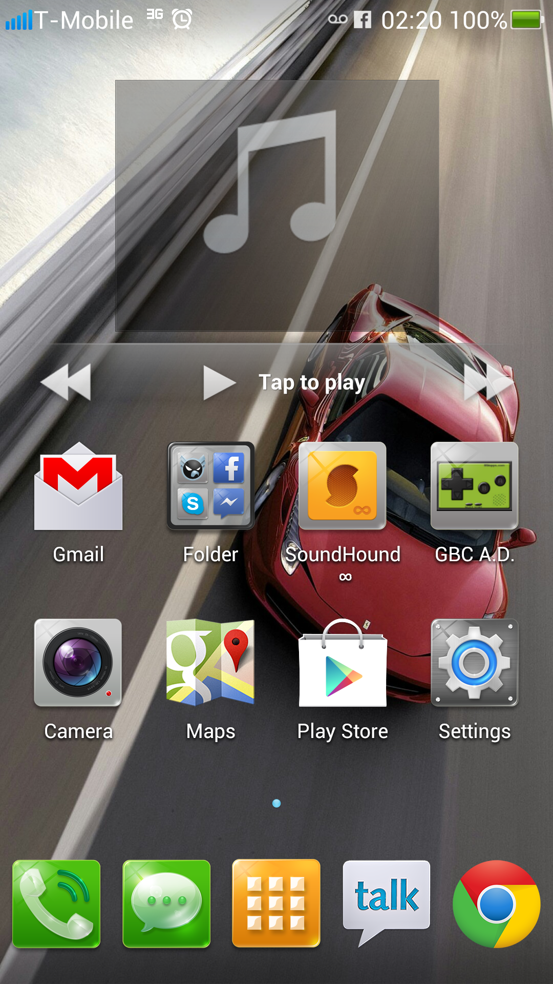
Aesthetically, the skin is a mess. The icons are forced into a square shape, and to achieve this, all downloaded app icons are put on a gray square background to fit the visual style. Common applications like Facebook, Netflix, Instagram, Spotify, etc. have this style of icon built into the system (a very recent addition in the latest software update) but more niche applications still look terrible. Confusingly, all of the Google system applications (Gmail, Maps, Play, etc) retain their usual iconography, so a homescreen like mine just looks like a mishmash of different design goals all failing to be met simultaneously. The widgets are ridiculous looking, they were clearly created by a designer but they appear unnecessarily cartoonish. Compared to the flatness of Holo and the stock Android interface, the visual style here has a lot of superfluous visual chrome and it just looks inelegant overall.
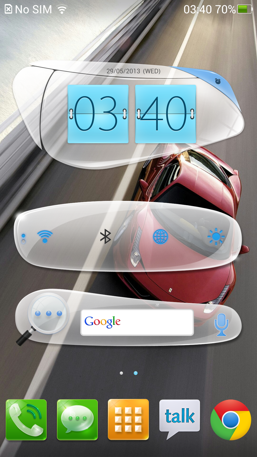
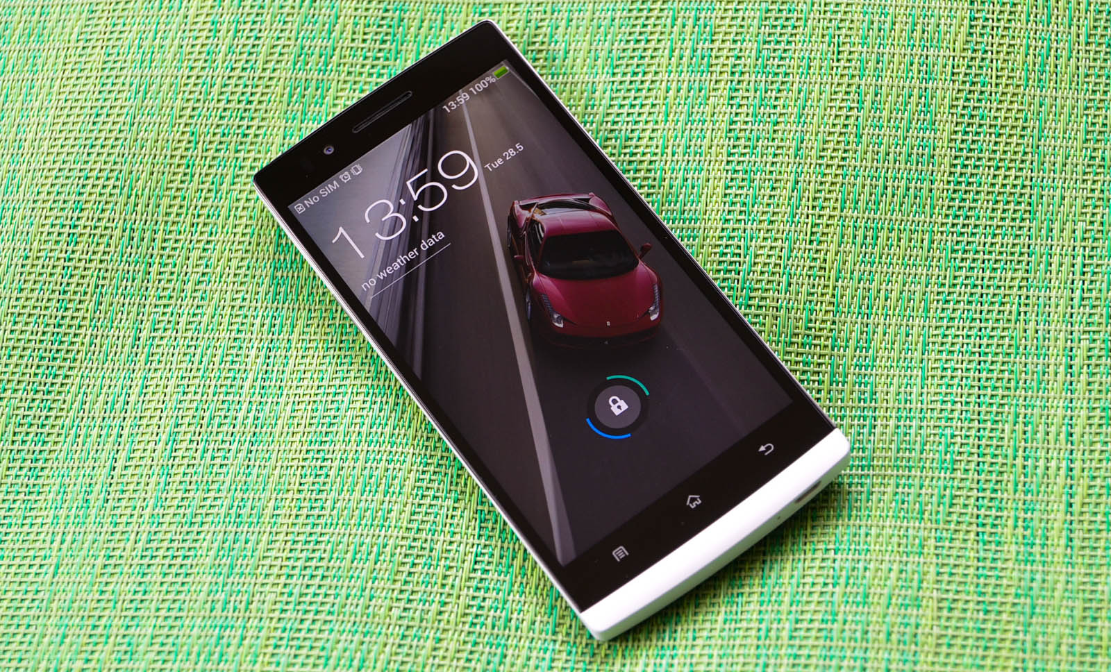
The lockscreen opens with an animation resembling a rotating window (OPPO calls it “Glass Board”), which would be cool if the framerate wasn’t so low. Also, I found myself in way too many situations where the phone decided that I didn’t swipe with enough velocity and then returned the window to its original place. There’s also a more traditional slide to unlock option, referred to as Slider unlock. The normal Android 4.x style lockscreen (and the slide circle outwards to unlock method) made an appearance in a late April update, with the Weather lockscreen option. It’s a bit different from the stock one, with an animated clock and weather details, along with a camera shortcut (sorely lacking in the other two lockscreens). The animations are well done, the one place in the UI where the framerates aren’t choppy.
The lack of smoothness in the UI is a recurring theme with the current Find 5 skin, as scrolling in the multitasking menus and other parts of the UI just drop tons of frames. Multitasking is now a card-based system, somewhat reminiscent of MeeGo in visual style, and you can flick the cards upwards to close apps. The settings menu is another major change, with four categories that can be scrolled through horizontally. Certain pages within the settings menu have been changed or removed, with the puzzling elimination of the useful battery usage page being chief amongst the flaws.
OPPO has added a couple of gestures, such as double tap on the menu bar to scroll to the top of a list (the way iOS does it) and easy answer (just put the phone close to your ear when ringing and it will answer automatically, using the proximity sensor). Double tap barely works, to be honest, though easy answer is a bit less buggy. It’s a cool feature when you remember to use it - accepting calls on a smartphone is a very ingrained reaction, so skipping that step and just putting the phone to my ear required a conscious effort. I had issues with the phone automatically answering itself in my pocket though, so overall it ends up being more trouble than it's worth to keep the feature enabled.
The phone application has similarly styled categories for the dialer, contacts, groups, and favorites, with a recent calls list showing up under the dial category. Messaging looks just about as you’d expect, though there’s a huge flaw with the application. The messaging app ignores the numbers in parenthesis if your contact is saved with a number formatted like 1 (425) 555-0900 or 1-425-555-0900. The number that ends up getting texted is 15550900, which obviously leads to nowhere. Numbers saved like 14255550900 are fine, but considering that in the US and other countries, parentheses and dashes are pretty common, this was a massive issue. Basically, to get around it, you either need the other person to text you first and then reply in the thread, or quickly memorize the 10 digit number and enter the number sans hyphens or parenthesis. And even then, sometimes the Find 5 wouldn’t connect the number you’ve texted with the saved contact. This is 2013, how the hell does a phone have issues parsing parentheses or dashes in saved phone numbers? It’s a blatantly unacceptable issue to be having.
There’s also some other weird bugs, like a private incoming number showing up as the last incoming contact. I’ve answered phone calls which according to the Find 5 are coming from my best friend, but actually are coming from my father. This is after a multitude of updates, too - the SMS bug was there since basically the beginning, and while some earlier bugs were squashed, this incoming number one has cropped up in a more recent update. It’s odd, and the entire thing just feels unfinished.
Otherwise, the OPPO works as you’d expect Android to, nothing more and nothing less. But it’s safe to say that the shipping software just isn’t very polished or pleasing to use, and for quite some time was a turn off to me, especially the texting issue as well as framerate dips in conspicuous places like the lockscreen and multitasking. And for someone as design conscious as I tend to be, the mismatched visual style basically killed me every time I turned the phone on.

I said this to our contact at OPPO early on in my review process, but honestly, the easiest way to fix a majority of my issues with the Find 5 would be a stable, solid CM10 port. That’s really all I needed (I’m easy to please), so it was exciting to see mostly stable CM10.1 4.2.2 nightlies hit the Find 5 recently. OPPO seems to be doing their utmost to help third party developers, such as giving dev units to the Paranoid Android development team to get the Find 5 officially supported by the ROM, a relative rarity for non-Nexus devices. Getting headlining ROM developers on board with the platform is a big step for OPPO, especially as it’s become clear that the software is a major Achilles heel for the Find 5. Perhaps OPPO should just pay Cyanogen or Paranoid Android to build the shipping ROM on their next handset.

OPPO has their own completely overhauled firmware in the works, as well. They have launched a new ROM for the Find 5 called Project Firefly, and they call it their “new focus on smartphone software and user experience, built together with the community.” (That community referring to a team of private beta testers on the official OPPO Forums). It’s still early in the development of the project - the ROM is still in private beta and OPPO advises that it isn’t meant for daily use - so it’ll be some time before stable releases are available publically. Based on what we’ve seen thus far, the design aesthetic has been radically redesigned, and now looks somewhat MeeGo-ish due to the new style of iconography. The homescreen scrolling animations are pretty cool, and the entire system comes in a white and green theme that really cleans up the notification drawer, settings menu, and phone application (amongst other core system apps). The animations are smoother and now come with sound, there’s a new keyboard, fullscreen widgets, UI themes, and overall the level of polish just seem like they are on a completely different level than with the current Find 5 UI.
The latest updates to the Find 5 solves some of the critical issues I had with the platform (after months of suffering) and the new lockscreen seem to point towards a good design direction going forward, which makes me hopeful that Project Firefly will solve the issues I have with the current Find 5 software. At the very least, it’s important to note that OPPO has been very rigorous in offering up software updates for the Find 5, both in terms of adding features as well as fixing bugs, with a new update cropping up every few weeks. It’s good to see this much commitment to improving a device post-launch, as it’s something we typically don’t see from larger Android device vendors.


39 Comments
View All Comments
nathanddrews - Wednesday, May 29, 2013 - link
As far as "finger friendly" designs go, I don't really care where the buttons are as long as they are set into the phone (concave). My only complaint with my S3 is that the buttons all protrude from the body, making unwanted power, home, and volume presses extremely common. Thankfully, I have a simple, somewhat thick $7 plastic slipcase that has button cutouts so I can freely handle the phone without ever accidentally hitting the buttons.Before today, I didn't know Oppo made anything but the best Blu-ray players on the market. It's a shame that the phone doesn't live up to the precedent.
cknobman - Wednesday, May 29, 2013 - link
"I think 4.7” is the sweet spot for display size, something that was reached with the last generation of handsets. There’s not really any benefit to going with a 5” panel over a 4.7” panel beyond just having a bigger number - it’s not like jumping to a Galaxy Note-sized 5.5” or larger display, where the device ends up being more of a phablet than a handset, but it does add just enough bulk to be on the cumbersome side."I just dont understand this statement. The GS4 has a 5' screen and is physically smaller than the OPPO and HTC One. I compared the HTC One side by side with the GS4 in store and it was shorter and thinner than the HTC one and actually fit in my pocket better. I also found that the .3 extra screen did benefit me quite a bit as it provides a better viewing experience for movies and games.
MantasPakenas - Wednesday, May 29, 2013 - link
"This is obviously less of a factor in Europe and Asia, where the prices are more equivalent (the Nexus 4 is a phenomenal value in the US through the Google Play Store, but less so in the rest of the world)"Correction - I'm not sure about the whole world, but at least in Europe you can: a) buy the device via Google Play Store in major markets, and even ship it outside those major markets if you are resourceful enough; b) buy it locally, where available, at an extremely close price point (at least that's the situation in Lithuania). In these cases, Nexus 4 is competitively positioned very close to US market, ending up ca 40% cheaper than flagship devices like HTC One or SGS4...
Kristian Vättö - Wednesday, May 29, 2013 - link
a) You need a local shipping address AND credit card (VCCs don't work AFAIK) to buy from Google Play Store, hence it's basically impossible to buy one if your local Play Store doesn't carry it yet. Of course, if you a friend in one of the countries where the Nexus 4 is sold through Play Store, then it's easy (I did this to get my Nexus 4).b) Here in Finland the Nexus 4 (16GB) currently costs ~490€. I got mine for 400€ when including all the shipping costs (the device itself was ~350€ but Google charged £10 for shipping plus another £15 to ship it from UK to Finland). However, the Nexus 4 was 600€ when launched here, so I saved ~200€ back in January.
fabarati - Wednesday, May 29, 2013 - link
Holy Crap! Something is cheaper in Sweden! A 16 GB Nexus 4 can be had for ~380€ (3300 SEK). But yeah, the price of the Nexus 4 was around 4500 SEK when launched here, about 520€ at today's exchange rate.tipoo - Wednesday, May 29, 2013 - link
Is the battery situated further from the SoC than the Nexus 4 or Optimus G? As far as I know, it was actually the batterys threshold temperature that actually triggered throttling, since the two were so close. The battery could only get up to 60 degrees before complete shutdown and made the phone throttle at just 36 C.flyingpants1 - Wednesday, May 29, 2013 - link
So spec-wise, it's an Xperia Z series clone. YawnPatriciaBau42 - Wednesday, May 29, 2013 - link
If you think Phyllis`s story is astonishing,, two weeks ago mother in law basically got paid $4919 putting in ninteen hours a week an their house and their best friend's ex-wife`s neighbour did this for eight months and actually earnt more than $4919 part-time from there labtop. applie the instructions from this address, Exit35.comTAKE A LOOKflamencoguy - Wednesday, May 29, 2013 - link
A version with a Snapdragon 600 has already been announced.editorsorgtfo - Wednesday, May 29, 2013 - link
LOL @ Polyurethane. Editors or GTFO.