Windows Phone 8.1 Review
by Anand Lal Shimpi on April 14, 2014 10:00 PM EST- Posted in
- Smartphones
- Microsoft
- Mobile
- windows phone
- Windows Phone 8.1
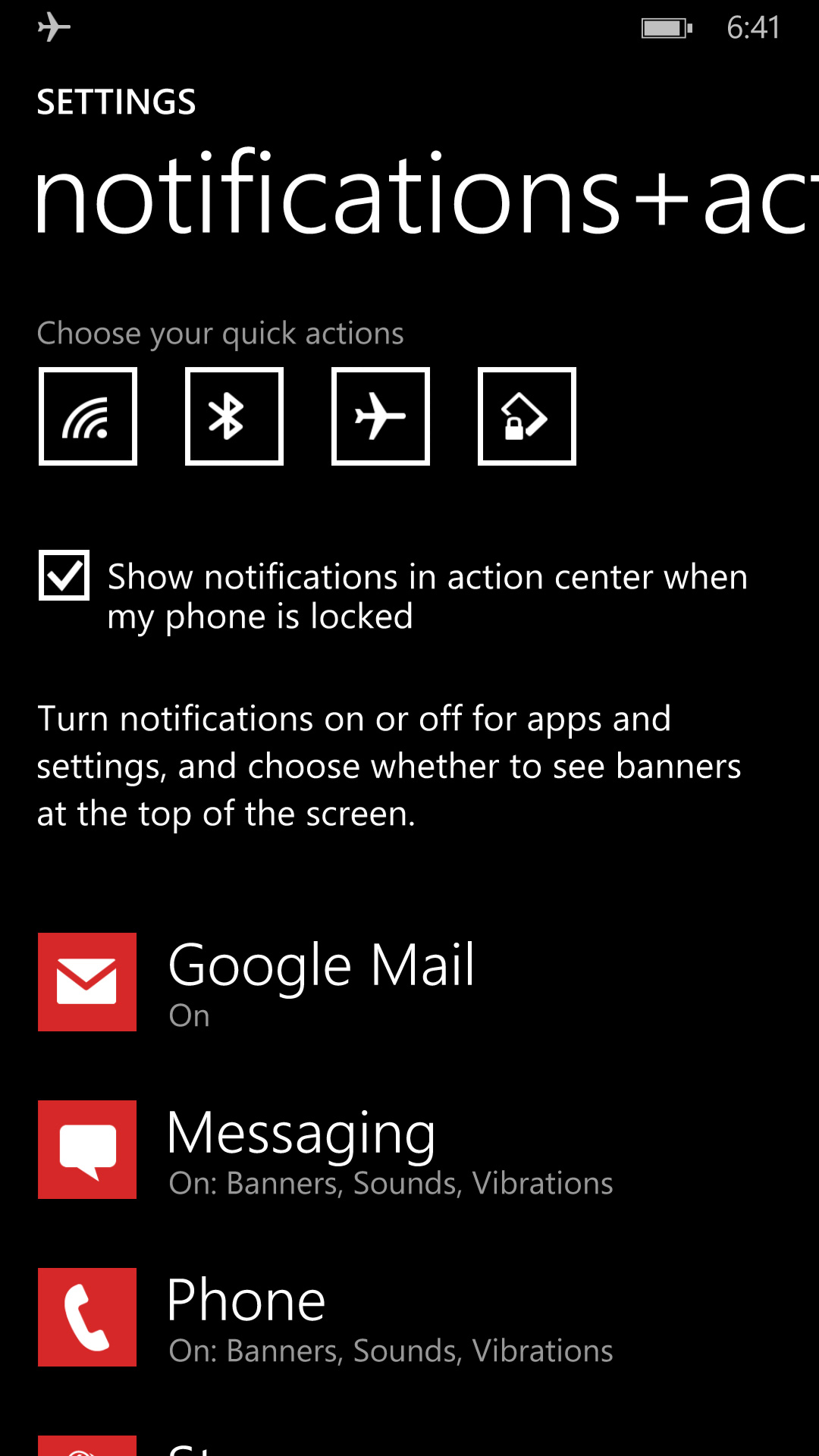
Action Center
With Windows Phone 8.1, all three of the major smartphone platforms now have some form of a unified notification hub, all accessed by pulling a shade down from the top of the screen. Microsoft’s attempt is called Action Center, and like most aspects of Windows Phone it occupies a middle ground between Android and iOS.
Microsoft’s Action Center gives you direct access to four different shortcuts, the settings menu, and notifications from your apps. All aspects of Action Center are user definable. You can control what shortcuts appear at the top of the shade and you can choose what apps get to display their notifications.
 |
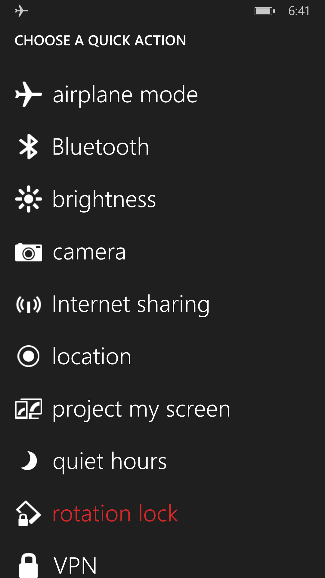 |
The user customizable launch shortcuts are awesome, although I would like to have one or two more shortcuts to avoid scrolling through the mess that is the Windows Phone settings page.
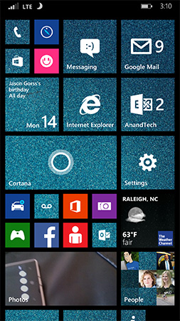
There’s a clear all button in Action Center that not only wipes the screen clean of all notifications, but also propagates the clearing effect down to live tiles as well. In the screenshot below you see I have two emails in my AnandTech account and nine in my Gmail account:
 |
 |
Clearing all notifications in Action Center clears the unread email counter on both live tiles.

The emails remain unread in the apps themselves, which is what you’d expect. If you want to just clear notifications for a single app, just swipe anywhere over the notifications for that app.
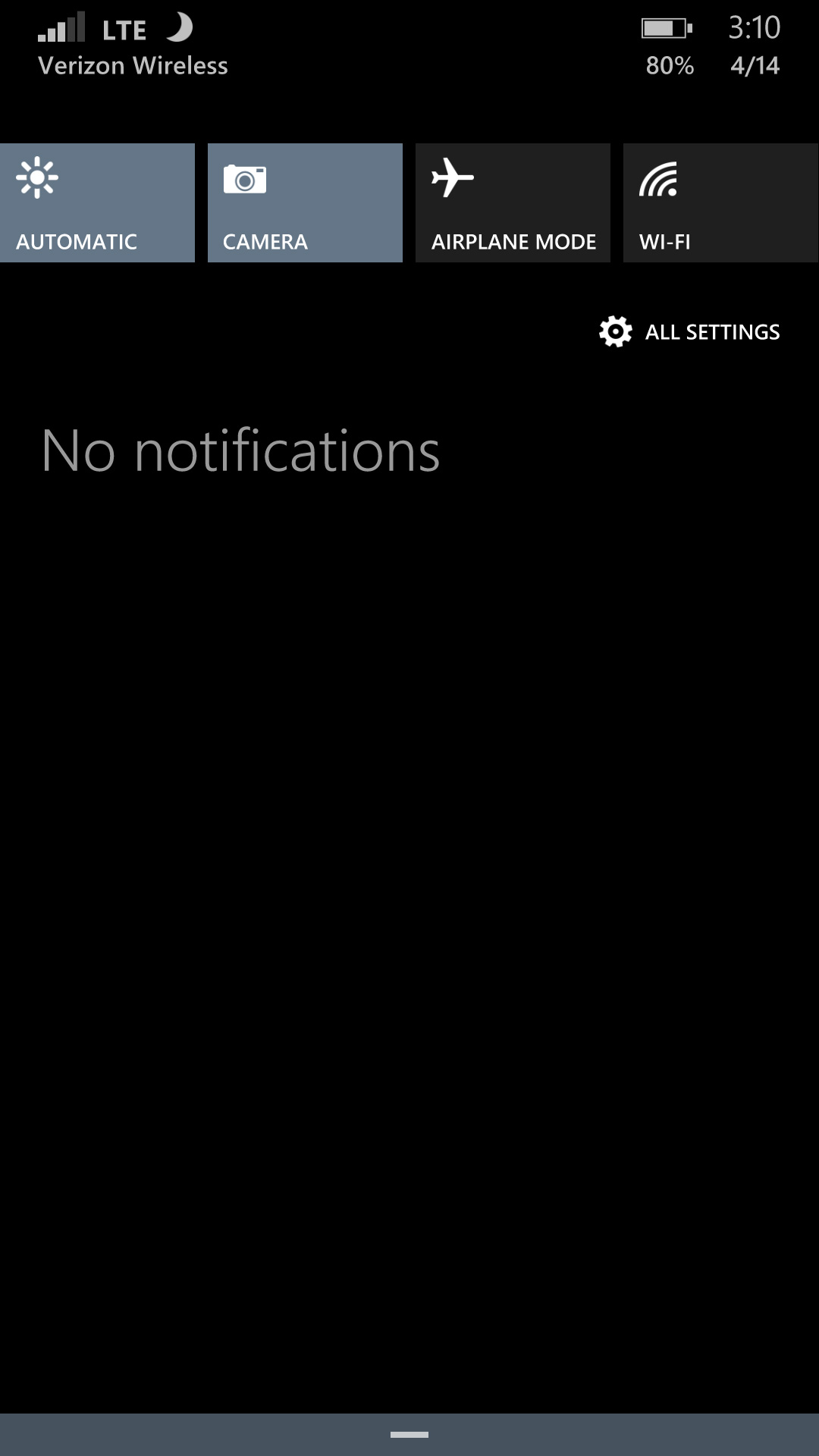
Pulling down on the Action Center also reveals a little more information in the Windows Phone status bar. You now get a battery percentage indicator, today’s date and the name of the cellular network you’re connected to. The status bar no longer automatically hides itself either. WiFi and cellular signal strength, notification (if applicable) and battery indicators are all permanently on display.
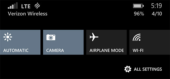
Microsoft also exposes individual volume controls for notifications (including the ringer) and media playback.
Cortana
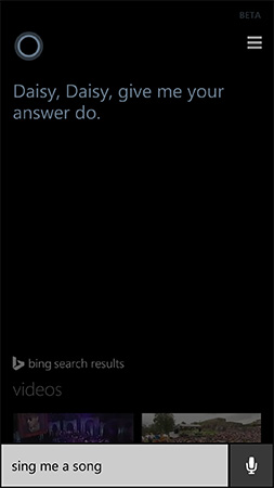
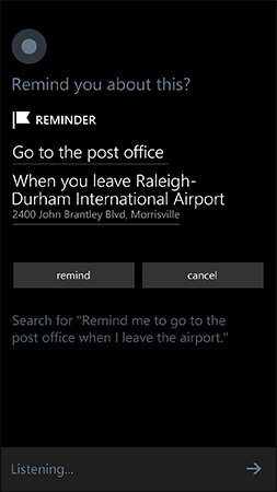
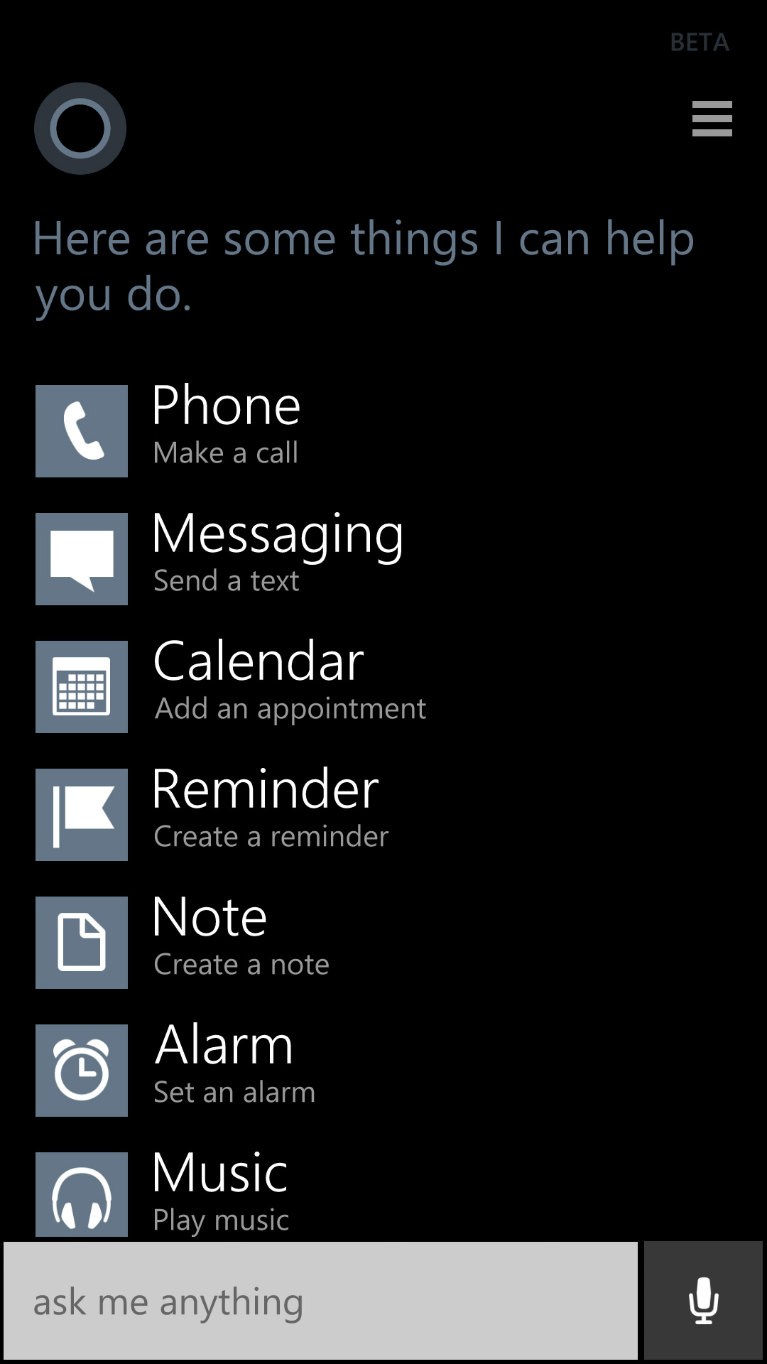
Apple has Siri, Google has Google Now, and Microsoft has Cortana. Pulled straight out of the Halo universe, Cortana ends up being a mix of Siri and Google Now. Cortana launches in beta with the same sort of basic voice assistance you get with Siri in iOS. Hitting the search button will take you to Cortana, while holding it down automatically puts her in listening mode. You can set reminders (including those based on location), create/move calendar events, ask about nearby shops/restaurants, place calls and dictate text messages.
 |
 |
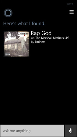
Anything that doesn’t fall into a category that guarantees a verbal response from Cortana triggers a Bing search. By default all Bing searches are aimed at the web but by swiping to the right you can redirect search towards your device itself. Phone search is universal and it’ll index everything from apps to text messages and emails. Cortana features integrated music recognition as well. Just tap the music icon and within a few seconds, if the track exists in the Xbox Music store it'll be identified.
 |
 |
Cortana’s basics work well thanks to Microsoft’s extremely accurate (and speedy) voice recognition. You don’t have to use voice to interact with Cortana, typing is supported as well.
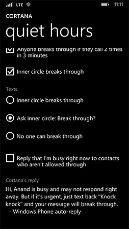
Cortana can prevent incoming notifications from surfacing while you sleep or are in a meeting using a feature called quiet hours. Similar to iOS6’s Do Not Disturb mode, Quiet Hours can be configured to allow certain contacts to break through. In an expansion over what iOS DND can do, Cortana can also instruct contacts who aren’t a part of your “inner circle” to text with a certain passphrase in order to break through quiet hours. Similarly, if any contact calls twice within a 3 minute period they’ll be exempted from quiet hours as well.
 |
 |
Unfortunately Cortana’s usefulness, much like Siri’s, can be quite limited. She’s great for settling alarms and creating meetings, but deeper natural language conversations just can’t happen yet. Cortana can save you from typing something, but that’s about the extent of her usefulness as a voice interaction tool.
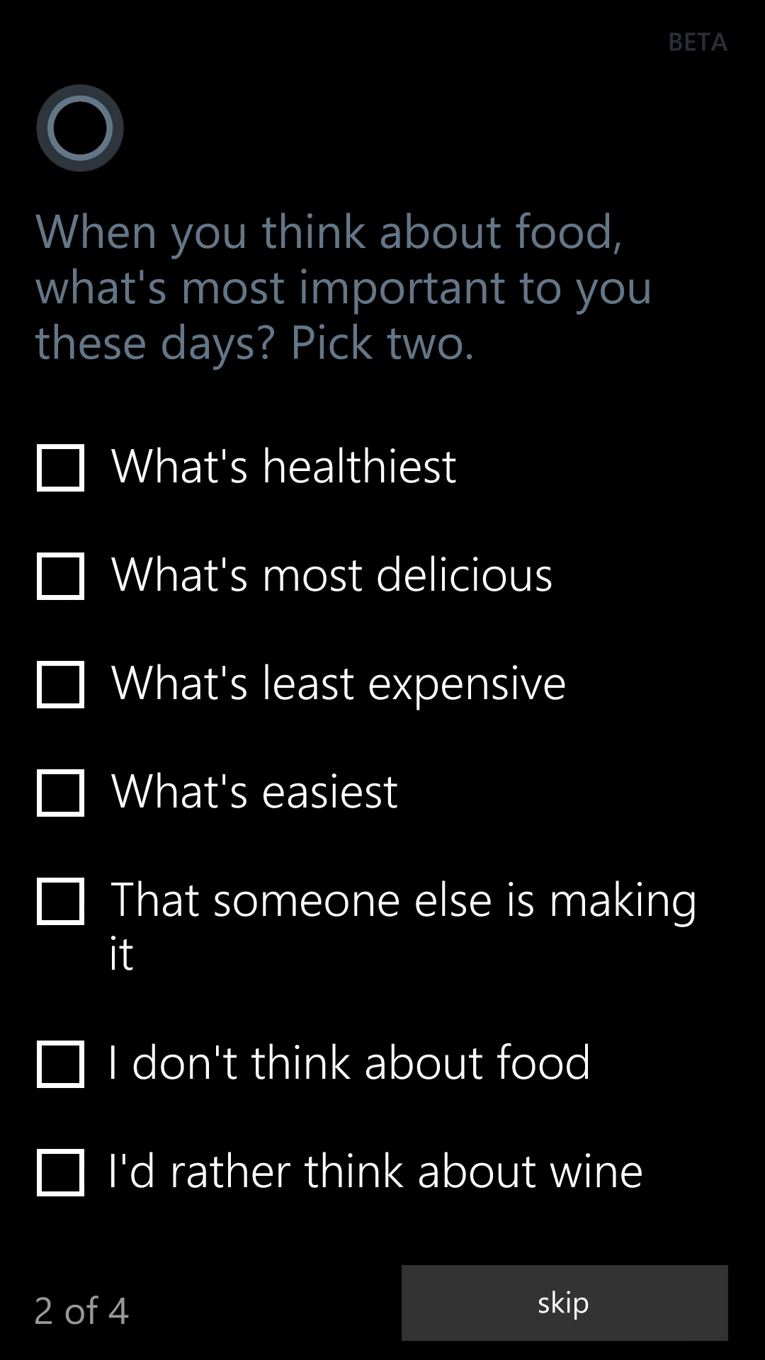
This is where Cortana’s notebook comes in handy. If you allow her to, Cortana will look at your emails and monitor your behavior to determine what information she should float up to your attention. The result is a Google Now like experience, where you get things like reminders of upcoming flights based on emails in your inbox, as well as estimated commute time based on where Cortana thinks you live and work. You can give Cortana hints about your interests and she’ll use Bing news to grab headlines you might want to read. I feel like this is ultimately where these virtual digital assistants will end up, but we’re still at a very early stage in their evolution.
 |
 |
 |
It’s interesting to note that Apple is now the only major smartphone player without a notebook/Google Now-like feature on its mobile platform. It’s no coincidence that the two players that do have that feature also derive revenue from selling advertising against user data. Once features like Cortana and Google Now get good enough, the obvious next step is to send highly targeted advertisements to the end user. It’s not necessarily a bad thing, but it’s clear that’s going to be the next major jump in advertising on mobile.


111 Comments
View All Comments
Hrel - Friday, April 18, 2014 - link
Get the dolphin browser. The other must have app for me, touchpal keyboard.vanster - Monday, April 21, 2014 - link
maybe just for some site not all site, yeah iphone and IE not doing what you mean, but i never try it on androidStormyParis - Monday, April 14, 2014 - link
I'm not sure text can be overused as a UI element. I'm a geek, and I'm sometimes baffled by icons or even worse gestures (which have 0 discoverability). Text is immediately obvious, visible... My non-geek relatives feel even more strongly about this:: it doesn't look good, but it is extremmely user-friendly, especially casual-user friendly.An example: if I want to send a text, do I click on this envelope, or that one ? "Text" vs "email" is way clearer.
StormyParis - Monday, April 14, 2014 - link
I didn't know only Android had that. Indeed, I use it all the time, whether with the basic browser or Opera.jeffkibuule - Monday, April 14, 2014 - link
Most people read words in their head before recognizing them, which makes them slower to process in the brain. Plus, compared to images, text is *obviously* language dependent. I often think the white text on black background motif is overdone since it makes apps look rather monotonous. Screens have color for a reason, color communicates a LOT more densely that text ever will.dorekk - Saturday, June 21, 2014 - link
"Most people read words in their head before recognizing them"That's not true. The way most people read is by recognizing whole-word shapes subconsciously.
nafhan - Tuesday, April 15, 2014 - link
That sounds like it would be more of an issue for people changing devices all the time. I just tap the mail icon that's always the same and always in the same spot on my primary home screen.Kenazo - Monday, April 14, 2014 - link
Next thing we'll be seeing a review of BlackBerry 10.2.1 on the Z30 (actually I wouldn't mind reading that....)creed3020 - Tuesday, April 15, 2014 - link
Would be nice to see some more coverage in that area but I'm doubtful that AT is going to even consider BB devices.For example the BB browser is excellent, it's get a score of 491 out of 555. I'd love to see how a Z30 compares in some of these benchmarks as conducted by a trusted source like AT.
cashkennedy - Wednesday, April 16, 2014 - link
The scores on the HTML5 benchmark are fairly useless because half of the score is for form elements and other silly coding that no one uses. Yes IE11 doesn't support a color input type that will come so handy.