Original Link: https://www.anandtech.com/show/8321/the-ios-8-review
The iOS 8 Review
by Brandon Chester on September 17, 2014 1:00 PM EST
As another year goes by we see a new iPhone and a new version of iOS to accompany it. We also got a preview of the Apple Watch which will be going on sale next year. Our reviews of both new iPhones will be coming soon, with a look at new iOS features specific to those devices like ApplePay. But with iOS 8 rolling out today to millions of existing iOS users across the iPad, iPhone, and iPod Touch, it's worth taking a look at what Apple is bringing to the users that are already in the iOS ecosystem.
This year brings the eighth iteration of Apple's mobile operating system, and with it comes features that users and developers have desired on iOS for many years. On the surface, iOS 8 seems like a minor update compared to the massive visual overhaul that iOS 7 brought. Indeed, there's no new design language, and no enormous changes to existing apps. But under the hood, with its features for application extensibility and continuity across the devices in Apple's ecosystem, it's a massive update that will be revealed over time as developers begin to take advantage of Apple's new features and APIs. If iOS 7 was the biggest update for users since the original launch of iOS and the iPhone 7 years ago, then iOS 8 is the biggest update for developers since the launch of iOS (at the time called iPhone OS) 2.0 and the App Store.
What's unique about iOS is the developer beta process that Apple runs in the time between announcement and release. While Google has taken a step into this area with the Android L developer preview, and Microsoft provides betas for Windows Phone 8.1, no mobile operating system operates on the 2 week beta schedule that iOS does. This cycle is interesting because it gives insight into Apple's development process on a smaller scale than looking at the changes from one major version of iOS to another. With iOS 7, developers became even more involved with this process as Apple began to really listen to the feedback given by people beta testing their software.
For example, the font weighting that we currently have is much heavier than what was originally demoed at WWDC back in 2013. It took many betas for Apple to eventually settle on what was a good balance between appearance and legibility. Likewise with iOS 8, I have observed many changes as Apple has gone through the different beta versions. The design of contact circles in the app switcher went through three or four different versions before Apple eventually settled on their current appearance. The buttons in Notification Center had a similar number of changes. Unfortunately, even when using iOS 8 betas on a daily basis it's difficult to keep track of all the changes made over time. What's most important to consumers is the end product though, and so with the exception of some features like SMS Relay, this review takes a look at the changes when making the jump from iOS 7.1.2 to iOS 8.0.
With that all said, lets dive into iOS 8, starting with the app that users use most.
Messages
According to Apple, Messages is now the most frequently used application on iOS. That's hardly a surprise considering the way most people use their smartphones (e.g. texting), so let's quickly discuss some of the changes. While Apple is fairly limited in terms of building on top of the SMS protocol, they have free reign to do whatever they wish with their iMessage platform. Because of that, feature additions for iMessage conversations and their accompanying design alterations are what make up most of the changes to Messages in iOS 8. That being said, there are a couple of additions that work for both iMessage and SMS conversations so it's best to talk about those first.
The core interface of Messages remains the same under iOS 8. Much like many other areas of the OS, the visual improvements are refinements to the interface rather than the drastic overhauls that we saw with iOS 7. For example, sending and receiving photos in a conversation features larger preview bubbles that stack atop one another when sent in succession. While this is a very minor design change, the resulting effect looks much nicer than on iOS 7 where each image was given a separate bubble with all the corners rounded off. This change also applies to videos sent in a conversation.
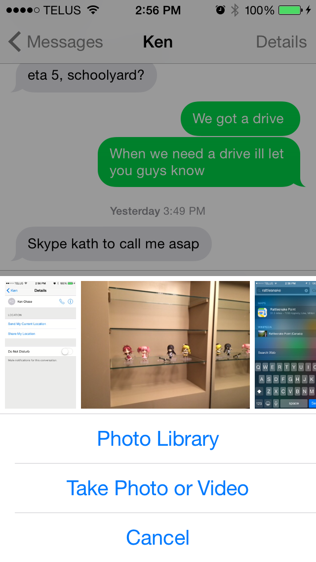
The photo picker is also greatly improved. Apple has added a scrollable list of recently taken pictures to make it easier to quickly share them. For older pictures the button to open up the Photos app interface is still present, as well as the button to take a new photo or video.
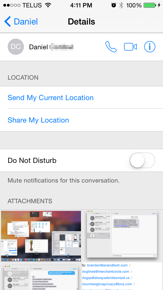
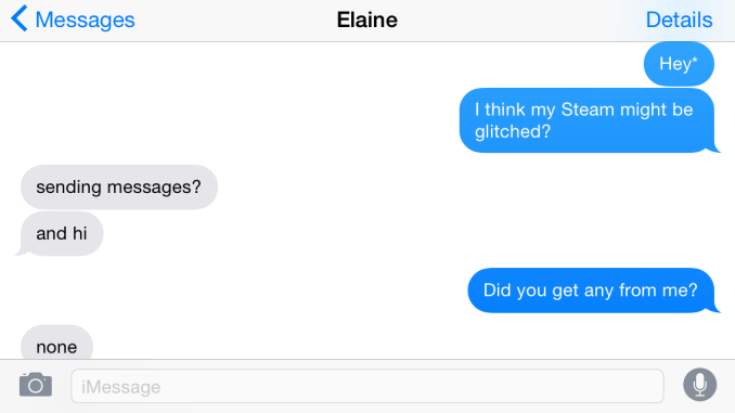
The contact button in the top right has been replaced with a details button. In addition to displaying buttons to call a person or view their full contact information, this new screen also has a switch to mute notifications for that conversation and a list of all media attachments that have been sent. For iMessage conversations there are also options to add users for group conversations, remove yourself from a group, assign a name to a group conversation, and to send location information in a vCard file with a message displaying a preview from the Apple Maps interface.
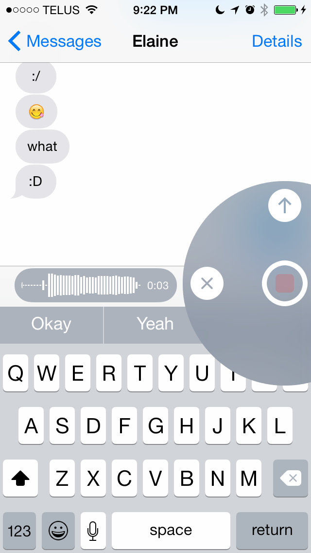
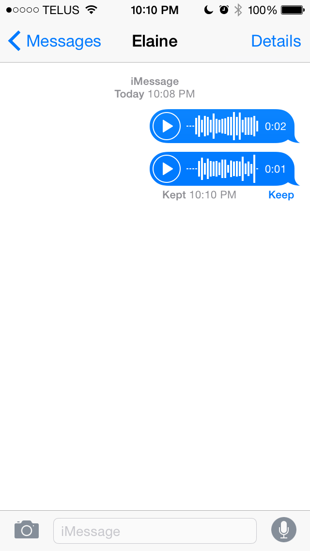
Things get more interesting once you take a look at what else Apple has done with iMessage. iMessage has the inherent advantage of being integrated into the stock Messages application. Apple is able to build in features to compete with other platforms while keeping the user in a familiar interface that includes all their SMS messages and iMessages. As you can see in the above screenshots, when the user has not typed anything into the input field the send button is replaced by a microphone. By holding down the microphone a user can record a voice message. The interface does feel a bit foreign at first, but essentially as long as the user is holding down the microphone button, the message will continue to record. If the user removes their finger while it is over the arrow it sends the voice clip instantly, while removing it when over the X deletes it; anywhere else gives the user the option to play back the clip before sending.
Holding down on the camera icon brings up the same sort of interface, although it works slightly differently than with recording audio clips. Once the user brings up the camera interface they no longer need to keep holding their finger down. Tapping the camera icon within the circle takes a photo, while holding down the red button takes a video recording. With the photo option there's no confirmation before the photo is sent so users who want to make sure they're sending a good photo should use the traditional button for taking photos and videos, which is accessed by tapping the camera icon in the Messages app rather than holding it down. One thing to note is that the photos taken with the new quick photo and video interface use a 16:9 sensor crop and scale, and have a resolution of 1920x1080.
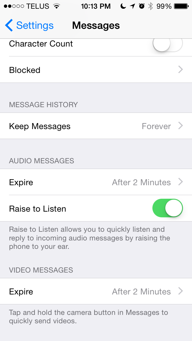
Since these features are meant to compete with other apps for sharing photos and videos like Snapchat, they wouldn't be complete without features for self deletion and for notifications when they're saved. By default, all audio and video messages sent will delete themselves after two minutes. Users can also set them to remain forever. In both cases, the user who sends the file and the users that receive it are given the option to watch/listen to the file and to keep it. Both actions send a notification to the sender, much like how Snapchat notifies users when someone takes a screenshot of a photo or video they send. Even after the message has deleted itself in the sender's conversation thread, if another user saved it there will be a notification and a time stamp to let the sender know.
As far as features go, iMessage and the Messages app are pretty much on par with every other messaging service. I do wish that Apple would add the ability to link accounts from other messaging services like you can with Messages on OS X. Having Messages become a central hub for Facebook, Hangouts, iMessage, and SMS would clear a number of applications off my phone. The risk that the dominance of the Messages app would crush the apps from other manufacturers may be exactly why Apple hasn't added such a feature yet.
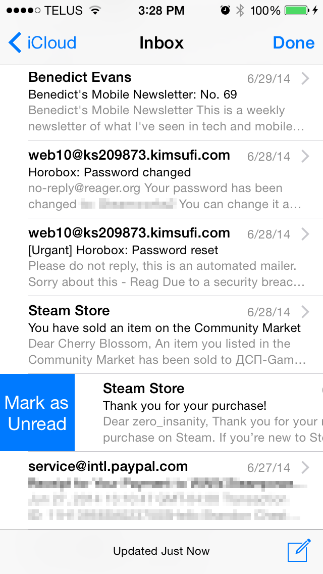
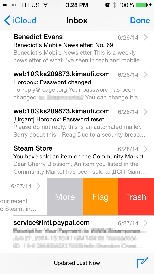
The Mail application receives some much needed usability improvements in iOS 8. Apple has implemented new swipe gestures for managing email. On iOS 7 swiping an email to the left would bring up an option to move the message to the trash as well as a menu labelled "More" that contained additional options like marking as unread, flagging, and moving to another mailbox. iOS 8 makes some of these options easier to access by giving them gestures rather than putting them all in a menu.
As you can see above, swiping an email to the right now brings up a button to mark as read/unread, and swiping to the left now contains the option to flag an email. Swiping to the very left edge of the screen now deletes an email without having to press the trash button. In practice this gesture is helpful but can sometimes result in unintentionally deleting an email, and so having an undo button show up temporarily after deleting an email like Google does with Gmail on Android would be a nice tweak to add to Apple's Mail app.
A simple swipe down moves the email draft to the bottom of the screen
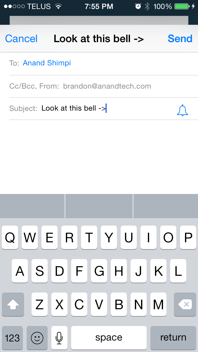
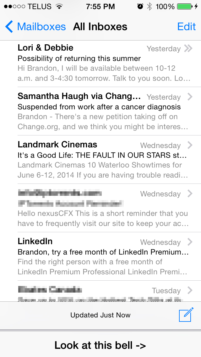
Apple has also included a new feature for thread specific email notifications. By default, iOS does not give individual notifications for emails that arrive. While this still remains the case on iOS 8, when composing an email an icon shaped like a bell will now appear in the subject field. The bell allows the user to enable notifications for a specific email thread without having to enable notifications for every single email that arrives. This can be useful when waiting for a reply to an important conversation, without having to also be notified about unimportant emails and spam that may also arrive in the interim.
Composing your own emails is also improved in iOS 8. The Mail app now renders over the device's wallpaper, much like the tabs in Safari and the Reminders app. Above you can see that email drafts are now cards that pop up in front of the mailbox, and they can be swiped down to grab or reference content from other emails without having to save and close the draft. This can be a real time-saver when you just want to quickly grab a photo from another email to insert into your own.
In the rightmost screenshot above you can see that Mail is also much smarter in iOS 8. The app can grab content from an email and give suggestions for things like new contacts and calendar appointments. As it stands, the email app on iOS 8 has most of the features I want in an email app. The one thing I would like to see added in the future is the app's ability to pick out information from emails extended to finding the unsubscribe link in spammy emails to be displayed at the top.
Recent Contacts
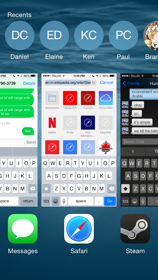
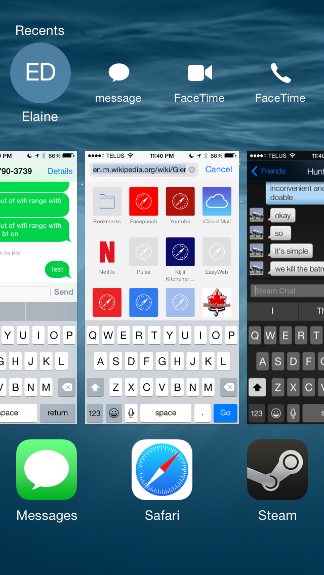
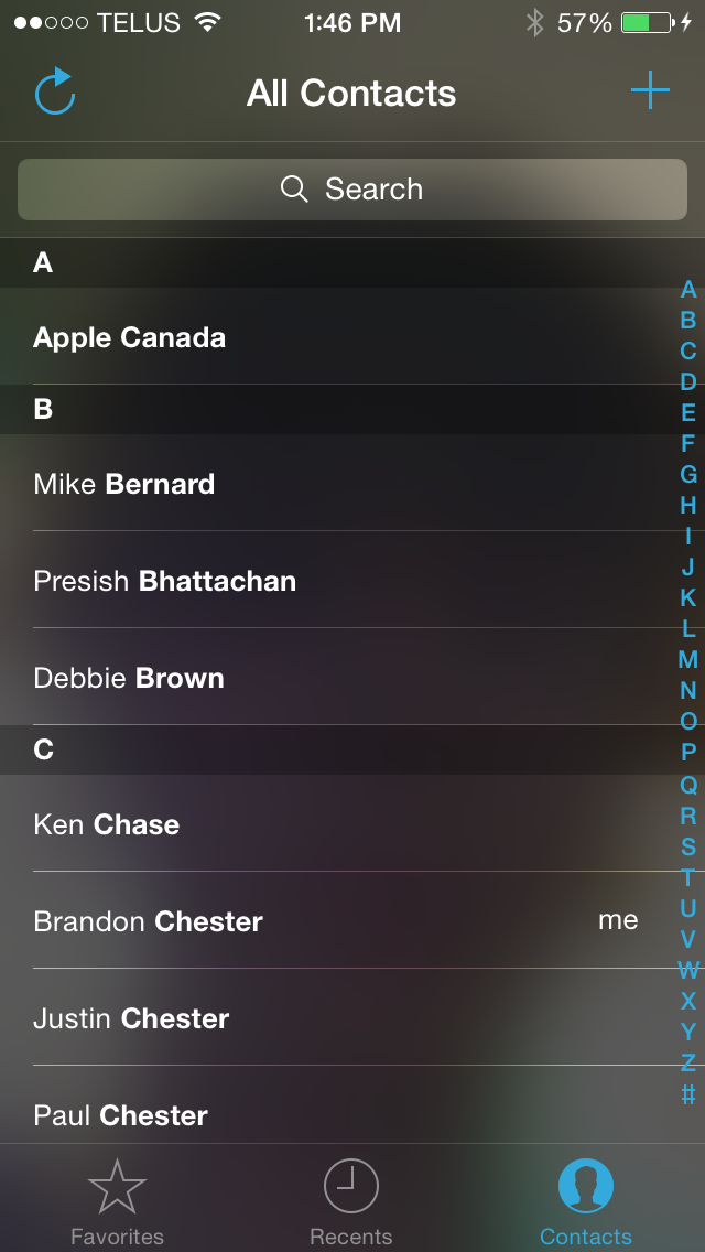
Recent Contacts, or "Recents" as Apple is calling them, is a new feature built into the iOS multitasking tray. Essentially the feature acts as a way to quickly contact people you talk to frequently. Optimally, each circle would have the person's contact photo, but in my case most just display the person's initials. Selecting someone's circle displays all the methods of contacting them that you have on file. If someone is frequently communicated with but not added to the iOS Contacts app, they will not appear in the Recents section of the multitasking tray.
Above you can see how the contacts are displayed and how clicking a list expands showing the different methods of communication. In theory this seems like a nice feature addition, but in practice I've had two issues, although both really stem from one main issue. The issue is that I don't find myself using the Recents list to contact people; I just go straight to the application I normally use to contact them. This is because every iOS app for communication has some form of built in contact list or history, so I can just as easily access the people I've recently contacted from within the app itself as I can using Recents. In my use case this makes the recent contacts list redundant, and I'm not sure how much use it will see with other iOS users. I've personally never felt a need for it.
Control Center
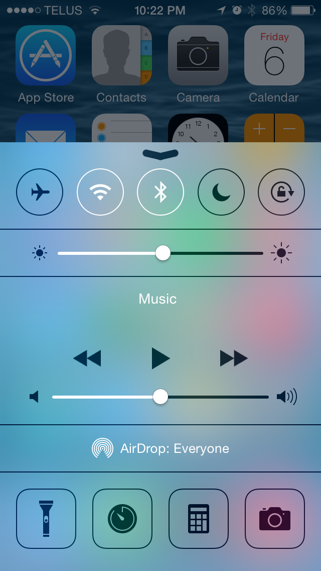
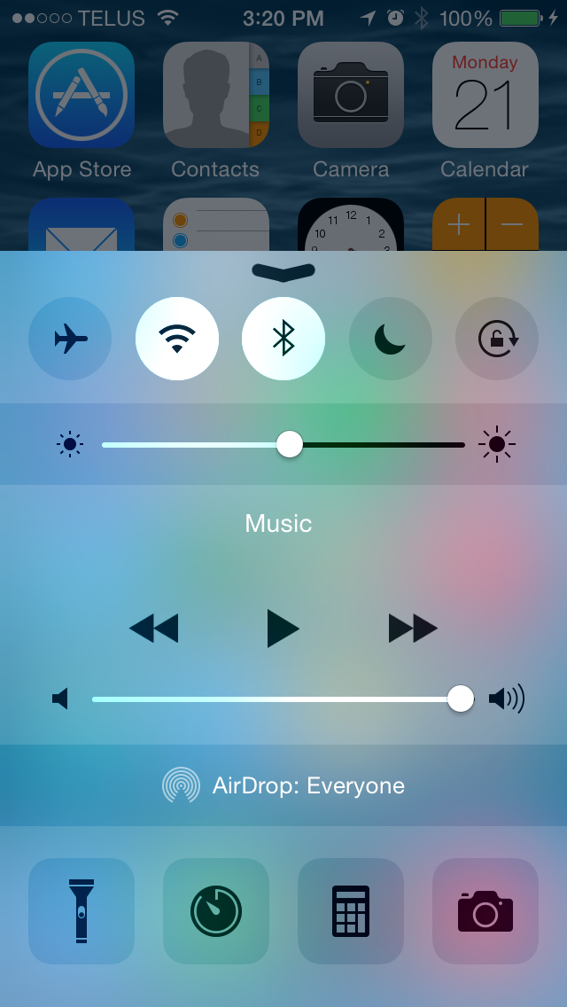
Control Center came into being with the release of iOS 7, and it's hard to imagine that before iOS 7 the only sort of toggles and controls that were accessible anywhere were the music controls and the rotation lock in the multitasking tray. Control Center was certainly a long time coming, but it's now a vital element to iOS. In iOS 8 Control Center is much of the same in terms of its functionality, with the same five fixed toggles for settings and four feature shortcuts. However, like many other parts of the operating system, Apple has refined the appearance by stripping out unnecessary design features and making the selection state of toggles much more apparent.
Control Center. iOS 7.1 on the left, iOS 8 on the right.
Immediately noticeable is the removal of the lines that defined the borders of buttons and separated the different sections of the application. The buttons and the brightness slider are now defined using a section with different opacity than the Control Center shade itself, with no black border lines to speak of. While design is certainly a matter of taste, the new design definitely fits in better with the overall appearance of Control Center and iOS in general by using different levels of opacity to indicate buttons and to separate information. Notification Center has used this type of design since the launch of iOS 7 so these changes also work toward making the design principles of iOS more consistent and unified.
The state of the five selection toggles is also improved due to the removal of the black borders. In iOS 7 the outline of the button and the icon in the middle would change from black to white to indicate that it was selected. Unfortunately this method had some issues with communicating which settings were on and which were off. If four toggles were enabled it may not have been immediately apparent if four were on and one was off, or vice versa; you almost had to look at the icons at the bottom for confirmation that the black border indicated an inactive icon. With the removal of the icon borders the state of the toggles is now communicated by changing the circle behind the icon to white. This white highlight contrasts heavily with all the other sections in Control Center and it's now readily apparent which toggles are enabled and which are not.
The brightness and volume sliders also receive a couple of minor changes. The previously opaque white section of the slider bar has been made slightly transparent and so it reacts to the icons and background beneath. In the screenshots above you can see that the blue and green from the icons and background shows on the slider. Setting brightness from Control Center has also been improved. Bringing up Control Center dims the brightness of the app beneath it. On iOS 7 this meant that it was difficult to gauge how bright your display would actually be during use was when changing brightness from Control Center as the application below was darker than it normally would be. On iOS 8 the dimming effect is removed when changing brightness using the slider in Control Center, eliminating this issue.
In the future, one thing I'd really like to see Apple add is the ability to modify the toggles and shortcuts in Control Center. I personally would much rather have a settings shortcut instead of the timer shortcut, and I would replace the airplane mode toggle with a toggle for personal hotspot if I could. Others might be happy with the default set of toggles, but there are definitely items that I use far more often than the current set.
Notification Center
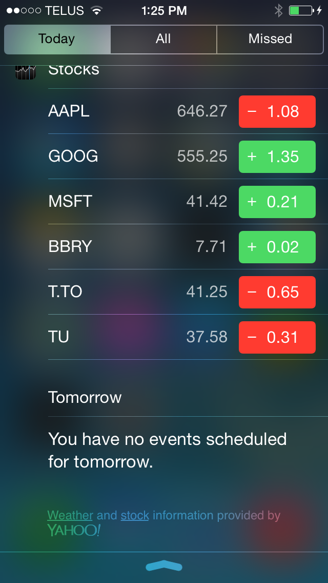
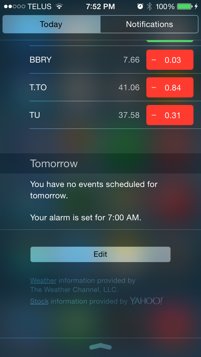
In terms of initial appearance, Notification Center in iOS 8 is very much the same as in iOS 7, but there are a couple of changes. The Today view tab has two major changes, both at the bottom. The first is that text for the source of weather and stock information now reflects Apple's move to getting weather forecasts from The Weather Channel rather than Yahoo. The second is the addition of an edit button that allows the user to manage widgets, which will be explained shortly.
Moving beyond the Today view you'll notice the removal of the Missed notifications section. It's likely that many users didn't utilize this tab often as if a user responds to a notification when using their device it shouldn't appear in Notification Center at all, which means that the normal Notifications tab fulfills the function of the Missed tab for the most part and made it redundant. Having the third tab also conflicts with Apple's new gesture to address individual notifications by swiping to the left to reply, flag, remove, etc.
Notification Center. iOS 7.1 on the left, iOS 8 on the right.
One doesn't normally associate the iOS Notification Center with widgets; however, since its introduction in iOS 5 it has included a widget of sorts for the Weather application as well as the Stocks application. In iOS 7 Apple expanded this to the Calendar and Reminders apps as part of the newly created Today view. With iOS 8 Apple is going even farther and allowing developers to create widgets for their applications that can appear in Notification Center. Widgets can be interacted with to perform actions or show relevant information, such as an Ebay widget that displays a list of items that a user has bid on and provides a button to increase the bid if another user has outbid them. Functionally they are very similar to widgets on Android; however, in terms of their implementation and place in the UI it is a very different approach and there are some pros and cons to both strategies.
With Android's widgets that appear on the homescreen they are immediately visible upon turning on your device. They can also be resized and arranged in different ways. However, this means that widgets will come in many shapes and sizes and adopt various visual styles. Android's widgets also require leaving an application and returning to the homescreen to view them. Widgets on iOS are always a defined width and must conform to the style of Notification Center. They can also be accessed in any app by simply pulling down the Notification Center shade from the top. However, they are not immediately visible after getting past the lock screen, and there's little room for customization aside from the vertical order they are displayed in.
For me personally, Apple's widget implementation wins because of the ability to pull down Notification Center in any app. Having to leave the app I'm working in on Android to see the weather widget on my homescreen introduces a bump in my workflow that is bothersome enough to make me to avoid using widgets on Android in general. That being said, having no ability to alter how much a widget displays means that some of them end up having considerable length, which forces you to scroll down to see widgets that you may have been able to fit onscreen had you been able to customize the widget sizes.
Actionable Notifications
The state of notifications on iOS wasn't always as good as it is today. At one time notifications were given by big alerts that popped up in the middle of the screen and blocked everything you were doing. My entry into the iOS world was an iPad 2 that ran iOS 4.3 for a short time. At the time, my phone was the original Samsung Galaxy S, and I could not understand why on iOS a notification needed to completely take over my screen until I dismissed it. On Android the notification simply displayed in the status bar.
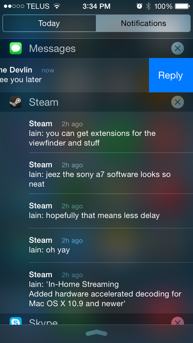
I knew many users who jailbroke their devices to get different notifications styles that didn't block the screen and allowed for replying right from the notification itself. Thankfully, Apple took inspiration from Google's implementation and introduced banner notifications and Notification Center in iOS 5. This addressed the interface issue but it didn't address the desire for the ability to respond to a notification without having to go into the app it was sent from. It's been a long time, but Apple has finally implemented Actionable Notifications in iOS 8.
With the above example from the Messages app you can see the new gesture for replying to messages directly from Notification Center by swiping left. When a banner notification is received at the top of the screen it can be pulled down to bring up the keyboard and open the interface for responding without leaving the current application. Both these gestures also work for notifications and banners received on the lock screen.
Developers can also specify custom actions. For example, pulling down on a banner notification from Facebook notifying you about a post you have been tagged in may display options to like or comment on that post. An application like Ebay could send notifications when you have been outbid, and pulling down on the notification could reveal a button to increase your bid on that item.
This is definitely one of my favorite additions in iOS 8. With the iPhone being far too small to do any sort of on-screen multitasking, any addition that Apple can make to enable performing actions in apps other than the one currently open are greatly welcomed.
Spotlight Search
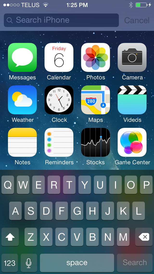
Apple brought Spotlight from OS X to iOS long ago with the release of iOS 3.0, but it has never really been one of my heavily used features. While I'll occasionally use it to find a text message sent long ago or to quickly find an important email, I never felt it offered much as a comprehensive search tool. The buttons to search the web or Wikipedia never felt convenient because navigating to them took longer than just opening Safari and doing a search.
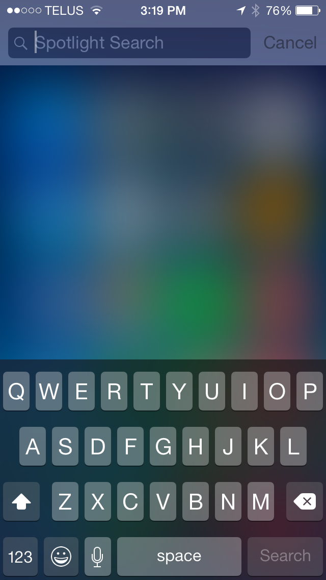
The other issue was the ever-present stutter when bringing up the Spotlight Search screen. It seemed like no matter how powerful the hardware in the iPhone and iPad got, Spotlight would always drop a few frames when bringing up the keyboard while the homescreen icons are still moving. In iOS 8 Apple has greatly improved the capabilities of Spotlight and eliminated the performance issues through a couple of design alterations.
Spotlight Search. iOS 7.1 on the left, iOS 8 on the right.
As you can see above, in iOS 8 the blurred overlay now appears before anything is typed into the search bar, which works to mask any possible stutter by blurring the icons while they are still moving. The other change is that the icons now only go down a certain amount before they stop and the keyboard comes up. The stutter with Spotlight Search would typically occur due the the keyboard coming up while the icons were still in motion and bouncing back to their original position. Because of this design change, Spotlight now feels much smoother and more in line with how the rest of the operating system performs. One other design change is that text in the search bar has also been altered to say "Spotlight Search" on all devices rather than just the word Search followed by the name of the device being used.
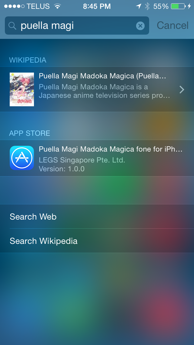
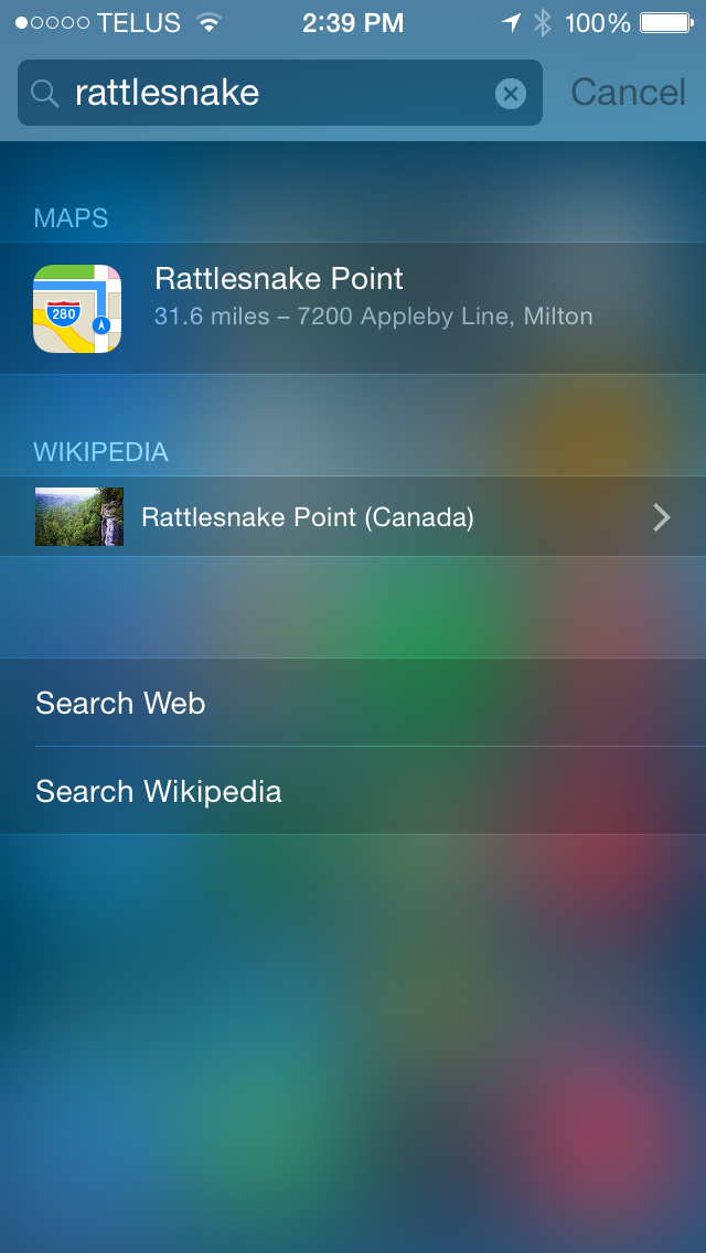
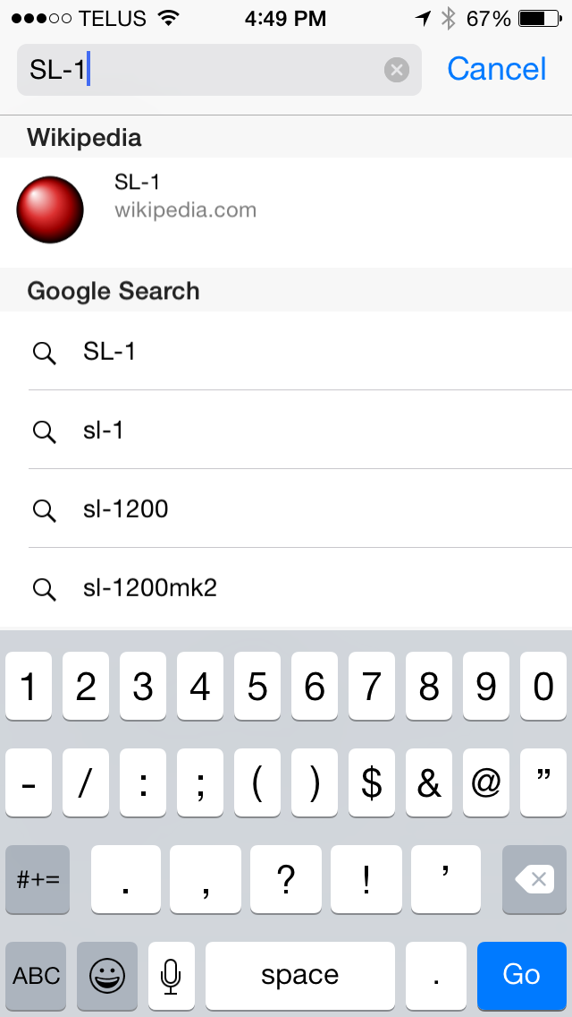
In terms of functionality, Spotlight is now very useful as a tool for searching more than just the content stored on a device. It now grabs information from various sources on the web and gives suggestions for what you may be searching for. Searching for apps and media can bring up links to Wikipedia pages and content available for purchase on the iTunes Store. If a movie is playing in nearby theaters, Spotlight will display showtimes right in the search result. Doing a search for a location or a business brings up results like Apple Maps information, Wikipedia entries, and official web pages in the case of businesses. These Spotlight suggestions have also been integrated into the search bar in Safari, which I've found to be really helpful when all I want is to get to a Wikipedia page without having to deal with search engine results.
Camera
iOS 8 puts a lot of focus into improving the camera and photo editing experiences on iOS. Earlier this year we reported on Apple's improvements to the iOS camera APIs that Apple had talked about at WWDC. For the full rundown of the changes Apple has made you should take a look at that article. A basic summary is that Apple has exposed almost every camera option imaginable for developers to use. The caveat comes with the last part of that statement.
While iOS brings many new possibilities for third party camera apps, Apple has always tried to provide a good shooting experience in the stock Camera app with minimal settings to play with. Nonetheless, Apple has still made some improvements to the stock Camera application and very significant improvements to the editing options in the Photos app. However, the improvements to editing come with a cost that I'll discuss later on.
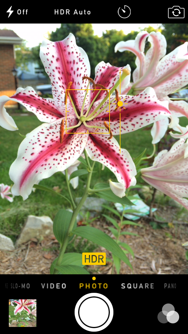
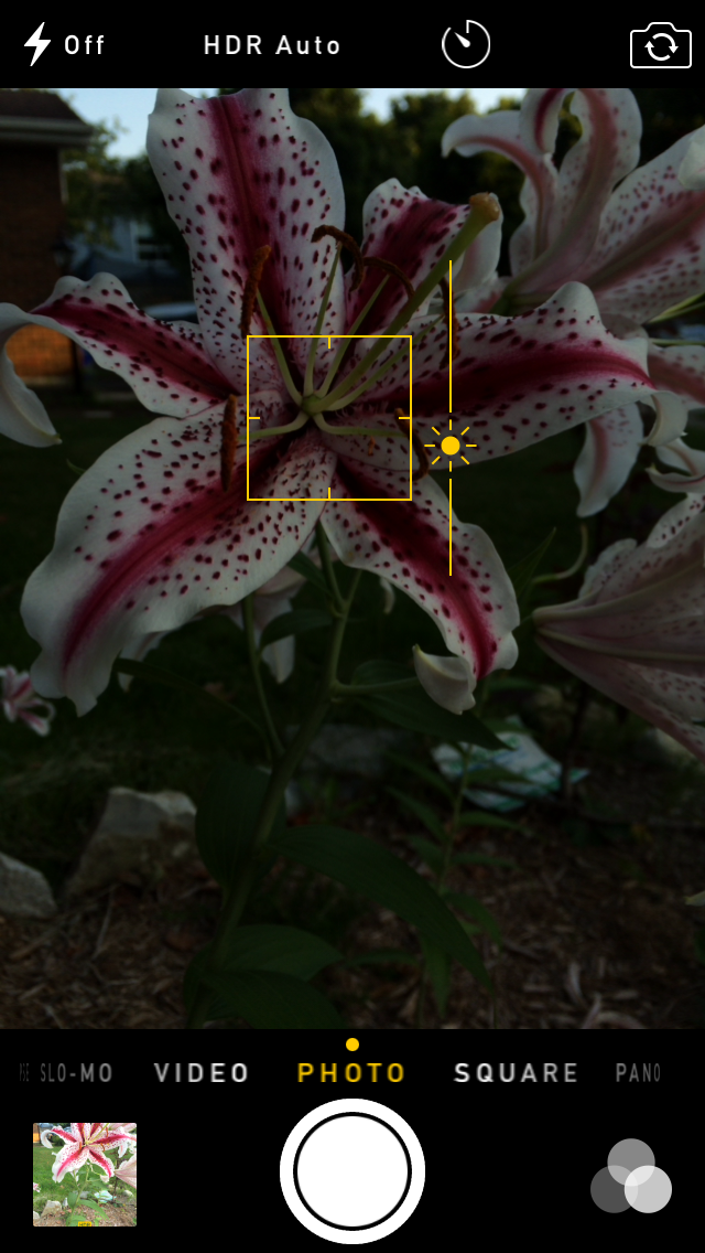
As you can see above, Apple has introduced a slider for controlling image exposure. To invoke this feature a user must tap to focus on a specific area and then slide their finger up or down on the viewfinder to move the position of the sun on the slider. The exposure control does not work when using the camera's autofocus.
Under the hood it seems that Apple's algorithm alters exposure primarily by changing the ISO value. When the ISO hits its upper or lower bound it then resorts to increasing or reducing the shutter speed. It makes sense for Apple to implement the setting in this way as reducing the ISO when aiming for a darker exposure reduces image noise, and avoiding longer shutter times for brighter exposures reduces the chance of shaky or blurry images which can be especially problematic on the iPhones (other than the 6 Plus) which lack optical image stabilization.
Apple has also implemented a shutter timer and a time-lapse capture mode. The shutter timer is fairly self explanatory; it lets the user set a 3 or 10 second delay before the camera takes a photo. The LED flash will blink along with the timer, and the app will take a 10 photo burst shot in case one of the subjects in the photo blinks. The time-lapse feature requires a bit more explanation. Time-lapse captures a photo every two seconds and creates a 30fps video file using the captured photos. This allows for videos of things that occur over long periods of time such as clouds moving, condensing one minute of photos into one second of video.
It's definitely an interesting effect, though it should be noted that the photos are taken at a 1920x1080 crop for a more standard video resolution. Support for 3840x2160 recording would be nice but the iPhone's 4:3 8MP sensor isn't capable of capturing images at that resolution. The other thing to make note of is that because the time-lapse mode is capturing photos, the resulting video file has no audio track, but that's not really a problem with this sort of content.
One final thing to mention is that those who use their iPad for photography will be happy to hear that both the time-lapse and shutter timer features have made their way into the iPad Camera app.
Photos
The Photos app receives a number of improvements in iOS 8. The changes can be divided into two categories. One is the improvements to photo management and integration with iCloud, and the other is a huge improvement in the capabilities of the Photos app's built-in photo editing functions.
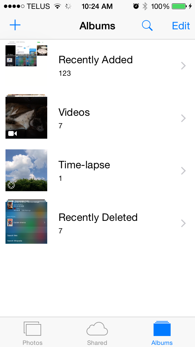
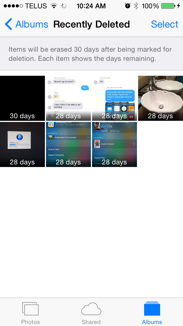
The album view receives several new sections. The camera roll no longer exists, having been replaced by the new Recently Added section. Given that the camera roll had become the storage section for every saved photo, it wasn't much of a camera roll anyway. Two new albums have been added to store Time-lapse videos and Recently Deleted photos. On previous versions of iOS, a photo or video could not be recovered once it was deleted; on iOS 8 deleting a photo sends it to the Recently Deleted album where it will actually be deleted from the phone after 30 days. Deleting it again from within the Recently Deleted album deletes it permanently.
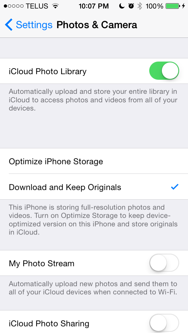
New options have also been added to the Photos & Camera section of the Settings application. With all the new iCloud related features in iOS 8 comes a new option to have all photos kept in iCloud, with the most recently viewed or accessed photos also cached locally. This may sound a lot like Photo Stream to some users so it's worth explaining how they differ. Photo Stream is not a place where photos can be kept. Photo Stream keeps photos that are taken for 30 days and pushes them to any devices connected to that Photo Stream. Once those 30 days are over the photo is deleted from iCloud and any newly connected device will not receive it. The iCloud Photo Library acts as a permanent storage for photos that can always be accessed.
Because it's rare that a person will leave a device unconnected to the internet to sync with Photo Stream for more than a month, the choice between using Photo Stream and iCloud Photo Library really becomes a question of whether the user wants photos to be stored locally or in the cloud. Photo Stream does not count against the 5GB of iCloud storage given free to every user but the photos must be kept on a device's local storage to be preserved. With iCloud Photo Library every photo is kept safely in the cloud but each photo stored takes up space in iCloud.
For users who take lots of photos it may be best to use Photo Stream and to keep photos backed up to a computer or another cloud service with more free storage. For users willing to spend extra money, purchasing additional space in iCloud is also an option. Users can also enable both features simultaneously but this results in each photo using storage in both iCloud and on all devices, which isn't an efficient use of space.
This brings us to a point that's more about iCloud in general. The 5GB of free storage for iCloud is quite small compared to what Apple's competitors in this space are offering. Both Google Drive and Microsoft OneDrive offer users 15GB of storage for free. I suspect that with Apple continuing to build out their iCloud service that we'll see the 5GB limit increased, or features like iCloud backups will be changed to no longer be counted as space used.
Update: I've received reports from users that iCloud Photo Library is not included in the final release of iOS 8. For users that have the Yosemite developer preview or consumer preview installed and signed into iCloud, the iCloud Photo Library option will be on your device. For all other users, it will be introduced in a later iOS update in October as a beta feature. Thank you to nvmarino in the comments for figuring that out.
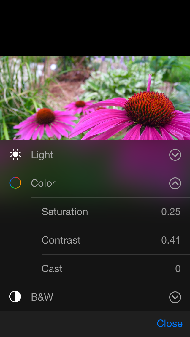
Editing receives some great new tools as well. iOS 7 didn't have much in the way of editing beyond an auto-enhance function, filters, and cropping. iOS 8 brings a new rotation feature to the cropping menu for fixing skewed photos, new color and light controls, and the ability to include custom filters from third party applications.
Above you can see the new interface for rotating photos and the menu for adjusting image color settings. When selecting a setting to alter, the application provides the user with a simple slider that adjusts various settings like saturation, contrast, brightness, etc. These separate settings can also be changed manually by the user if they want to go beyond the simplified slider interface. All edits made in the Photos app are non-destructive, and the image can be reverted to its original look at any time. The new editing features are a nice addition to the Photos app, but as I stated earlier there's a cost to these changes:
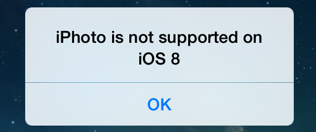
These changes mark the death of iPhoto for iOS. The problem with this is that the new features in the Photos app don't provide anywhere near the number of editing options that were available in iPhoto. Some users may feel that this is another step in a trend of Apple snubbing power users, much like when the 2013 update for Apple's iWork suite removed AppleScript support and various features in an attempt to have parity between the iOS and OS X applications. Many of those features were eventually re-added over time, but with Photos being a stock iOS application it can only receive improvements as part of iOS software updates. It will be interesting to see what Apple does in this situation. It's possible that, much like their retirement of Aperture and work to help users migrate to Adobe's Lightroom software, Apple may feel that other developers are better suited to create comprehensive photo editing applications for iOS.
iCloud
iCloud is somewhat difficult to talk about due to the fact that many of the improvements require developer implementation. The first part of the iCloud story is iCloud Drive. While I have used iCloud Drive, I cannot show any screenshots of it as they would have to be from the section in the Finder application on the beta version of OS X Yosemite, and that remains under an NDA. However, the above screenshot from Apple's website is how iCloud Drive and the document picker appear on iOS and OS X. iCloud Drive will also be accessible on Windows via Apple's iCloud.com website.
iOS was designed without a user accessible filesystem, and each application has traditionally had its own files private and inaccessible by other applications. This is great from a simplicity and security standpoint, but it makes working on files in multiple applications effectively impossible. iCloud Drive changes this and provides a potentially massive increase in productivity abilities on iOS devices. In a way, iCloud Drive is a service to compete with all the cloud storage services offered by other companies. Files can be put into it and organized in any way the user likes. But in another way, iCloud Drive is the repository for the files from all iCloud enabled applications across iOS and OS X.
Applications that use iCloud for file storage can now mark their application file container as public. This means that files created in that application will be accessible to other applications that provide an option to choose iCloud Drive as a file source. It should now be possible to start a document in Notability and then open it in Pages to continue working on it. Any changes made in Pages are saved back to the original document in Notability's app container, and the file is also continually visible in Pages alongside all the other documents created in the app. This is a huge step forward for productivity on iOS. No longer are users stuck with the tools provided in the application they initially created a document in.
iCloud Drive and the iCloud document picker rely heavily on developer support and it will be interesting to see if and when developers decide to start implementing it in their applications. Support for iCloud among third party applications isn't massive, with many past difficulties implementing iCloud and Core Data scaring off developers despite the improvements made in iOS 6 and 7. I personally believe that the functionality and inter-app communication offered by iCloud Drive will be too big for developers to ignore going into the future.
SMS and Phone Call Relay
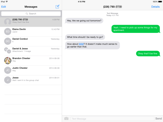
When I was an iPad user I thought it was very cool that iMessages directed at my iPhone's phone number were able to be pushed to my iPad and could be sent from the iPad using that same phone number. Unfortunately, the experience wasn't as good when communicating with the many people I know who don't have an Apple device or just don't use iMessage. Being able to have SMS messages pushed between all my devices has been a feature I've wanted for quite some time, and with iOS 8 that finally becomes a reality. SMS Relay will sync SMS messages between all of a user's iOS and OS X devices. There's just one catch: it won't be available until October and so it will likely launch alongside OS X Yosemite. My impressions below are from the iOS 8 beta.
As you can see above, SMS messages are being pushed to an iPad. The most interesting thing about Apple's SMS Relay is the requirements for it to work. When it was demoed at WWDC I assumed that it would require some sort of connection via Bluetooth 4.0 or an 802.11 WiFi link. This is not the case. The only requirement for using SMS Relay is to have all devices connected to the internet on any network, and to be logged into iCloud and the Messages app on those devices.
This means that a text message sent from an iPhone while travelling will appear on an iMac sitting at home. Apple likely avoided any implementation that involved a direct connection between devices to prevent issues with syncing. If SMS Relay required devices to be in contact over Bluetooth or WiFi, any SMS messages sent or received when the user was away from their other devices would not sync and there would be large gaps in the SMS conversations on other devices.
Apple has not documented how their SMS Relay works but my best guess is that it utilizes iMessage to send the messages from the iPhone to the iPad or Mac, displaying them with a green bubble rather than a blue one. If this is the case, SMS messages sent from iPads and Macs would then send a silent iMessage to the iPhone, which would then send out an SMS to the receiving device.
Phone calls can also be made and answered on an iPad or a Mac. Unlike SMS, this feature does require both devices to be on the same WiFi network.
SMS Relay is definitely my favorite feature in iOS 8. Not everyone has an Apple device and therefore not everyone has iMessage. The ability to have SMS messages synced just like iMessages is one that I've wanted for a very long time and it's exciting to know it will be here soon.
Handoff
Handoff is a new feature in iOS 8 and the soon to be released OS X Yosemite that allows you to begin a task on one device and continue it on another. It works by detecting nearby devices that are logged into the same iCloud account using Bluetooth LE, and allowing the user to transition between the same applications on different devices. On OS X the icon for an application appears as an additional section of the dock, and on iOS it appears either on the lock screen or the app switcher depending on if the device is unlocked. Currently Handoff works with the following list of Apple's applications:
- Safari
- Contacts
- Calendar
- Reminders
- Maps
- Messages
- Pages
- Numbers
- Keynote
Handoff can also work between websites and apps, and Apple is providing APIs for developers to implement Handoff in their applications. An example would be Facebook implementing Handoff so a user could transition between the Facebook website on their Mac and the Facebook app on their iPhone or iPad.
Handoff and continuity in general is a key part of Apple's strategy for providing a seamless experience across all their devices, and it's very different from the strategy that Microsoft is employing. With Windows Phone 8 and Windows 8, Microsoft is trying to create an interface and applications that run on all Windows devices. I don't agree with such an approach because inevitably you will end up with parts of the software that don't fit in with the device being used.
The most common area where I see this arise is complaints that the Windows 8 Start Screen feels out of place on traditional devices and seems designed with touchscreen laptops and tablets in mind. Apple is creating a unified experience across all their devices by allowing them to work together and employing similar design conventions, but keeping OS X and iOS separate and running on the devices where they make sense. Which approach is better is obviously a matter of opinion, but given that the adoption of Windows 8 was only 14% as of Q2 2014 I think Microsoft's solution isn't resonating with consumers.
Third generation iPad users should be aware that much like Airdrop, they are excluded from Handoff features despite the Broadcom BCM4330 sporting Bluetooth 4.0. I don't know the reason why Handoff isn't supported on the iPad 3 as it seems capable from a hardware standpoint. When Airdrop didn't come to it with the release of iOS 7 some users speculated that the reason was the single stream 802.11n WiFi. I don't really believe this is the case, as jailbreak solutions to enable Airdrop on the iPad 3 work perfectly in my experience. I would really like to know Apple's official reason behind the exclusion of both Handoff and Airdrop on the iPad 3, but right now it seems more of a decision to artificially limit for the iPad 3 than any inherent hardware deficiency.
Keyboard
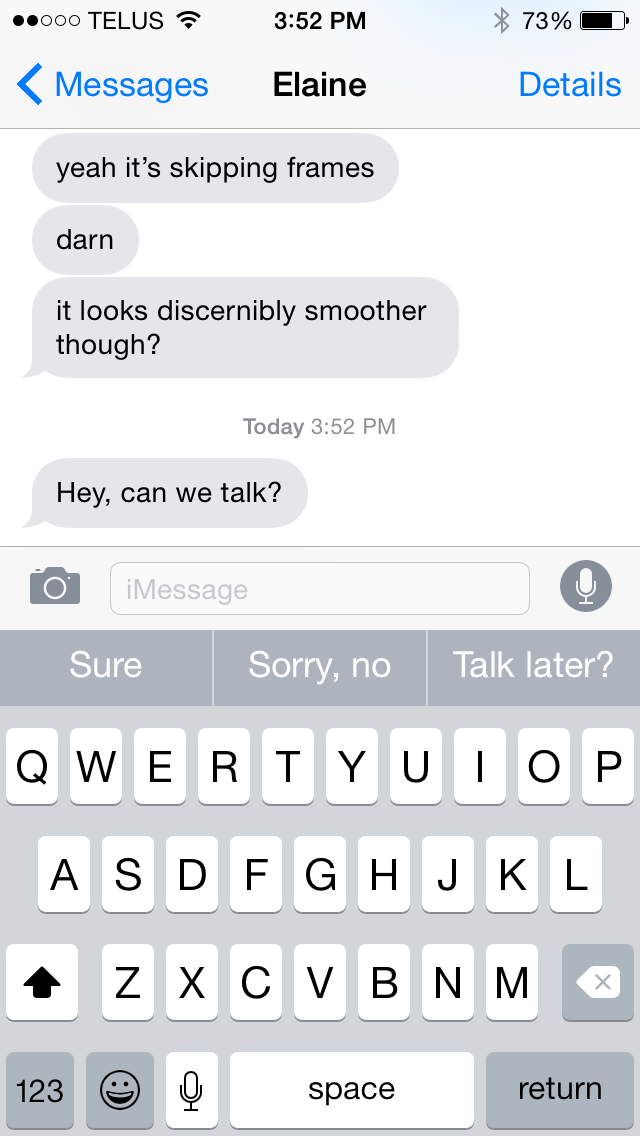
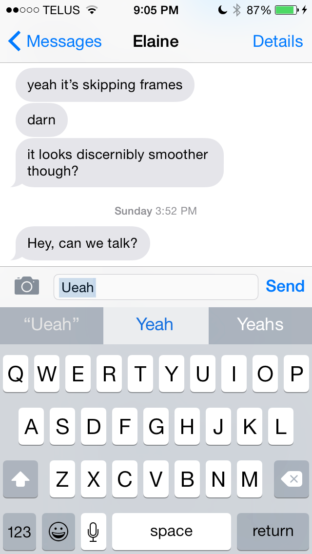
For a long time the keyboard experience on iOS remained the same as it was when the original iPhone launched all the way back in 2007. With iOS 7 the keyboard received a visual overhaul, but the layout and correction functions remained the same. This has been a prominent criticism of the stock iOS keyboard over the years, with the single suggestion implementation of iOS's autocorrect seeming archaic compared to other smartphone keyboards. Apple addresses this with two solutions in iOS 8. The first is QuickType, Apple's new suggestion and correction feature.
The above two images will be instantly recognizable to anyone who has used the Google keyboard for Android, or third party keyboards like SwiftKey. The way quicktype functions is nearly identical to the suggestion feature on Google's and other smartphone keyboards. A bar above the keyboard gives three suggestions as the user types, with the box turning white and the text turning blue to indicate that a typed word will be autocorrected.
QuickType is not Apple's only solution to complaints about the iOS keyboard. While it offers a better method of correcting typos, the keyboard itself is still functionally identical to its predecessor. Because Apple can't possibly hope to address every single user's desire for keyboard input on their own, they have finally included the long requested ability to use third party keyboards on iOS 8. How keyboards and other extensibility options are implemented is discussed in the next section, but there are a couple of things specific to third party keyboards that should be noted.
The first is that third party keyboards will be system wide; there's no need for developers to implement them in their applications on their own. The second, and possibly most important, is that third party keyboards run in an extremely restrictive sandbox by default. They don't have access to the information from other applications on the phone, or access to WiFi or cellular networks. However, third party keyboards can ask for access to typed words and networking to do prediction, but for privacy and security reasons that is never something that can be enabled by default. I recently took a look at the beta version of SwiftKey for iOS 8, and you can read my impressions about the actual third party keyboard experience on iOS there.
One last point about the stock keyboard. The shift key is the same as on iOS 7.1. Users (like myself) that are frustrated with its new design as of iOS 7.1 are out of luck. A return to the iOS 7 style of having the shift key arrow as an outline when it is turned off is my biggest recommendation for improving the iOS keyboard from its current state.
Extensibility
When the iPhone was first launched, iOS wasn't even designed to support third party applications. Apple's original stated intent was that users would use web apps through Safari. Obviously things turned out quite differently with the introduction of iOS 2.0 and the App Store. However, iOS itself was never conceived with a massive library of native applications in mind. Because of that, and because of security reasons, each app has traditionally been completely segregated from all others.
Applications on iOS have never really had a proper way of sharing data and integrating with each other, with the exception of the select few services that Apple has built into iOS over the years like Facebook and Twitter. This has always posed a problem with working on files across multiple apps. It also greatly limits the ability to share content through other applications, as the iOS Share Sheet is limited to the services built into iOS unless a developer adds support for other applications on their own.
Extensibility changes this. Extensibility in iOS 8 is really an umbrella term for new features like share extensions, action extensions, custom photo filters, and document provider extensions. Some of these have been covered at other points in this review, and the parts being focused on here are Action Extensions and Share Extensions. Much like the improvements to iCloud, these are additions that are hard to talk about now as they are yet to be implemented by developers. This is just a small overview of things to come once developers start using the new tools given to them.
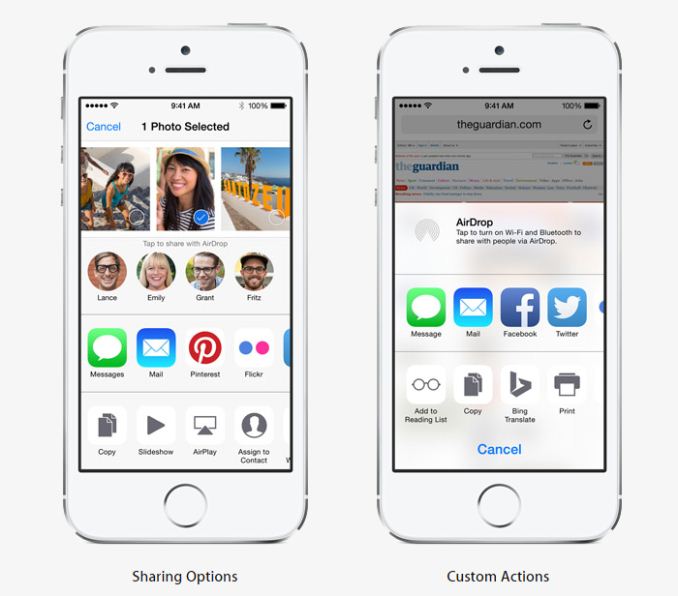
Action Extensions do what their name implies, they perform actions that extend the functions of applications. An example would be an extension for the Bing Translate app shown at WWDC. Rather than Apple having to work with Microsoft to make translation with Bing a system wide feature, Microsoft can simply make an Action Extension and have it appear in the Share Sheet in any application.
Share Extensions also do what their name implies. They allow applications to put their own options for sharing in the system's Share Sheet. This is a massive improvement over the previous system that only included limited options and the small handful of services that Apple had integrated into the OS like Twitter and Facebook. Share Extensions are very similar in function to how Intents are able to share files and content between different apps on Android, and it addresses what has been a major iOS shortfall for years. The example Apple gave at WWDC was the ability to open the Pinterest app interface within Safari to share a photo.
iOS also has contextual awareness relating to extensions. Because the Share Sheet can only display four icons in each row, only the extensions that relate to what the user is doing will be shown. If the user is looking at the photos application the Share Sheet won't show an extension for text translation as it doesn't relate to the task at hand. Apple also allows the order extensions are displayed in to be customized so that frequently used extensions are always displayed in the Share Sheet without having to scroll.
One final part of extensibility that pertains to iPhone 5s users is that developers are now able to use Touch ID authentication in their applications to unlock passwords stored as keychain items. The fingerprint data itself is never shared with applications, only whether or not the fingerprint was successfully identified or not.
As I said above, the iOS security model has always used application sandboxing to prevent malicious access to information. With extensibility you may be wondering if Apple has had to compromise on security to enable these new features. Fortunately, the answer is no. With the way extensions work on iOS 8, the extension is part of its parent application's container. Extensions can only reach out to other applications by way of the operating system, which has various checks and balances to make sure things are being done in a safe and secure manner. I don't believe users should have any concerns about the security of their devices when upgrading to iOS 8.
Health
Talking about the Health app in iOS 8 is difficult. Much like extensibility, what Health enables depends greatly on developer support that doesn't exist yet with iOS 8 being newly released. What can be explained right now is how it will work and what features it offers beyond being a simple aggregator of a user's health information.
At its core, Apple's Health app is a hub for keeping track of the health information from several different apps and devices. It will be able to sync data with health applications from other developers that use Apple's HealthKit framework. Many of these applications rely on data input by the user, but applications that integrate with fitness devices like the Nike FuelBand can also automatically send information that the device tracks to the Health application.
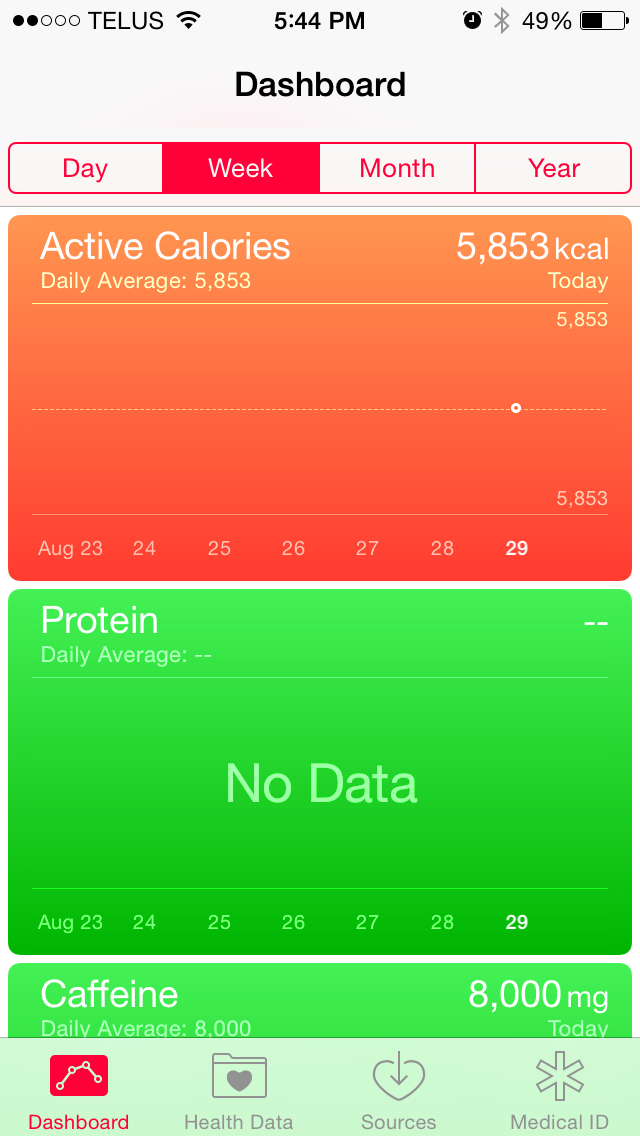
The Health app consists of four main screens. The dashboard is a user customizable section that displays cards with information about various health statistics. These cards display the information in a graph, with buttons at the top of the page to change the scale of the graph's horizontal axis.
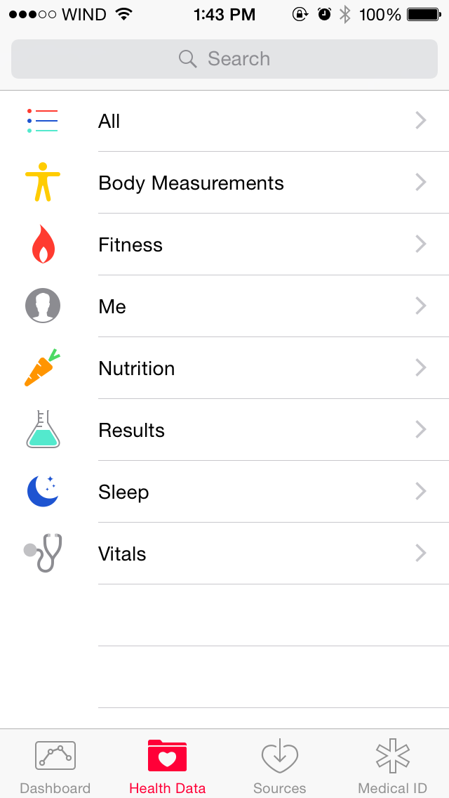
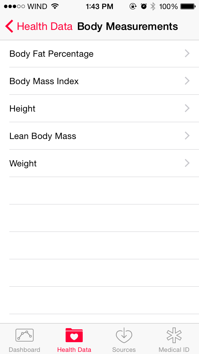
The Health Data screen contains all the possible health information categories that the app keeps track of. You can search by a certain category such as body measurements, or you can view a list with all the various different types of information. Data points for a category can be added manually or sourced from applications that the user gives the Health app permission to access. Other applications for tracking health information can also request access to the information stored in Apple's Health app.
The Sources section contains a list of all applications that are allowed to access and update the information stored in the Health app. Once developers start to hook into the Health app using Apple's HealthKit framework, the Health app will become an area where a user can view all the information from various different health focused applications in a single place.
Medical ID
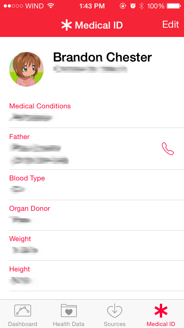
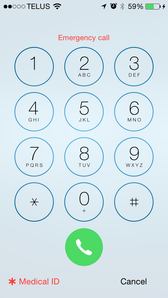
Medical ID is a new feature in iOS 8 where users can create a section that displays their personal and medical information. It's integrated into the Health app and it has sections for various information like Medical Conditions, Emergency Contacts, Blood Type, Allergies, Medications, and Organ Donor status. These are all things that would be of immense value to emergency workers when helping a person who is unable to give the information themselves. Medical ID can be made accessible via the emergency dialer so it can be viewed even on devices that have a passcode enabled.
I've personally been in situations where I was unable to give information like medications and allergies to emergency services about another person who needed immediate assistance. If you have any conditions that might be important, I encourage you to fill out the Medical ID and enable lockscreen access so paramedics or doctors can access it if they need to. It could save your life someday. What's unfortunate is that this is an Apple service for iOS, as it's something that could really be helpful if it was on every device. There's also some privacy concerns (e.g. anyone with access to your phone could view this information), but as always you have to decide which is more important.
The Health app is also an iPhone only application. I know of many elderly people who own iPads but do not own iPhones. I think Apple should bring the Health app over to iPad, or at the very least the Medical ID feature, as the elderly are a segment of the population that could benefit most from it.
Settings
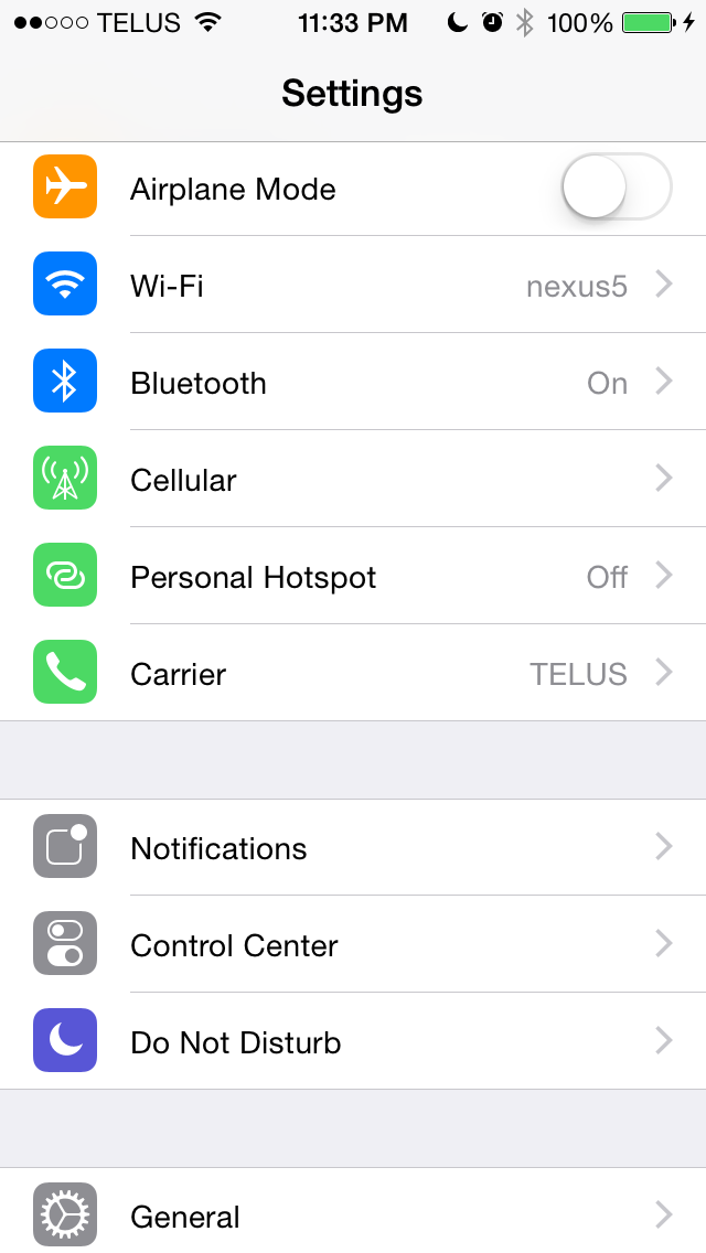
In terms of its appearance, the Settings application is relatively unchanged from its iOS 7 counterpart. There are some changes to icon colors to better group menus that all relate to a certain type of setting such as cellular settings. The big changes are the new sections that have been added along with many of the new features in iOS 8.
We have already shown some of these in other sections of the review, such as the new settings for self-deleting audio and video messages, or the settings for iCloud. The rest of the changes covered here are those that didn't quite fit into the other parts of the review, as well as changes that pertain to the functions of the Settings app itself.
Those looking closely for changes from iOS 7's Settings app will notice that the Personal Hotspot settings have been promoted from the Cellular section and given their own area on the main settings page. The color of the phone icon for the Carrier section has also been changed from blue to green, better reflecting the Phone app icon it is based on and creating better unity with the other two green icons that are also for settings relating to cellular connectivity. The section for General settings now houses a new menu for settings relating to Handoff, as well as the new battery usage section.
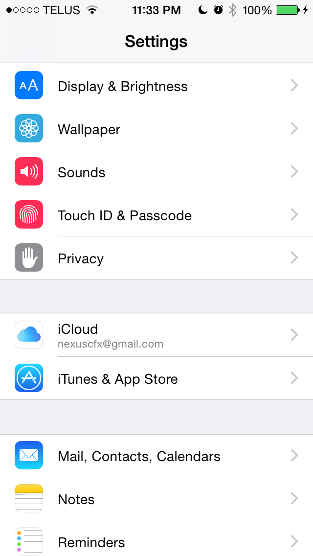
Moving down we can see that the wallpaper and brightness section in iOS 7 has been split into a Wallpaper section and a Display & Brightness section. The new Display & Brightness section also inherits items previously classified as General settings for text size in applications that support Apple's Dynamic Type feature, and the bold text option. The next block of settings contains the sections for iCloud and iTunes & App Store settings that were previously attached to other sections of the Settings app.
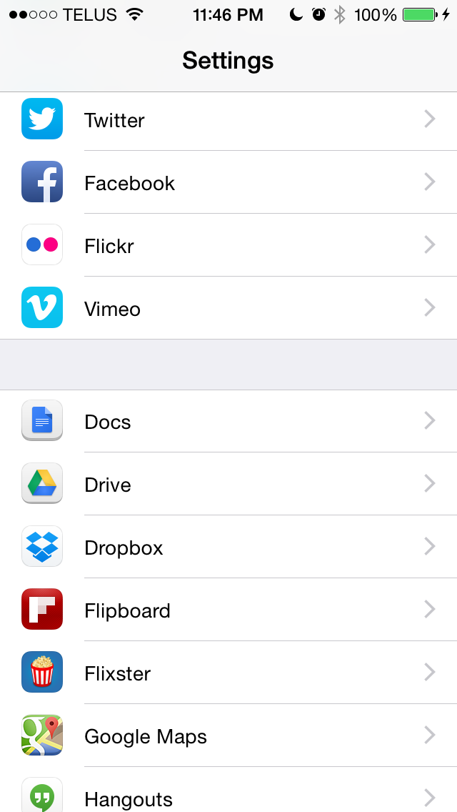
Near the bottom there's a new Twitter icon that reflects the design of the actual app icon, and a section that previously contained a small handful of App Store applications but now seems to include the majority of applications installed on the device. The reason the Settings app is now home to new settings menus for these applications is because on iOS 8 any application that requests access to cellular data will show up in the Settings app with a menu containing an option to block cellular data access if the user desires. However, I don't think that goes far enough; I would like to see Apple put developer guidelines in place to include all individual app settings into the Settings app so they can be modified from a single location rather than having to go into each app separately.
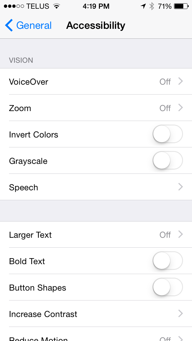
Some of the sub-menus in the General section of the Settings application receive some additional changes in iOS 8. The Accessibility section now has a greyscale feature for those with visual impairments, and for users with hearing impairments there is a setting that blinks the camera flash whenever a notification arrives.
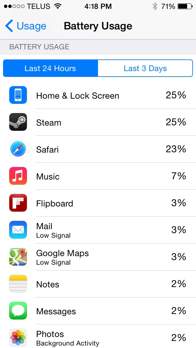
The Usage section has a new Battery Usage feature that displays how much each application on the device contributed to battery usage within either a 24 hour or three day period. Applications that were used when reception was poor are labeled as such to help the user differentiate between misbehaving applications and ones that were simply using more battery because the phone's radio had to be active for longer to complete a task. The Battery Usage section will also give tips for improving battery life such as enabling auto-lock or auto-brightness.
Safari
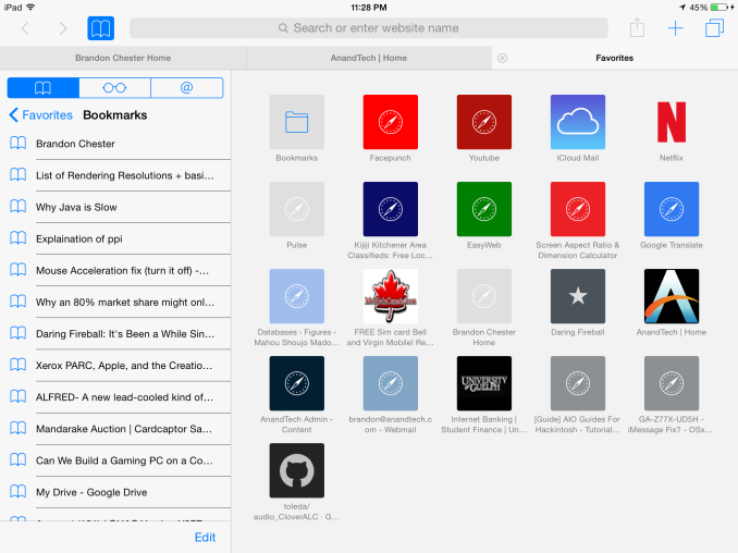
Safari received one of the larger overhauls of the stock iOS applications when iOS 7 released last year. The new unified search bar, vertical scrolling cards for tabs, and overall iOS 7 style design were big changes from the Safari in iOS 6 and earlier. Safari's appearance is relatively unchanged in iOS 8, but there are a couple new design elements and new features. For example, if you look closely at the above photos you'll see that Apple has changed the bookmarks icon on the navigation bar.
Safari also inherits all the additions to Spotlight Search. Search engine results are now accompanied by App Store suggestions, direct links to Wikipedia, Apple Maps results, and more. The Wikipedia results are proving to be a favorite feature of mine, as cutting out the time to navigate to and from a search engine to access a Wikipedia article makes finding information significantly quicker.
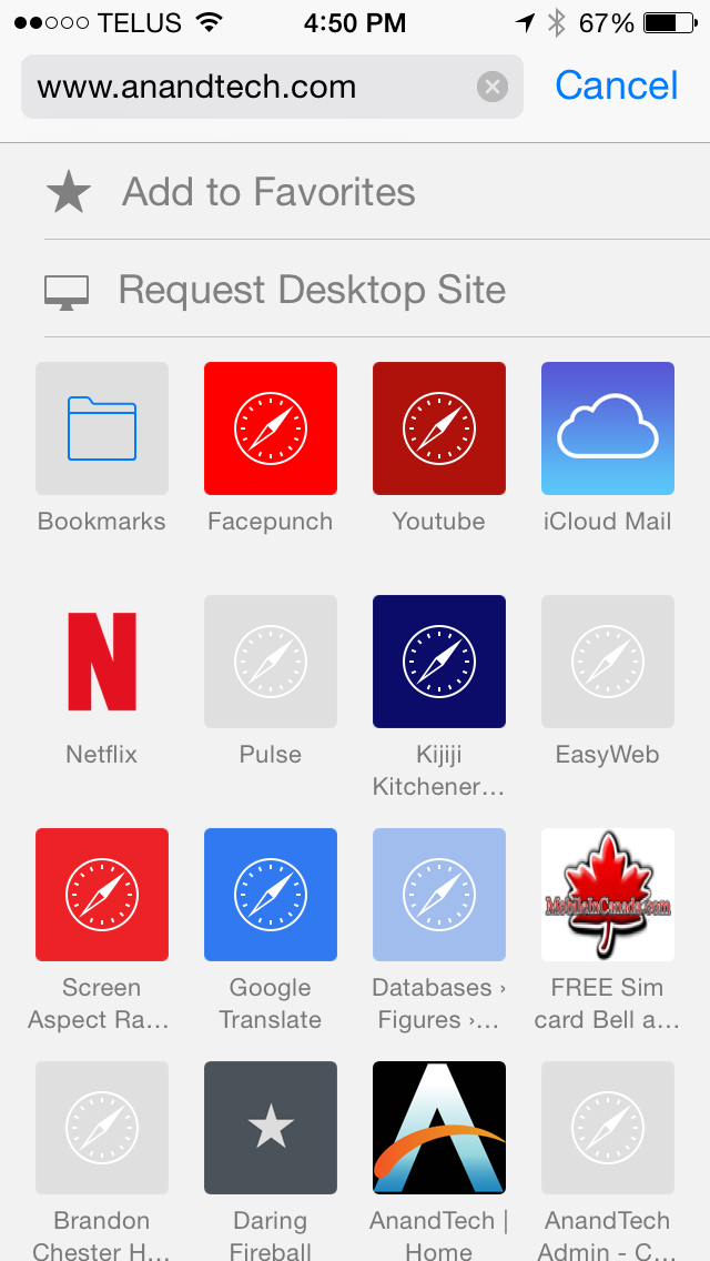
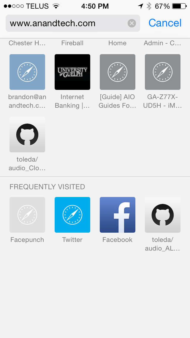
The Bookmarks page now contains buttons to add a website directly to favorites, as well as to request the desktop version of sites that default to a mobile layout. Users may have trouble finding these buttons unless they discover them by accident though, as they are hidden behind the search bar by default and require you to swipe down on the favorites page from what was previously the highest scroll position on iOS 7. At the bottom of the Favorites page there is also a new section for frequently visited websites.
Safari for iPad is an entirely different situation. The interface has undergone quite a number of changes, and it includes all the new features of the iPhone version along with a few of its own including a new tab view.
Above you can see that the Bookmarks menu has been implemented as a pane that slides in from the side rather than a menu that appears above other UI elements. The navigation bar at the top also receives some changes, including the tab view button that iPhone users will be familiar with.
Tab view on iPad is implemented slightly differently than on iPhone due to its larger screen area. Rather than stacking all tabs together, each website is given its own stack. These stacks are displayed in rows across the screen and all tabs from the same website will be added to its own stack. In addition to being accessible from the navigation bar, the tab view can also be accessed by pinching inward to zoom out on any page that is already being rendered at 100% scale, including the favorites page. Despite the addition of tab view, Safari for iPad still retains the tab bar beneath the navigation bar, although it only appears when more than one tab is open and can be disabled if the user desires. The navigation bar also shrinks to only display the website URL when scrolling down, much like the iPhone version of Safari.
What I found most interesting about the new Safari for iPad is how similar it looks to the new version of Safari for OS X Yosemite. The tab view, sliding bookmark menu, and bookmark links in the search bar suggestions are all features that Apple is also including in the next version of Safari on OS X. Even the gesture to access tab view by pinching the touchscreen exists on the OS X version by performing the same gesture using a Macbook's trackpad or Apple's Magic Trackpad. Once upon a time the iPad's web browsing experience was impeded by the limitations of mobile Safari, a cut down interface, and a web filled with Adobe Flash content. Now the browsing experience on the iPad and on a Mac are much the same. Times certainly have changed.
Performance
As usual, Apple has made improvements to their Nitro JavaScript engine in iOS 8. What's also exciting is that with Apple's XPC API for inter-app communication now on iOS, third party apps are now able to take advantage of Nitro rather than being limited to a slower JavaScript engine. This means that third party web browsers and applications such as Facebook and Twitter that use the iOS UIWebView class to display web pages will no longer have a performance penalty compared to Safari and Apple's other stock applications if they are updated to use the new WKWebView class. In addition, WebKit has been updated from 537.51.2 to 600.1.4.
Below are several benchmarks comparing the JavaScript performance on iOS between iOS 7.1.2 and the iOS 8 GM release. These tests were performed on an iPhone 5s, and they were also run on an iPad 3 to see the degree that performance has improved (or regressed) on an older device.
| iPhone 5s | iOS 7.1.2 | iOS 8 GM |
| Sunspider 1.0.2 (ms) | 405.8ms | 393.6 |
| Kraken 1.1 (ms) | 5948.7ms | 5301.6 |
| Google Octane (score) | 5700 | 5880 |
| HTML5test.com (score) | 410 | 440 |
| iPad 3 (Early 2012) | iOS 7.1.2 | iOS 8 GM |
| Sunspider 1.0.2 (ms) | 1303.8 | 1525.2 |
| Kraken 1.1 (ms) | 30790 | 29145.8 |
| Google Octane (score) | 1450 | 1590 |
| HTML5test.com (score) | 410 | 440 |
Something that took away from how fast iOS devices felt when iOS 7 launched was the speed at which animations played. Seeing the homescreen turn into a card and zoom out to reveal a list of apps was a neat effect the first few times, but after a while sitting through the lengthy animation made devices feel slow. With iOS 7.1 Apple increased the speed of animations like the multitasking drawer and the icons flying in when unlocking the device. The same has been done with iOS 8, and as a result the iPhone 5s I was testing felt faster than ever.
In terms of UI smoothness, the experience on the iPhone 5s is as fluid as it always has been. With the improvements to areas like Spotlight Search it may be that iOS 8 is actually smoother overall on the 5s than iOS 7.1 was. Unfortunately the same can't be said for the experience on iPad. As an early iPad Mini with Retina Display adopter, I was never really satisfied with the UI performance under iOS 7, especially given how much I paid for the tablet. It was certainly not up to par with my 5s. Though much of that has to do with the significantly higher resolution display, I still didn't feel it was as smooth at it should have been given the performance of Apple's A7 SoC. iOS 7.1 remedied this in many ways, but some areas such as the multitasking drawer and notification center would still drop below 60fps at times.
As for the third generation iPad from early 2012, there are definitely regressions in UI fluidity. I upgraded from the iPad 2 to the iPad 3 shortly after its release and even in the days of iOS 5 there were areas where performance was worse than its predecessor due to the memory and GPU requirements of driving such a high resolution display. In our iOS 7 review we remarked that it was surprising how early after its release the iPad 3 got to the point of feeling very slow to use.
It's unfortunate to say this, but that trend hasn't stopped with iOS 8. There are also issues like homescreen icons not rendering when using the four finger app close and swiping to another app page. I don't know if this occurs on the newer iPads but on the iPad 3 the software feels like it's not even finished. Taking all that into account, with the current performance under iOS 7.1 and fact that the iPad 3 is still excluded from features like Handoff and Airdrop, I can't say I recommend that iPad 3 users upgrade to iOS 8 unless they're fully aware of the possible bugs and reduction in smoothness from doing so.
Design Tweaks
Apple often makes tweaks to existing applications, even when they are not doing an entire redesign. iOS 8 is no exception. I've already covered some of the more significant design changes such as the new Control Center and the new parts of the interface in Messages. Below are some of the other various visual changes that I noticed going from iOS 7.1 to iOS 8.
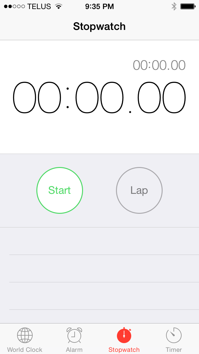
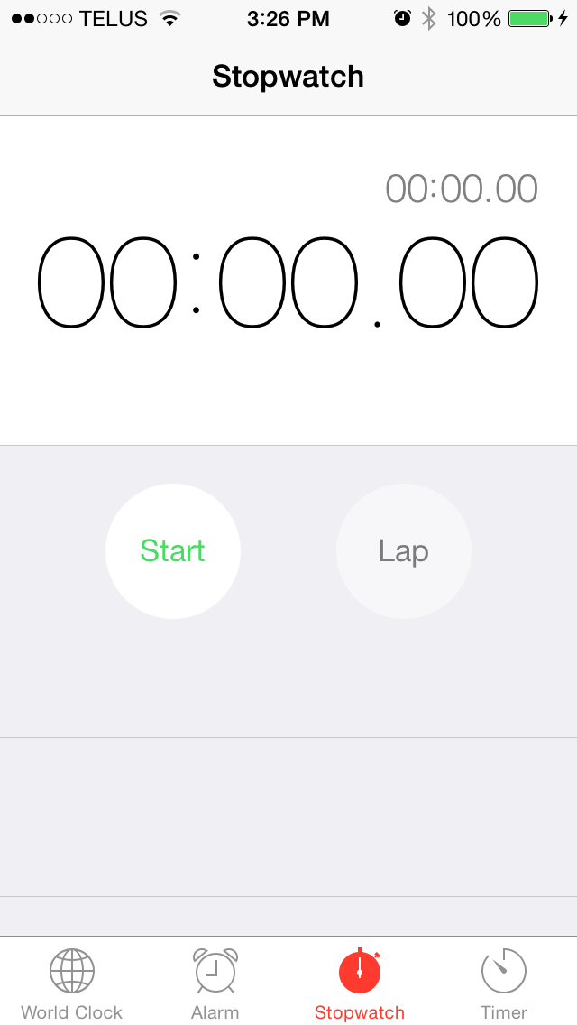
Clocks App. iOS 7.1 on the left, iOS 8 on the right.
The circular buttons in the Clock application no longer have a border, and the lap button has been given a background that is slightly different than the grey color of the app itself. This is a similar change to what we saw with the buttons in Control Center. It seems that Apple no longer feels that users require that a button has an explicit border to recognize that it can be pressed. The smartphone is something most people are familiar with today and so it makes sense that design conventions that would have been necessary with older versions of iOS are no longer necessary today.
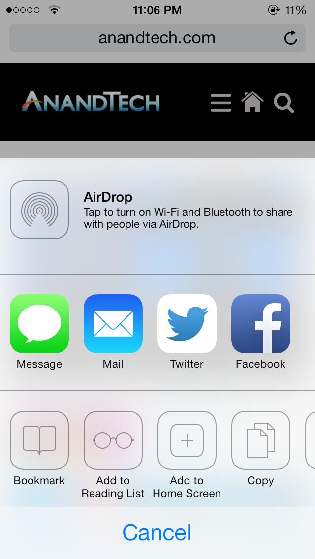
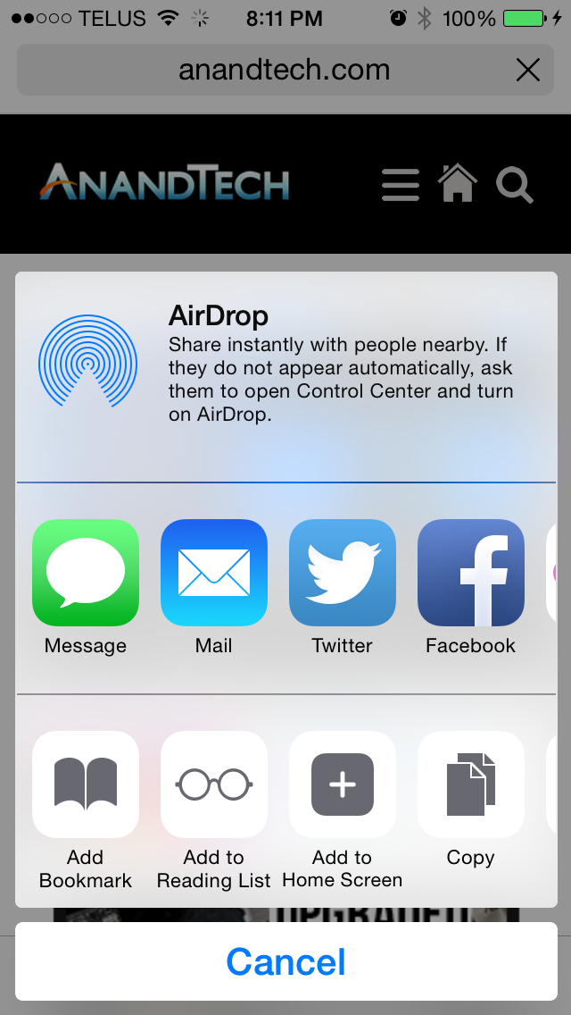
The Share Sheet. iOS 7.1 on the left, iOS 8 on the right.
Apple has also modified the design of the Share Sheet. There is slightly less spacing between icons, and the action buttons in the bottom row also adopt Apple's new style for buttons. The sheet itself is now like a floating card that is separated from the cancel button at the bottom.
The last design change that I noticed is that landscape mode in Apple's stock applications is now a fullscreen interface, with no status bar at the top. This affords a bit of extra space but when using landscape mode I usually have the keyboard up and there's still not even remotely enough space on an iPhone's display to fit much besides the keyboard in landscape orientation. It's possible that this feature offers a greater advantage on newer devices like the iPhone 6 and 6 Plus with their higher screen resolutions.
Application Changes and Additions
Weather. iOS 7.1 on the left, iOS 8 on the right.
Apple's Weather app receives some improvements in iOS 8. As I mentioned earlier in the section about Notification Center, Apple now sources their weather information from The Weather Channel rather than Yahoo. This allows the app to provide more detailed information and that required some changes in its interface. Both the hourly and daily forecasts have been extended to show information further into the future. Accessing the additional dates requires swiping up in the application. This also reveals a section with detailed information about the current weather. Previously this information was accessed by tapping on the current temperature, which wasn't a very obvious gesture. Putting it at the bottom was also necessary to fit additional information like the UV index, visibility, amount of precipitation, and sunrise and sunset times.
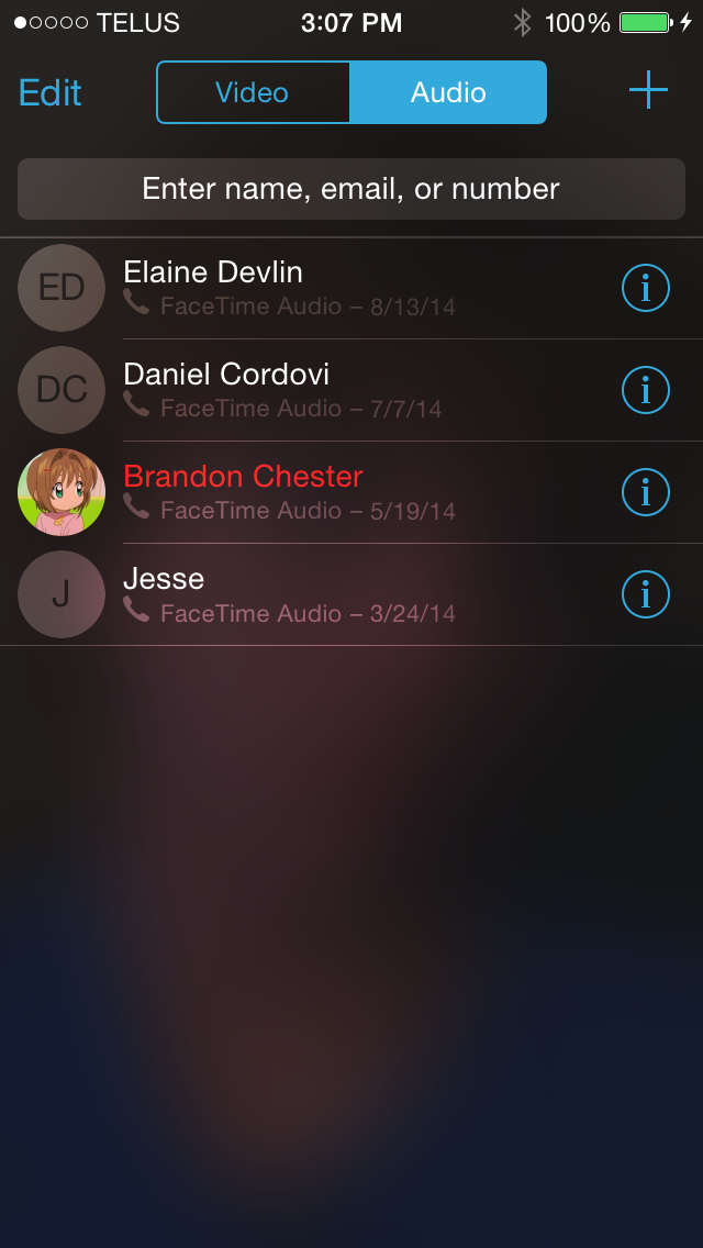
Facetime. iOS 7.1 on the left, iOS 8 on the right.
FaceTime receives some design tweaks in iOS 8 as well. After the inclusion of FaceTime audio calls in iOS 7 it looks like Apple has seen fit to split the app into a section for video calls and a section for audio only calls. The navigation buttons at the bottom have been removed, with the recent calls page now being the main page of the application. The plus symbol in the top right now brings up a list of contacts to select from, rather than its previous function of adding a new contact that seemed out of place.
iOS 8 also brings a new Tips application with hints and information about how to do things on your iPhone or iPad. Given that most things on iOS are designed well enough that they're fairly evident to the user, I don't really see why another application taking up space on my 16GB device is necessary.
In addition, Apple's Podcasts and iBooks apps have also been added as stock applications. Because of this, iBooks is able to adopt the transparent design with the device's wallpaper showing through, like the Newsstand app. Again, I don't think a large enough percentage of users use these applications frequently enough to make them worth including with the operating system rather than keeping them as optional downloads from the App Store. Having to hide them in a folder is annoying, and I feel constrained enough trying to manage storage on 16GB iOS devices with the current size of the OS and all its apps.
It's hard to express how I feel about iOS 8. On one hand, it's a massive release for developers and those new tools and APIs will eventually translate into better and more functional applications for users. From this point of view, iOS 8 could be considered even more exciting than iOS 7, but from the perspective of a user there's no real wow factor with iOS 8 right now.
There are some great new features like SMS Relay and Handoff, but they require being a user with multiple Apple devices, and the former isn't here yet. That isn't to say that users with only an iPad or an iPhone are left out. The improvements across iOS in apps like Messages and Photos are solid improvements, and features like Actionable Notifications finally address complaints that have existed for years. But a great deal of the additions are currently just a promise that great things are coming from the developer community, and many of the most exciting features that can be used right now are part of continuity.
As someone who does use multiple Apple products, I'm happy with what Apple has brought in iOS 8. I think many of the continuity related features are things that are very hard for another company to replicate without the control over hardware and software that Apple maintains. When I imagine myself as a user who can't take advantage of the new features given to users of multiple devices I believe I would still be pleased with what iOS 8 brings to the table, but not to the degree I was when iOS 7 was released.
Many of the improvements are in areas of the OS that have long needed to be improved or changed. There are also number of additions that take a great amount of inspiration from other mobile operating systems. While this may be seen as copying by some, for users the end result is that their experience is improved and they have features they did not have before, which is what really matters. Apple looking to other operating systems to see what deficiencies they need to fix in their own ultimately benefits users.
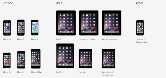
iOS 8 runs on all the devices shown above. It's great to see Apple supporting devices like the iPad 2 that launched in 2011, but I'm not without my concerns, primarily regarding Apple's A5 devices and all iPads in general. Even under iOS 7.1, the UI smoothness on devices like the iPhone 4s and the iPad 2 is far from exceptional. That performance doesn't get any better with iOS 8, and I believe that users of those devices may want to try out the iOS 8 experience on someone else's device before upgrading their own.
The iPad concerns in particular are ones I've had since iOS 7 initially launched. For about a year now I've felt that the iPad build of iOS has been neglected by Apple. The Springboard crash bug that took until iOS 7.1 to patch crippled my iPad Mini with Retina Display. If a similar bug had widely affected iPhones I believe it would have been patched much sooner. Other various bugs and performance issues that existed on the iPad but not my iPhone resulted in me eventually selling it. Many of these still remain today, and iOS 8 even introduces some issues of its own.
Given that the iPad 3 I have for testing falls into both the Apple A5(X) camp and the iPad camp, I won't be updating it to iOS 8. While the new features like SMS Relay will be nice, the missing features and issues like keyboard lag outweigh the benefits of updating.
Despite my concerns, iOS 8 makes me feel excited for the future more than anything else. Apple's steps to open up more options for customization by developers and users on iOS marks a significant departure from their previous releases. It's not Android but it isn't meant to be. It brings new features and capabilities that are implemented in a very Apple-like manner, for better or for worse. I don't think it's going to do much to sway Android fans toward iOS, but it gives a lot of reason for current iOS users to stay with Apple. This is especially true for users who can take advantage of continuity. iOS 8 feels like another step in the maturation that began with iOS 7. Most exciting of all is that it's still only the beginning.

