Lenovo Yoga 3 Pro Review: Refreshed With Faster Core M
by Brett Howse on March 13, 2015 8:00 AM ESTDisplay
The Yoga 3 Pro keeps the same display resolution as the Yoga 2 Pro, but the model number has been bumped from the SDC424A to SDC434A. The good is that this is already a high resolution display, with 3200x1800 pixels. The bad is that the Samsung made display is a Red Green Blue White (RGBW) subpixel arrangement, which can cause issues with color reproduction and contrast. Luckily Lenovo has sorted out the color reproduction for the Yoga 3 Pro, just like they did with the Yoga 2 Pro a few months into its life.
The higher display density can cause issues with some Windows apps, but overall it is less of a problem now. Hopefully Windows 10 will fix the last remaining issues with high DPI displays.
![]()
The Samsung display now has some competition as well. As we have recently seen, Dell launched the new XPS 13 with a Sharp IGZO 3200x1800 display. The Lenovo does come in a bit less expensive, but the Sharp displays have proven to be very good for brightness, black levels, contrast, and color reproduction.
To test our displays, we use SpectralCal’s CalMAN 5 software suite, with an X-Rite i1Display Pro colorimeter for brightness and contrast testing, and the X-Rite i1Pro spectrophotometer for color accuracy.
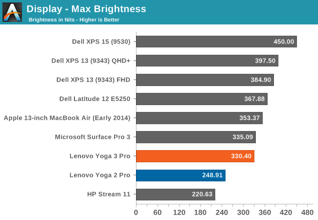
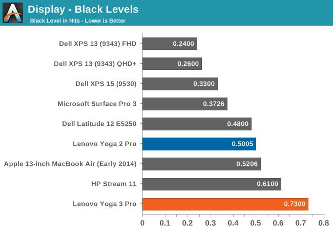
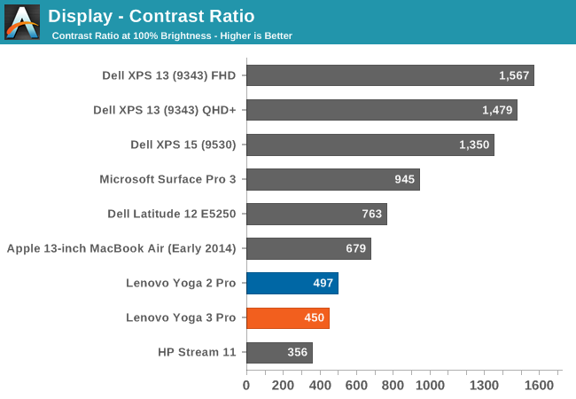
The Yoga 2 Pro was only able to hit 248 nits, and the Yoga 3 Pro can achieve 330 nits, which is a good improvement. However the black levels are very high, with 0.73 nits at maximum brightness, which leads to a mediocre 450:1 contrast ratio. The Dell XPS 13 was able to get over 1500:1, with a higher brightness as well. Lenovo needs to move away from the Samsung display if they can.
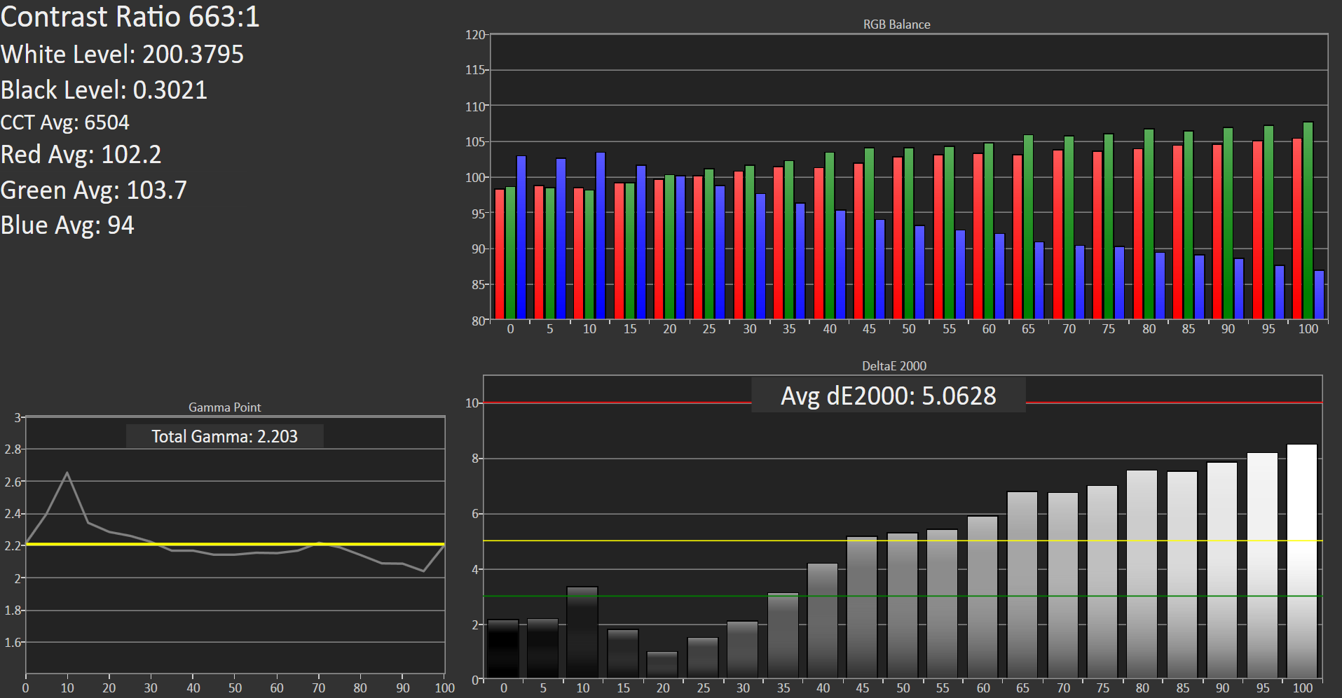
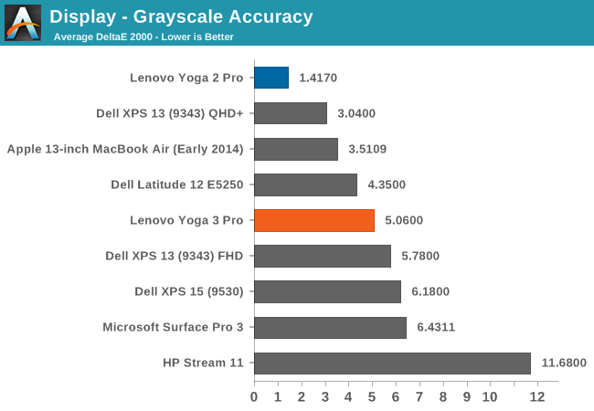
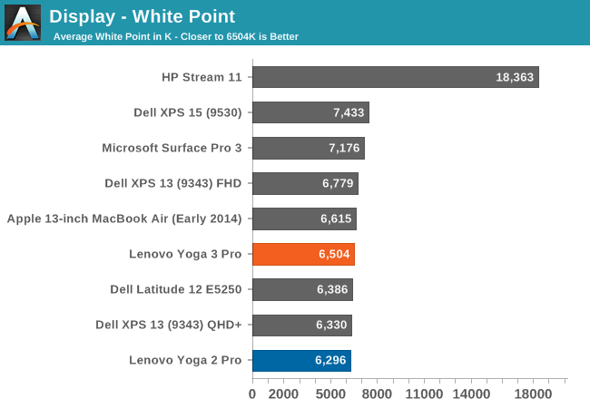
In the Grayscale sweep, you can see that the blue colors drop off quite substantially in the upper levels. This gives us an average dE of just over 5. It is not horrible, but not as good as we have seen from competing devices lately. Luckily this can be corrected through calibration. The White Point is ideal though, and the default gamma comes in close to the 2.2 that we are looking for.
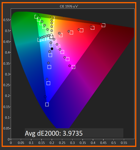
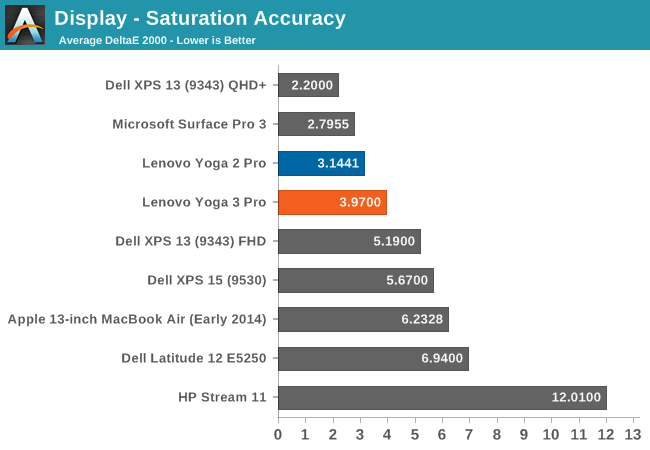
The saturations on the Yoga 3 Pro are pretty good, with the display able to cover the sRGB gamut with the exception of the Blue range which cannot quite hit the 100% level. Still, it is a reasonable showing.
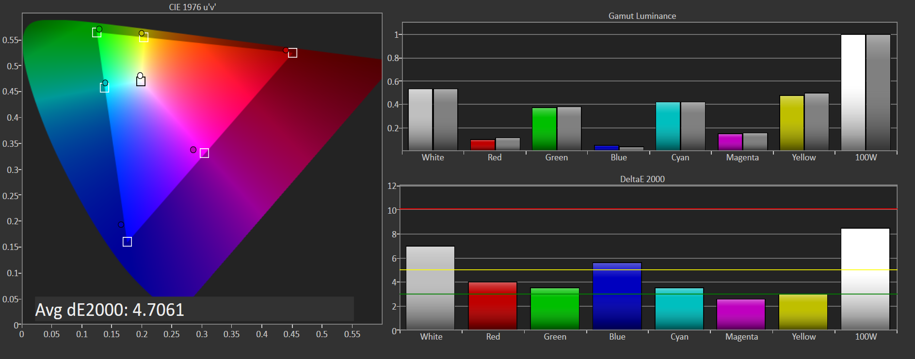
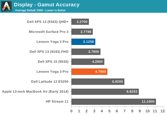
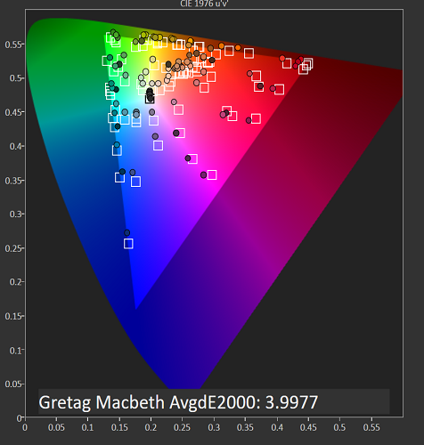
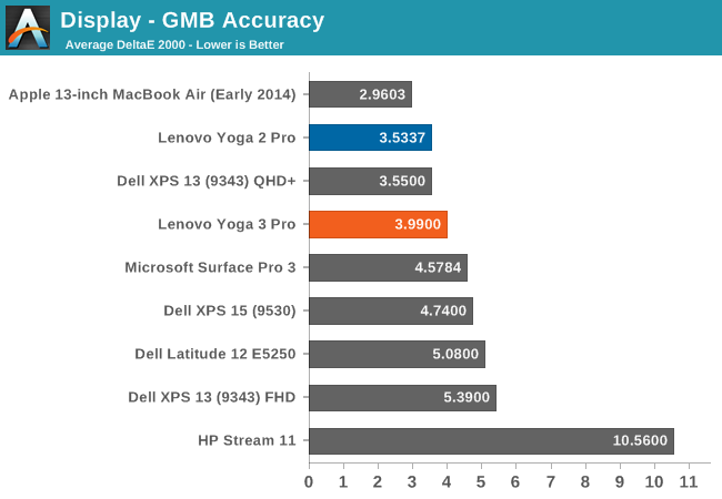
The GMB score is also reasonable, with the Yoga 3 Pro coming in just under 4. It is not the best nor worst display we have seen, but the bar has been raised and it would be good to see more devices having better quality displays. It seems like a broken record, since we have now pretty much moved away from TN panels on all premium devices, but we still have a ways to go.
The Yoga 3 Pro had no issues being calibrated, and we were able to run through our tests and clean up the scores a bit. Calibration on a device like this mostly just fixes the grayscale, but it can be a big improvement.


The grayscale result is much better once calibrated, coming in at just 1.34. All of the other scores have improved as well, with saturation now 2.337, GMB at 2.5013, and gamut at 3.6681. Once calibrated, the display behaves very well, although the contrast ratio cannot be corrected through calibration. That is really the one detriment to this display. The RGBW layout is not ideal and hopefully Lenovo will move to a different display for future models. The Samsung display just has very poor blacks, and it can be distracting when using the device for watching dark movies. Still, it would be a nice benefit if Lenovo would include an ICC profile for the display to correct what can be corrected.


113 Comments
View All Comments
KZ0 - Friday, March 13, 2015 - link
Why did they have to break the keyboard! So close to perfect, but the keyboard is important!fokka - Friday, March 13, 2015 - link
the yoga line is nice and the yoga 3 pro could be one killer machine, but when i have to press key combos for simple things as adjusting brightness, or to skip a track this would be just a big step back in usability for me.like the author, i'm also not a fan of the rgbw-display, especially when sharp makes a display of the same resolution which is just so much nicer.
and the third point would be the middling battery life. i would give up the 1800p screen in a heartbeat if it meant i could get the same battery life as the 1080p xps 13.
i'm still not the biggest fan of core m, even with a little fan helping out.
i guess for me that means the time isn't quite here yet for the super-slim 12mm for factor and in this generation and probably the next i'd still be more inclined to go with a 15-17mm thick device, simply to have something a bit more future proof in the cpu and especially gpu department.
if more manufacturers could now offer 16:10, or even 15:10 screens on their future devices, that would be much appreciated.
fokka - Friday, March 13, 2015 - link
oh sorry, now i posted the whole shebang, when i only wanted to share my sentiments about the keyboard... edit option, anyone?wintermute000 - Saturday, March 14, 2015 - link
someone in lenovo has obviously gotten hold of some kind of focus group testing or user survey that says most 'normals' don't use the F keys, and gone ahead and loaded the shotgun (pointed at their feet). Observe the X1 carbon (though maybe the latest variant went back to the F keys?), yep thinkpad users don't use F keys... not.....My company recently got a laptop refresh where we were given the choice of T440s or X1s. The first wave of people went X1s en masse and there was a seriously high return rate after people realised how much of a PITA the new, no-F-key layout was.
MrSpadge - Sunday, March 15, 2015 - link
I agree, this is ridiculous especially for a "Pro" version. And they still have so much space left at the top of the current keyboard.Wwhat - Sunday, March 15, 2015 - link
It seems the new paradigm to remove stuff and reduce user convenience, samsung did it with their new phones, apple did it with their new single-port laptop, and you see more and more devices being released with pointlessly reduced functionality.But as for 'pro', I'm not sure any 'pro' would get lenovo after the spy-ware fiasco.
I know lenovo is not an option for me after that.
Gigaplex - Monday, March 16, 2015 - link
"Pro" use in the Enterprise would just use a corporate image, rather than using whatever Lenovo installed.Wwhat - Saturday, March 21, 2015 - link
Fair point, but seeing we hear more and more about things embedded in firmware and BIOS I'm not sure I'd trust it either way. Especially the BIOS would only require a cooperation of lenovo to 'enhance' their system.It's the nature of the nastiness they were exposed as bundling, it was too complex and devious to brush off. In my opinion at least. And it ruined any trust I have.
miahshodan - Tuesday, March 17, 2015 - link
I don't mind the function keys as much as having keys in the wrong place. For instance the right shift key should be directly below the enter key and the forward slash / should be below the '. things like that kill typing speed.Wwhat - Tuesday, March 24, 2015 - link
Odd view, the shift key isn't too bad if you type with ten fingers since it is where it suppose to be except the right part missing, and people can probably adapt to that.As for the forward slash, that is always below the middle between ; and ' on standard keyboards, check wikipedia to see. And it's actually the ctrl key which isn't where you expect it.