AnandTech Mobile: Pinch to Zoom & Pipeline FP Now Supported
by Anand Lal Shimpi on July 16, 2013 6:10 PM EST- Posted in
- Site Updates
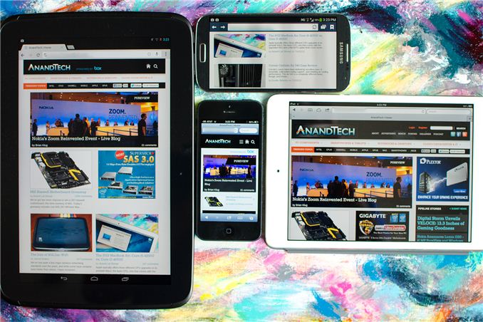
Yesterday, with the help of our friends over at Box, we launched the first responsive version of AnandTech. To recap, our single site design will now present you with one of four different views depending on your browser's reported resolution (not user agent string). You'll get a smartphone portrait, smartphone landscape, tablet or desktop view depending on what resolution your browser supports.
Based on your feedback from Monday our developer John has added a couple of additional frequently requested features:
1) Support for Pinch to Zoom is now enabled in the mobile view.
2) The most recent 8 Pipeline stories are now integrated on the front page (all other front pages had them integrated already).
Next on the list are higher res icons :)


 Facebook
 Twitter
 RSS
RSS


20 Comments
View All Comments
miahshodan - Tuesday, July 16, 2013 - link
So it will think my Lumia 920 is a tablet? Seems to work ok thoughabrowne1993 - Wednesday, July 17, 2013 - link
I'm getting the two smartphone views shown above on my 920.wavetrex - Tuesday, July 16, 2013 - link
Awesome !I'm a web designer and find this idea wonderful... It switches automatically even while you re-size the desktop browser to smaller and bigger width.
My next website will possibly include something somewhat similar ( if time permits... )
skiboysteve - Tuesday, July 16, 2013 - link
How do you guys do smartphone portrait vs landscape? I thought iOS and IE9 /10 don't report rotation. I think android and IE 11 do though.Flunk - Wednesday, July 17, 2013 - link
I noticed this yesterday when I visited the site on my tablet, the sidebar was missing. It seems to work great, as a developer myself I realize how hard it is to create a proper responsive layout (having done so a few times myself) so it's really nice to see a major site like this one going that way.Responsive sites are the best way to support a large number of different clients with the best possible experience/least amount of work.
jimbo2779 - Wednesday, July 17, 2013 - link
Is there any chance we can get a desktop view option for mobile devices? I have yet to see a mobile wesite that is as good as the desktop version and I hate to say it is the same here.I just find things so much easier when a website s not "dumbed" down for the device. All mobile devices have pinch to zoom and you can focus on a specific div on a website by ouble tapping so you get that section full screened instantly when you want it.
The first thing I look for on pretty much all mobile sites is a link to the desktop view due to there being less info on the mobile version.
I never struggled to navigate any website with a mobile device for the past 4 or 5 years as mobile browsers have become excellent at providing a great experience on desktop centric sites across the board (iOS, Android, WP and Win8 touch) now so there really isn't any need for mobile versions of websites at all IMO.
Hopefully this is taken as a serious request and not just the ramblings of an old fart unwilling to come to terms with current trends.
mgc8 - Wednesday, July 17, 2013 - link
I must say I tend to agree with the above sentiment -- mobile sites are almost always a downgrade in content, although they improve the usability. Case in point here: there is no "DailyTech" column on the homepage in the mobile view, which is 50% of my reason to visit this website while mobile. Can you please fix that by adding it back?On another note, @jimbo2779 -- there actually *is* a "desktop" view button, it's just very well hidden under the "About" tab => "Show full site".
Unfortunately there is another problem with the "full site" view -- at least on the two Android devices I use almost exclusively to browse Anandtech: the left-right padding is way off. On the Nexus 10 using Chrome, there is too much space on left and right (instead of the page nicely filling up the browser like it used to). On a Samsung GS3 using the default Browser (not Chrome since it's unusable on phones), there is no padding whatsoever, therefore the text starts directly from the left margin and is quite difficult to read. Please look into fixing this (I'm sure Brian Klug can test this on his myriad Android phones) as it makes reading AnandTech a chore; I wouldn't care if it wasn't my main tech site, but as it is I'm starting to look at alternatives :-/
jimbo2779 - Thursday, July 18, 2013 - link
Thanks for the tip about switching to full website mode, I am just used to there being a permanent "full desktop" link at the bottom of mobile sites that I can use, I didn't think to look in "About".I'm surprised you have issues with the desktop site on your Andy devices though, my WP7 and WP8 devices and wife's iPhone 4 (with iOS4) seems to handle it just fine. I haven't had an Andy device for most of this year, don't remember how it was when I did but I don't remember having any issues though.
Thanks again, I have my anandtech back on my phone now.
Kill16by9TN - Wednesday, July 17, 2013 - link
I really wish that I could force-lock "desktop mode" and get the H-scrollbar back for a browser window width of 1920px/2=960px, instead of losing the right-hand side PIPELINE STORIES and Dailytech News column or being forced into overlapping estimated some 1028px wide browser windows.prophet001 - Thursday, July 18, 2013 - link
"Box"lol
No. You can't haz my stuffz.