Beyond TV 3.5 - SnapStream's Bread and Butter Undergoes a Minor Facelift
by Andrew Ku on October 8, 2004 2:00 PM EST- Posted in
- Smartphones
- Mobile
Beyond TV 3.5 - Visit by the Doctor's Scalpel
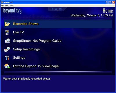
When SnapStream told us that they completely redesigned the user interface (UI), we asked them, "What did you specifically change?" They just told us to take a look for ourselves. That response made us a bit weary at first because a complete UI revamp usually only goes one of two ways: a dud or a win. There is less of a middle ground because people are familiar with the previous UI and people generally don't respond well to change unless the switch is an improvement.We expected a different UI when we launched the program, but it is the same ol' UI that we have become accustomed to from SnapStream (aside from them canning the 4-menu pop-up window). We like to refer to it as "dark horizons". But things do change dramatically once into TV viewing mode...
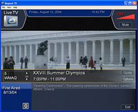
In many of our previous conversations with SnapStream, we kept emphasizing two UI points to them: less obtrusive and low profile. In return, they usually said that they were working on it and or that a skin-ability feature was a possibility. While the skin-ability feature isn't panning out for this version of Beyond TV, there is a dramatic change in the TV viewing UI.
The information panels used to take up about 50% of the TV viewing space. The problem with this was that there was redundancy and even unused space (i.e. the live TV icon and the show description). The new layout is much cleaner looking, though some improvements can still be done (e.g. make the show description two lines with a "more info" option). There is no right-click function in TV viewing mode, as those options have been migrated to the upper right hand corner. Additionally, the volume control is hidden until you mouse-over it. Like previous versions of BTV, the volume and timeshift track slider are functional, and it's a relief to see that we don't have to get to a separate control panel to rewind and/or fast forward.
This is exactly where we want to see the direction of Home Theater PC (HTPC) software go in their UI designs. While some may comment that it is somewhat similar to SageTV 2.0, we feel that it departs from the latter as it is freer flowing and is definitely less chunky/blocky.
 Before: Beyond TV 3.5 beta Click to enlarge. |
 After: Beyond TV 3.5 final RCA Click to enlarge. |


2 Comments
View All Comments
Puppetman - Saturday, October 9, 2004 - link
Whoops. Posted a blank.Two things I noticed when comparing SnapStream and Sage.
1) SnapStream explicitly states that it supports the ATI TV Wonder cards (different from the All-In-Wonder cards). SageTV lists a bunch of chip names and product ids at the bottom. Good luck trying to figure that out.
2) SnapStream has a guide for Canadian tv channels. SageTV is US-only, so if you live in Canada, good luck programming shows or figuring out what's on tv that night.
Unfort, MythTV had problems with the ATI TV Wonder Pro last time I tried it (due to driver issues). Maybe it's cleaned up.
Puppetman
Puppetman - Saturday, October 9, 2004 - link